Overview
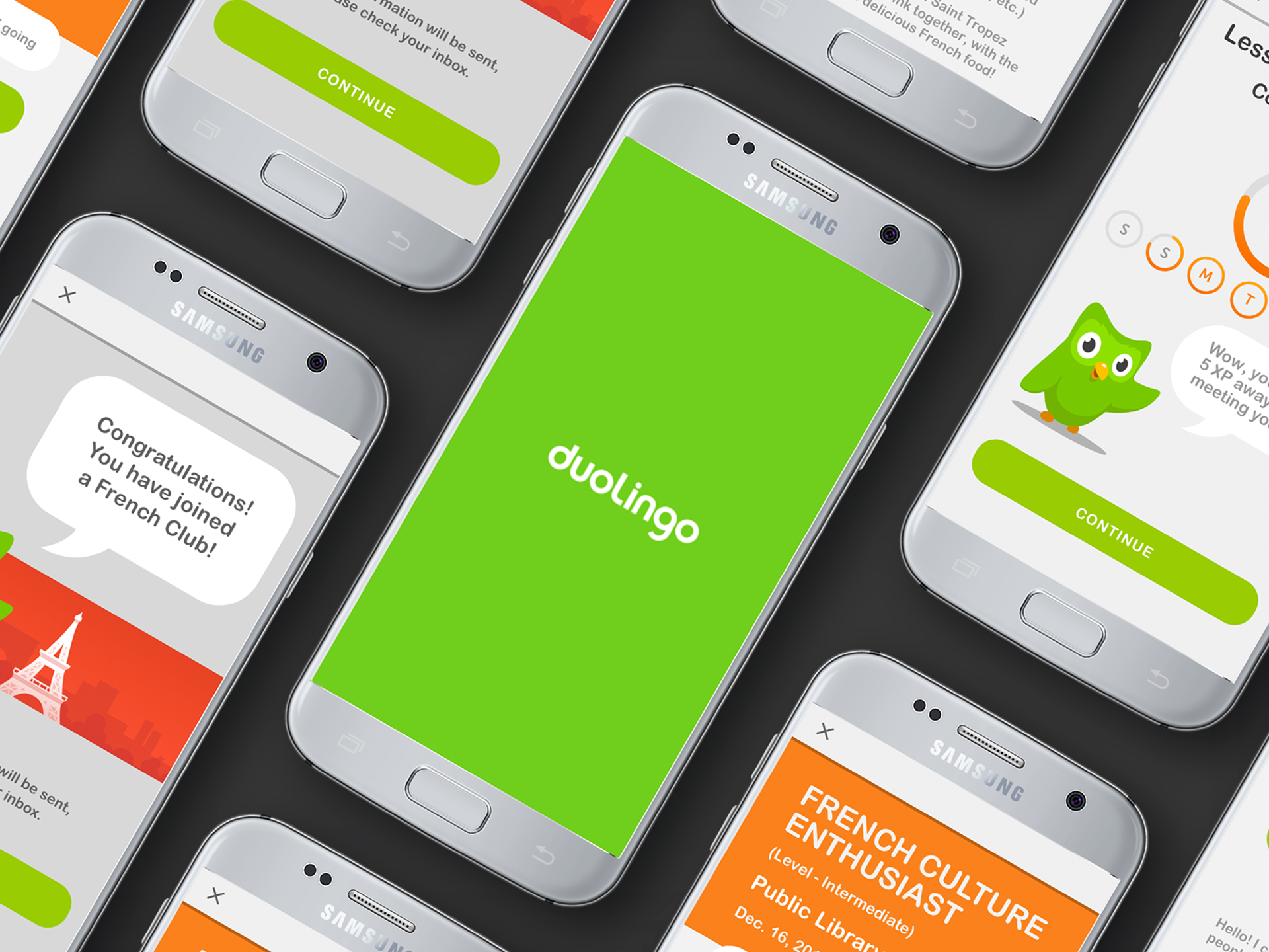
Creating and incorporating immersive language experiences into the Duolingo mobile application. The key features explored were: on-site translation, virtual tutoring, mobile integration
ROLE
UX Researcher, UX/UI Designer
UX Researcher, UX/UI Designer
SCOPE
On-spec, Team of 4 UX designers, 2-week time frame
Platform
Android (Material) Application
Tools
Sketch, Zeplin, Adobe Illustrator, Realtime Board
What is Duolingo?
Duolingo is a language-learning platform that offers personalized lessons in over 37 different languages. Users can track their progress, earn rewards, and practice skills such as reading, writing, speaking, listening. Lastly, they can engage in conversation with AI chatbots.
They strive for personalized education, fun learning, and universal accessibility. Regardless of background, income, or context, Duolingo aims to improve the overall quality of life for its users.
“Language is a lifeline."
- User interview participant
- User interview participant
The challenge
Duolingo is having issues with users gaining a full immersion with a new language. I set out to determine what features could be utilized to guide users to a more engaging experience.
After only using the app for a few minutes, I quickly realized how successful the User Interface was. It utilizes a consistent and cohesive color scheme while maintaining a vibrant and approachable aesthetic.
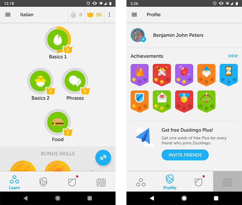
Screenshots of the Duolingo app before my proposed solutions
initial questions
• How can Duolingo's well-established design components be leveraged?
• What exactly is "full immersion" and what does that mean for different people?
• How do I work around functional and technical limitations?
• Will adding too many features lead to an overwhelming experience?
• What exactly is "full immersion" and what does that mean for different people?
• How do I work around functional and technical limitations?
• Will adding too many features lead to an overwhelming experience?
Research
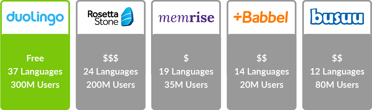
Competitive analysis
Since there is a wide variety of options out there, I began my research process by looking into some other platforms that have similar goals to Duolingo:
Interviews and Additional Research
Using the interview questions I scripted, I spoke with 6 language learners with a variety of backgrounds and motivations. I gathered valuable information about their goals, cultural context, and learning preferences.
INSIGHTS
• 90% of interviewees were uncomfortable with video chatting with a stranger
• The language learning marketplace is lacking in interpersonal connection
• A direct correlation between infrastructure and Duolingo users exists: better Internet, more users
• The language learning marketplace is lacking in interpersonal connection
• A direct correlation between infrastructure and Duolingo users exists: better Internet, more users
• A larger global Android user base led to designing in Material over HIG
• A vast amount of Duolingo users are displaced refugees, which influenced our persona creation
• A vast amount of Duolingo users are displaced refugees, which influenced our persona creation
Gamification consideration
From research, I found that many people enjoy using mobile learning environments due to the virtual ways of gaining instant feedback (progress bars, achievements, levels, skills, points, etc).
Inspired by aspects from popular video games like The Sims and Animal Crossing, I considered adding in the following features to construct a more in-depth virtual world:
• Character building and customization
• Virtual communication with other Duolingo users in real-time
• The ability to travel to different locations to complete simple tasks (Ex: buying an item in a shop)
Due to a constraint in time and resources, I realized that adding these features was not technically feasible and went a bit too far out of the scope of what users actually need.

Personas
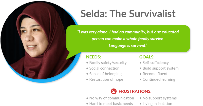
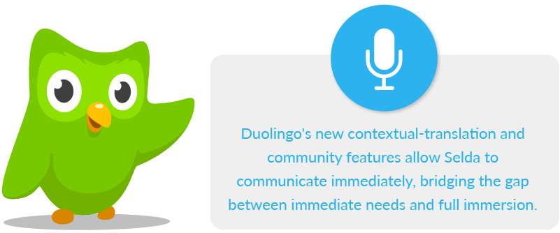
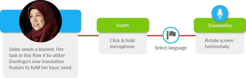
Selda needs a better way to meet her basic needs through language acquisition because she wants to build a foundation that supports her family's growth and development into the future.
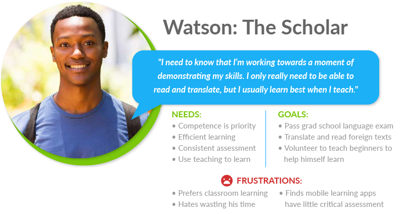
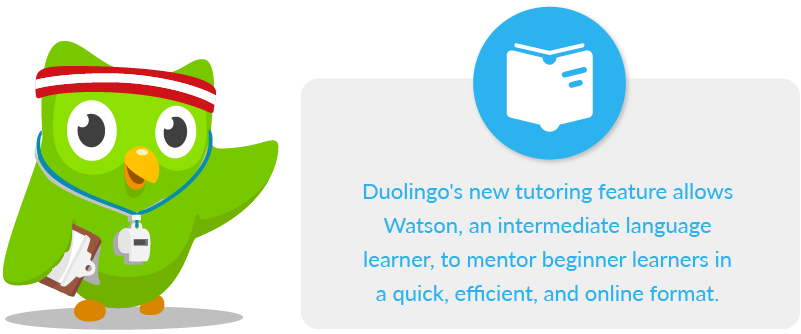
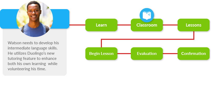
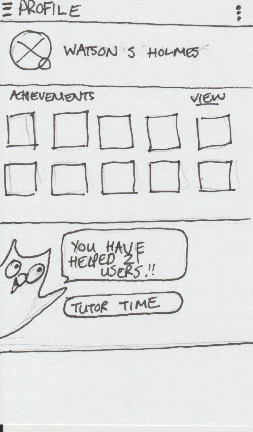
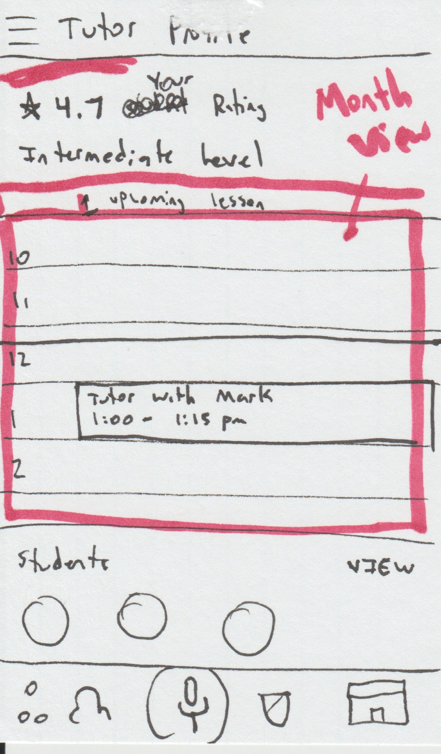
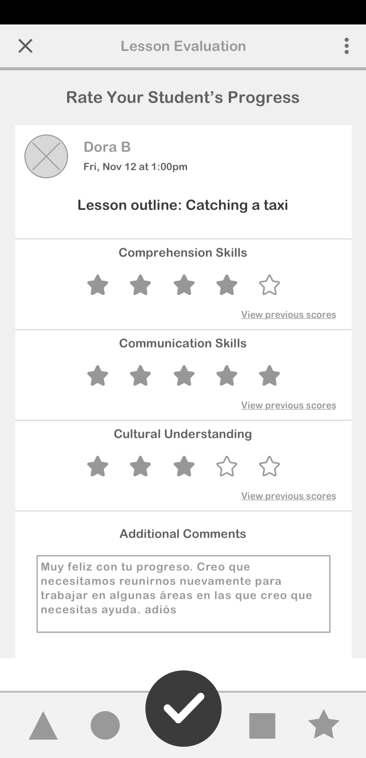
Watson needs a better way to study for his university's language exam in addition to his traditional learning environment, which will allow him to tutor others when it's convenient.
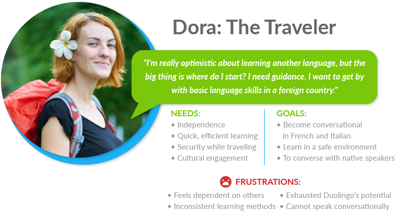
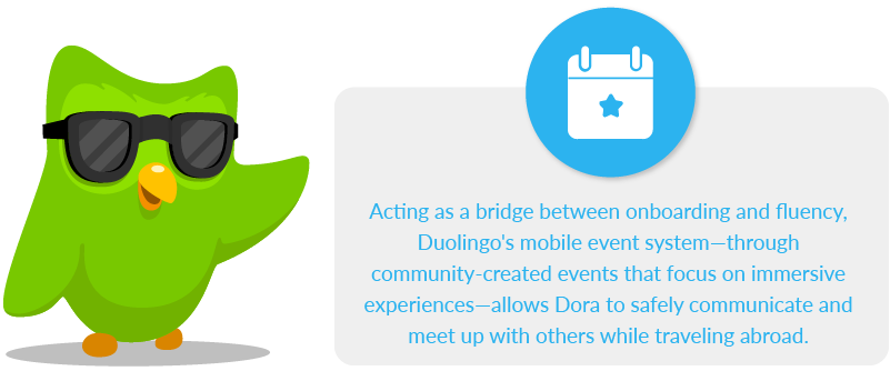
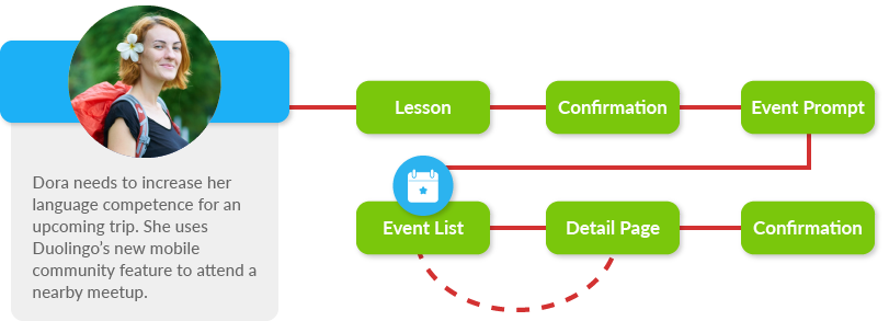
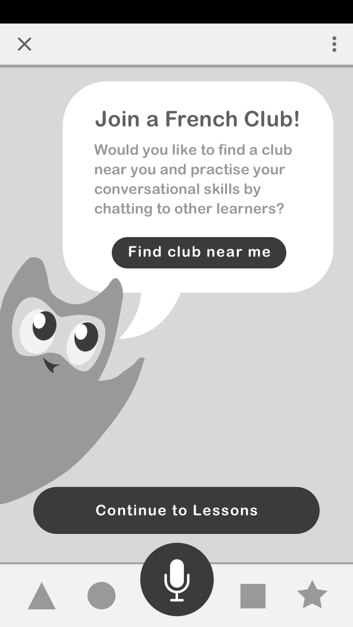
Dora needs a better way to safely practice her French and Italian with others on her travels because she wants to speak conversationally, increasing her cultural immersion.
Information Architecture
Mapping out where each function would exist within the structure of the app was essential when trying to plan out the flows of each user.
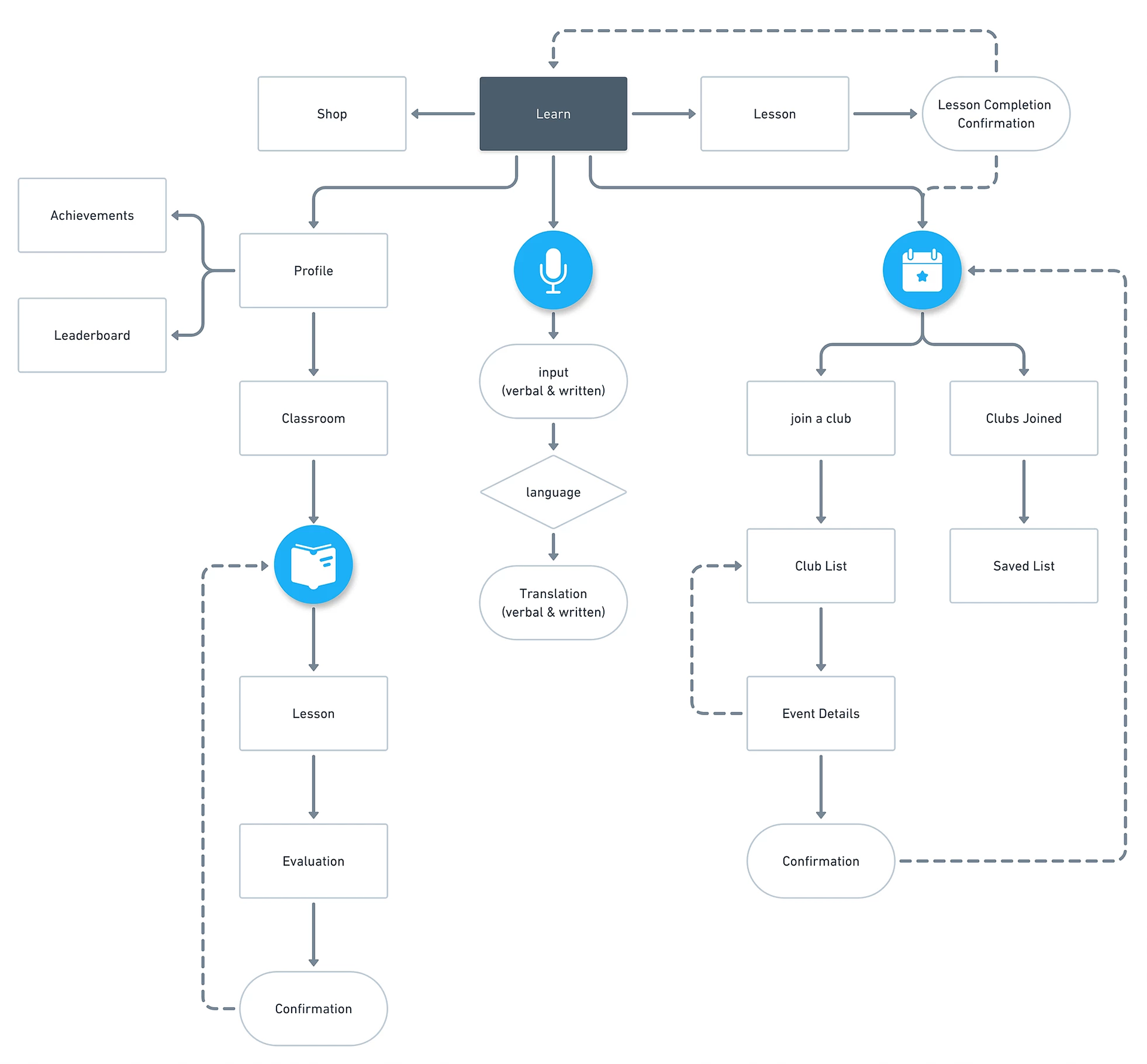
User flows
Consideration of how Selda, Watson, and Dora would use the app to achieve their goals, helped me identify the visual elements needed to be included with each of their unique pathways.
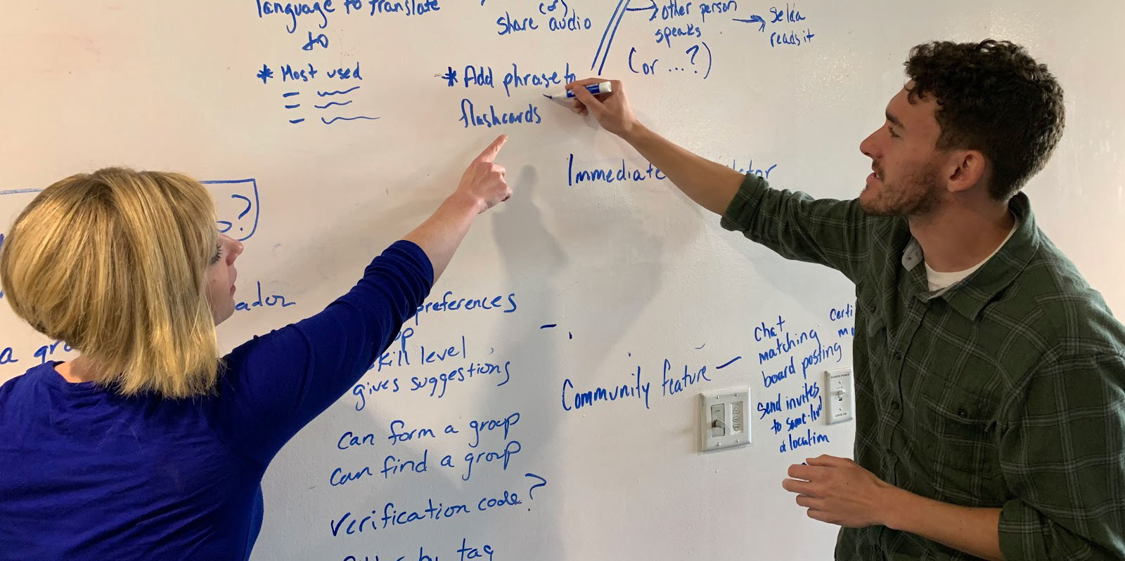
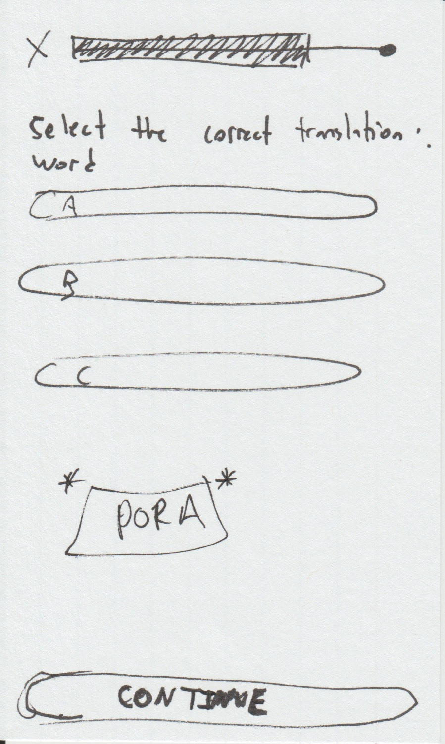
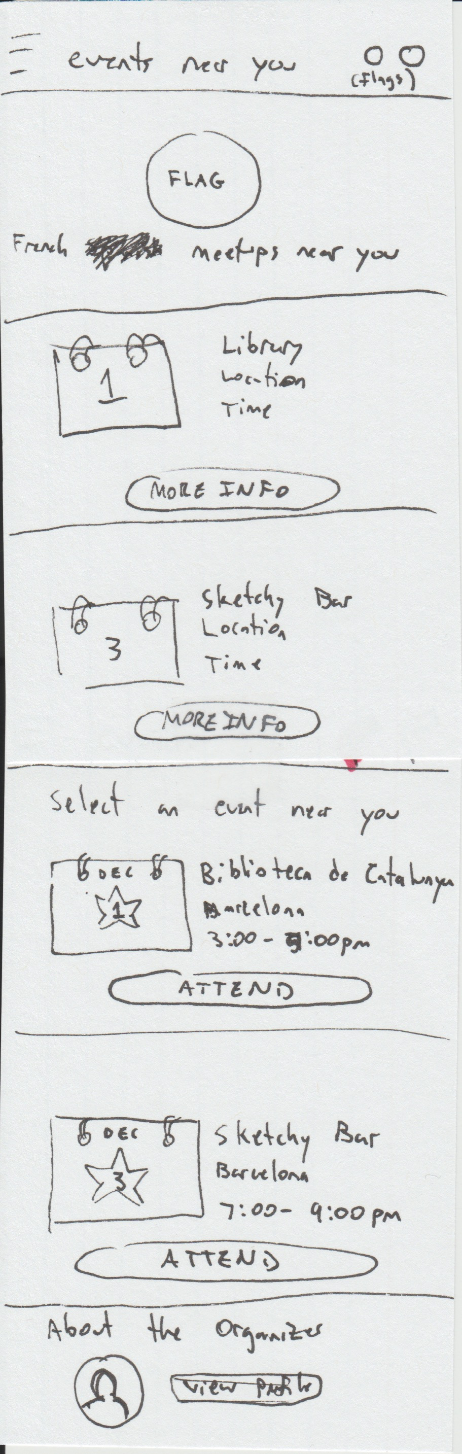
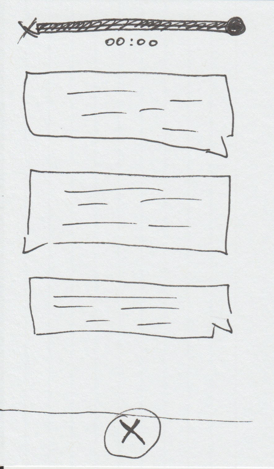
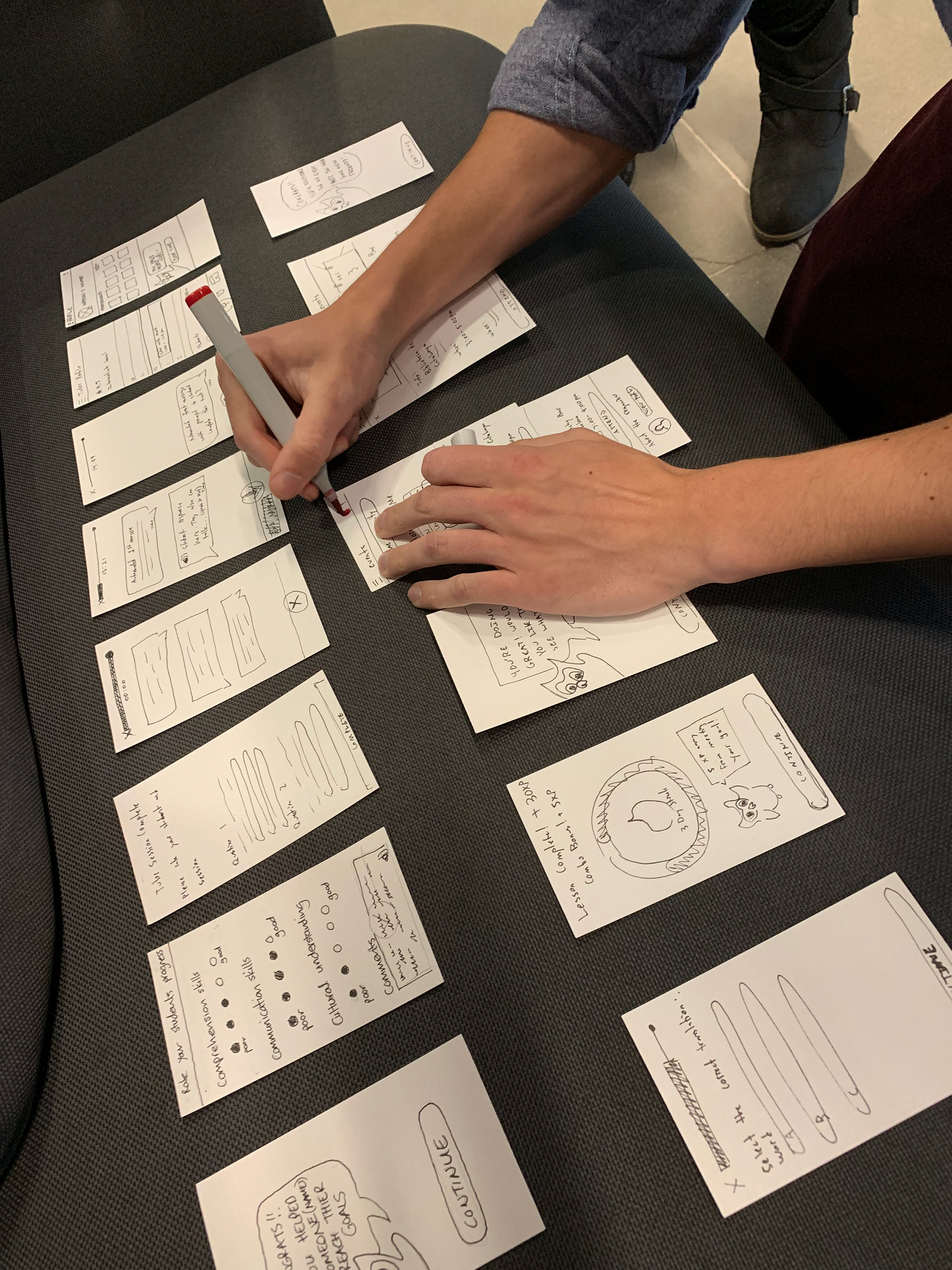
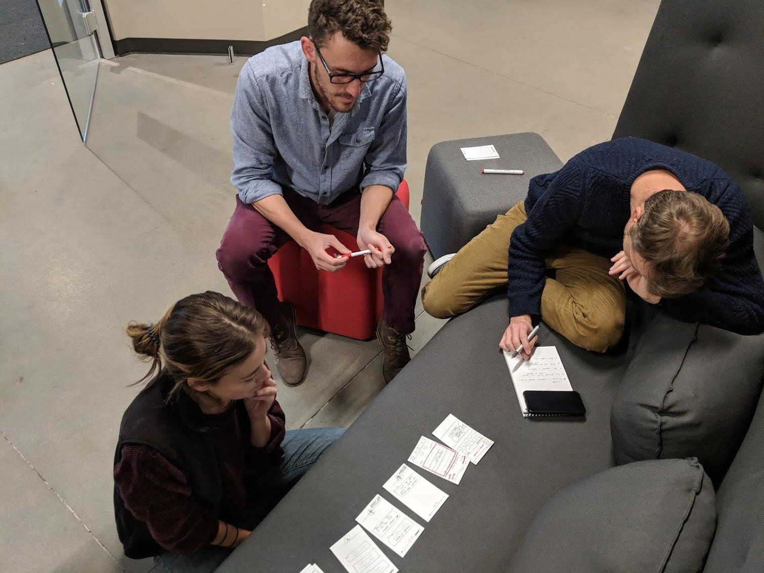
Sketching & Wireframing
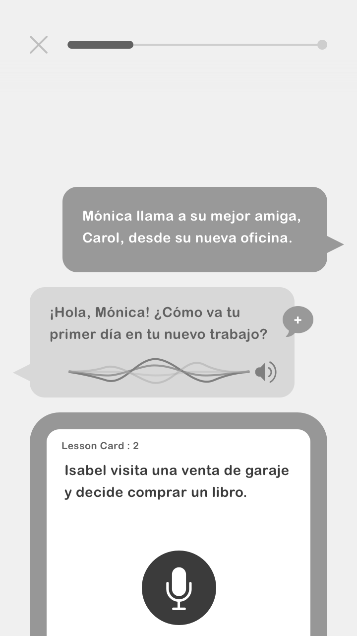
While ideating my three proposed solutions, I kept Duolingo's visual guidelines in mind as well as common design trends, and UI patterns.
User testing results
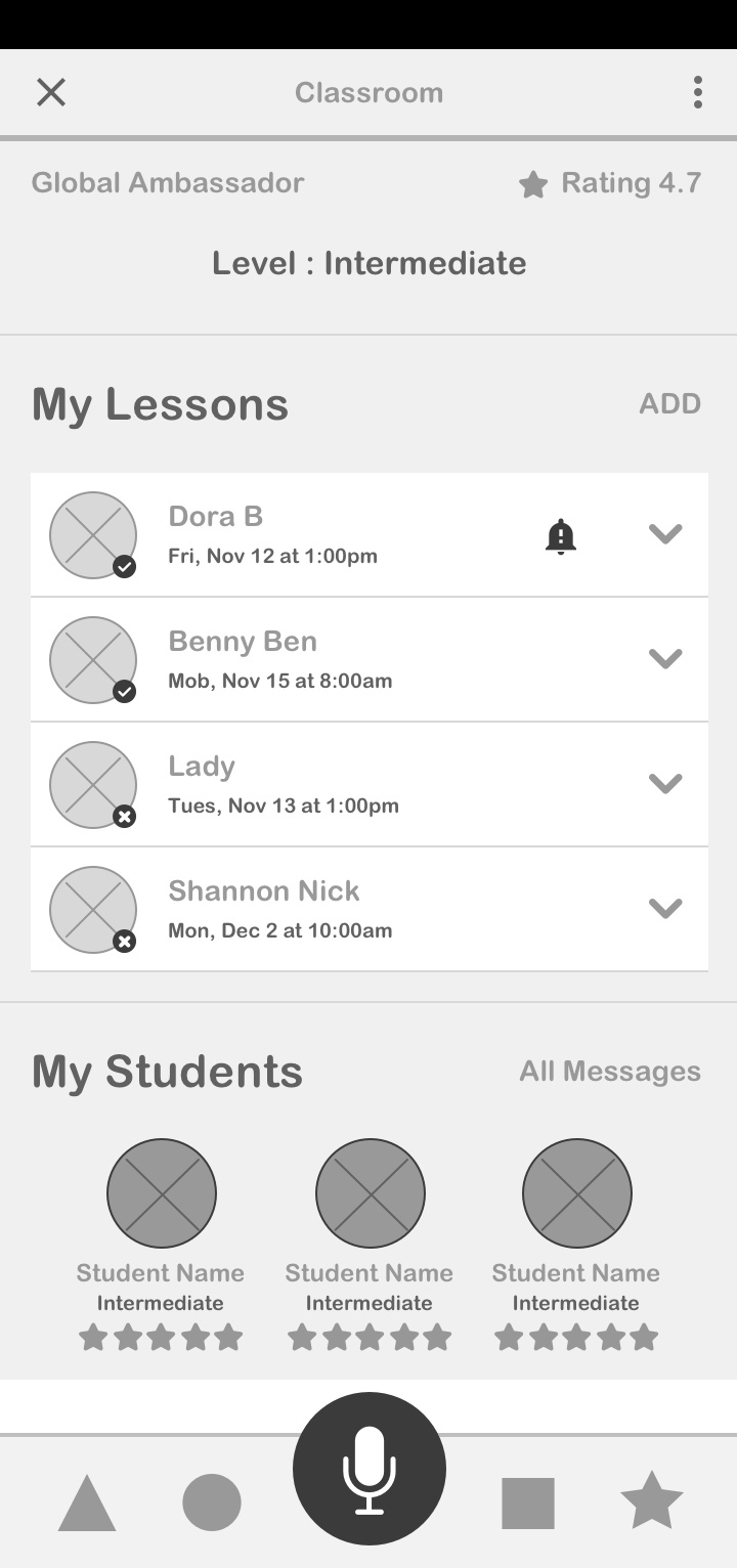
• Confusion arose around the "lessons" component of the profile in Watson's Flow
• Some testers stated they would've liked to see more info on the student's progress
• Many complaints came up around a large calendar feature that didn't make it to the final design
• A few users found the bottom call to action distracting when visually separated from the navigation
• Many complaints came up around a large calendar feature that didn't make it to the final design
• A few users found the bottom call to action distracting when visually separated from the navigation
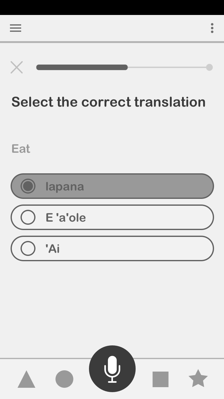
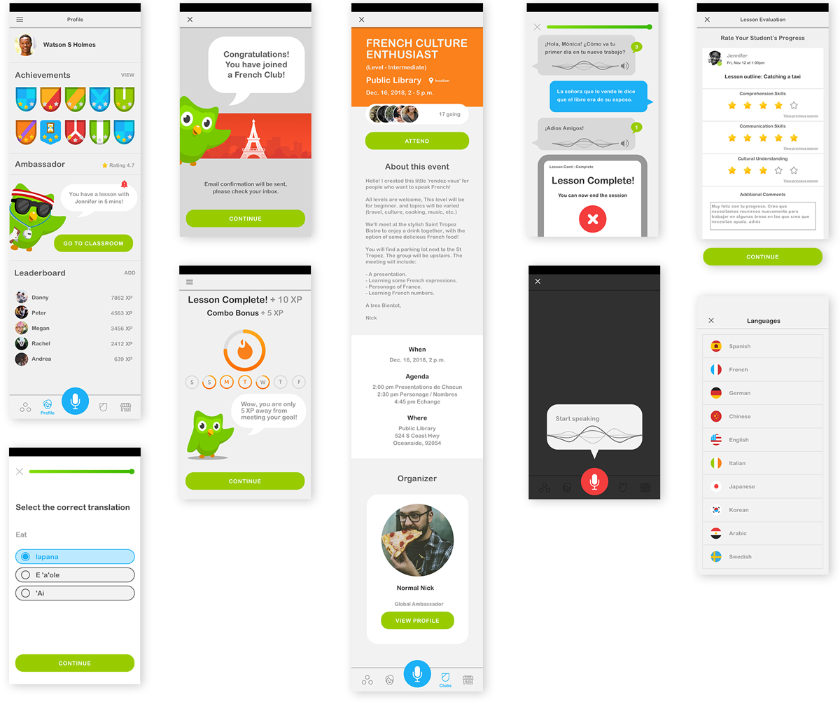
High-fidelity mockups
While designing these screens I factored in persona goals, testing results, common UI patterns, and Duolingo's guidelines.
Prototypes screen recordings
Next Steps
• Possibly integrate more gamification to enhance community interaction
• Expand on the tutoring component – collaborate with volunteer organizations
• Integration with "Tinycards"- Duolingo's digital flashcard studying tool
• Inclusion of a LinkedIn certification process
• An optional video chat feature available to users utilizing the mentoring feature
• The design of a tablet-sized layout for use in educational scenarios (for students using iPads)