
Overview
When designing an E-Commerce website for a Colorado running store, I focused on providing both new and current customers with unique methods of finding running shoes.
ROLE
UX Researcher, UI Designer
UX Researcher, UI Designer
SCOPE
On-spec, 3-week time frame
Platform
Responsive Website
Tools
Sketch, Adobe Illustrator
What is Runners High?
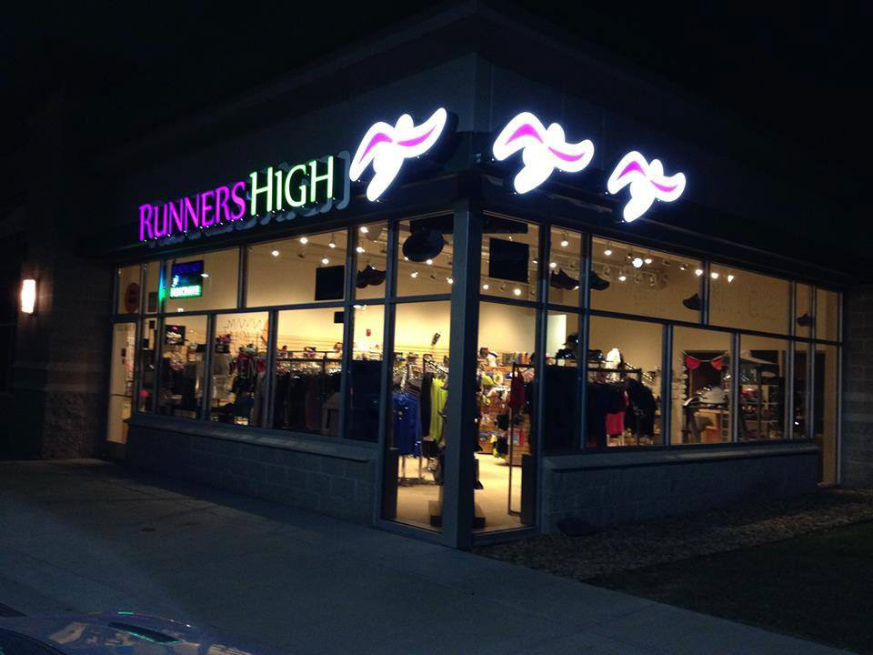
After finishing a 10K race in Morrison, CO, I met a store owner named Ken promoting the grand opening of his running store’s second location – at the base of the famous Red Rocks Amphitheater.
The first Runners High location was founded close to ten years ago next to the mountains in Golden, CO. It quickly became a community favorite due to the store's fantastic customer service and specific appeal to trail runners.
“Our success comes from learning and engaging with our customers to see what they may be interested in.”
- Ken, Runners High Owner
- Ken, Runners High Owner
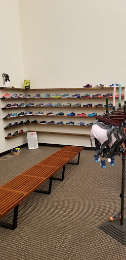
They also host a variety of races, educational sessions, local artists and other events. Yet, despite their strong community base, they still have issues competing with "giants" – as Ken calls them – due to their lack of an online presence. These giants include large national chains and online warehouses that lack the personalized touch Ken and his employees provide their customers.
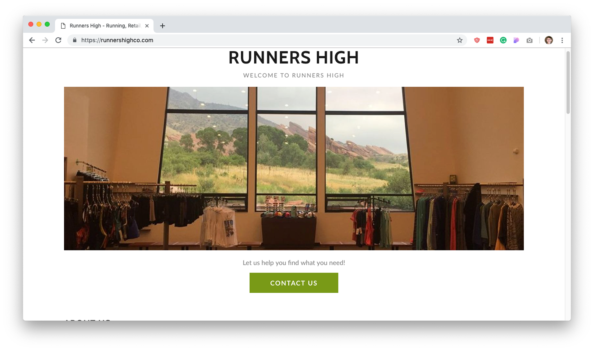
Current Runners High Website
The challenge
I set out to redesign the Runners Hight website to provide an improved online presence while also giving customers a personalized experience. The current state of their website only consists of a simple landing page with some basic store information.
Initial questions
• How should I factor in SEO optimization as an additional way to compete with larger stores?
• Would long-time local customers switch to shopping online?
• What other drawbacks would arise with the introduction of this new site?
• Should the site just focus on shoes, or also the variety of clothing and nutrition products they sell?
• What are the best methods of developing empathy for prospective users and store owner Ken?
Research
Competitive analysis


Interviews & contextual INQUIRIES
Using a series of questions I developed, I spoke with currently active runners and non-runners with varying backgrounds and motivations. I gathered valuable information about their goals, running and shopping habits.
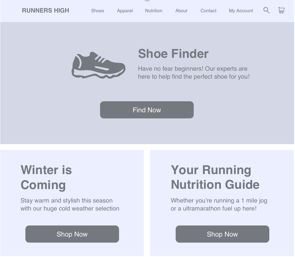
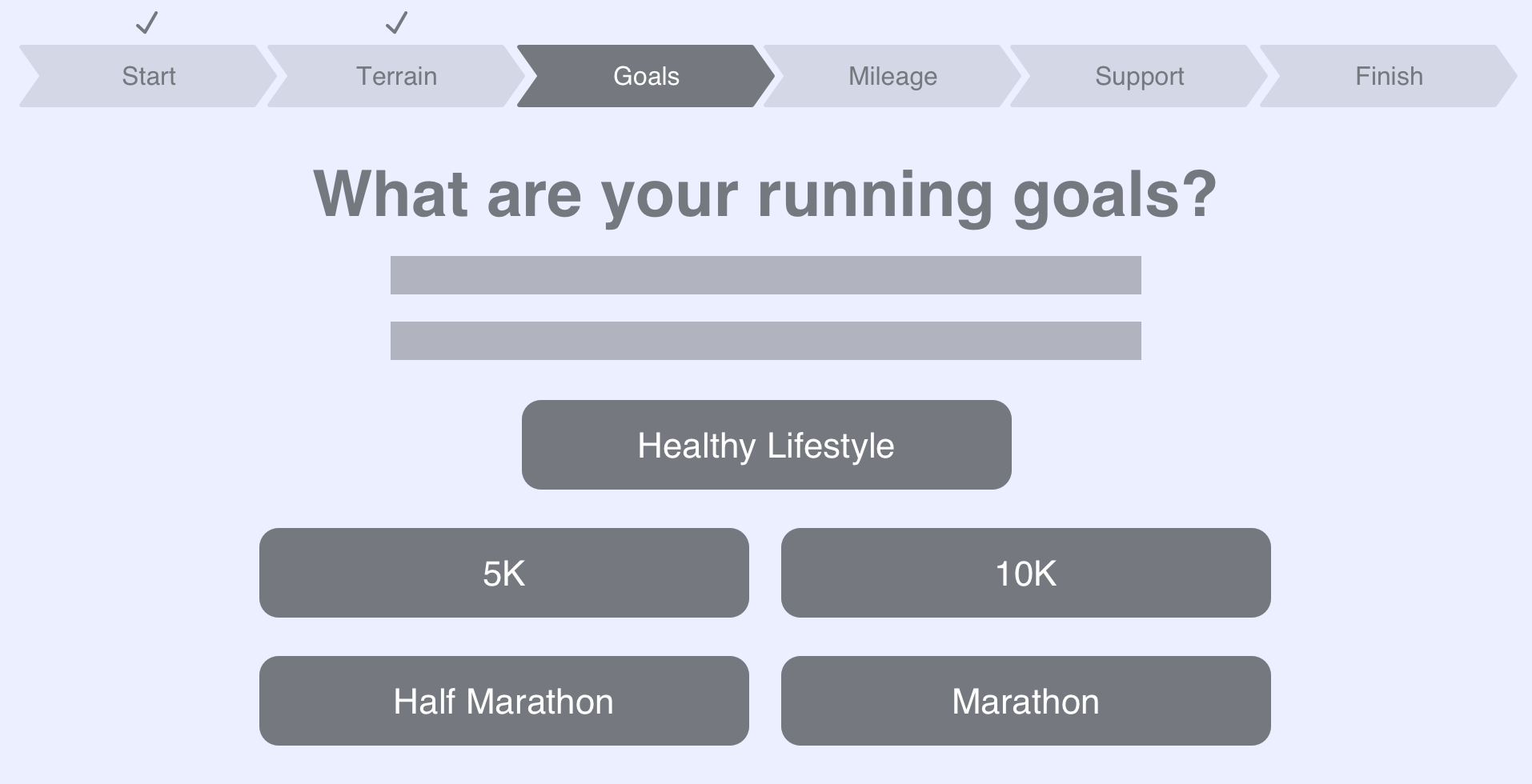
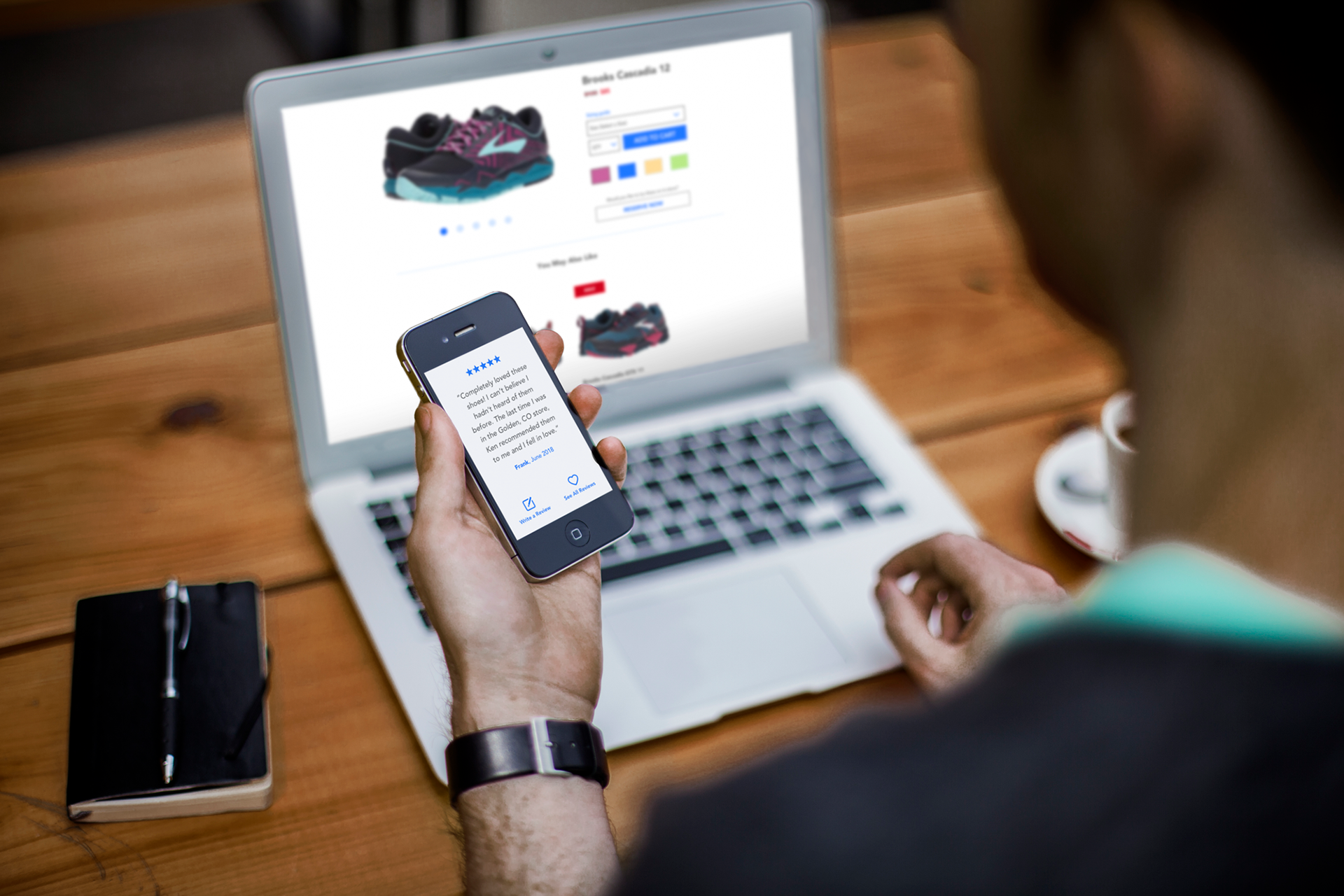
I conducted a series of tests in which I had users complete an online "shoe finder" feature - an online tool that walks users through a series of questions to identify their shoe preferences. I wanted to include a feature like this but decided to test it out first. After providing the verbal prompts, I observed and recorded their reactions.
I conducted a series of tests in which I had users complete an online "shoe finder" feature - an online tool that walks users through a series of questions to identify their shoe preferences. I wanted to include a feature like this but decided to test it out first. After providing the verbal prompts, I observed and recorded their reactions.
INSIGHTS
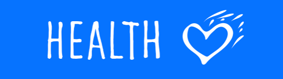
• All of the testers found the video components in running sites distracting
• Interviewees who hadn't purchased shoes in a while felt more comfortable getting guidance first
• Active runners simply wanted the quickest way to get their desired shoes
• 80% of testers enjoyed the shoe finder concept but found aspects of the navigation unclear
• There was an overwhelming response claiming that the shoe finder feature was unnecessarily long
Personas

Problem statement
Steve needs a better way to help him decide what shoes to buy so he can successfully run an upcoming 5K. This is because he is genuinely interested in learning about running but is unsure on where to start.
Proposed solution
Provide assistance for novice runners in selecting a personalized shoe. Once Steve utilizes this integrated tool, he can promptly receive tailored shoe suggestions and make a purchase based on his preference.
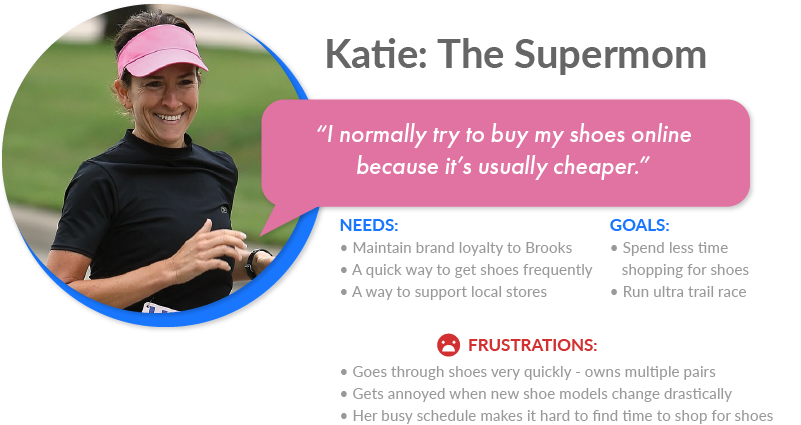
Problem Statement
Katie needs a better way to cost-effectively purchase Brooks, her favorite brand of shoes, so she doesn’t have to take time away from her family and active lifestyle.
Proposed solution
This website will help experienced runners find the brand shoe they are looking for. Katie can purchase her favorites conveniently while also supporting a local community-driven small business.
User flows
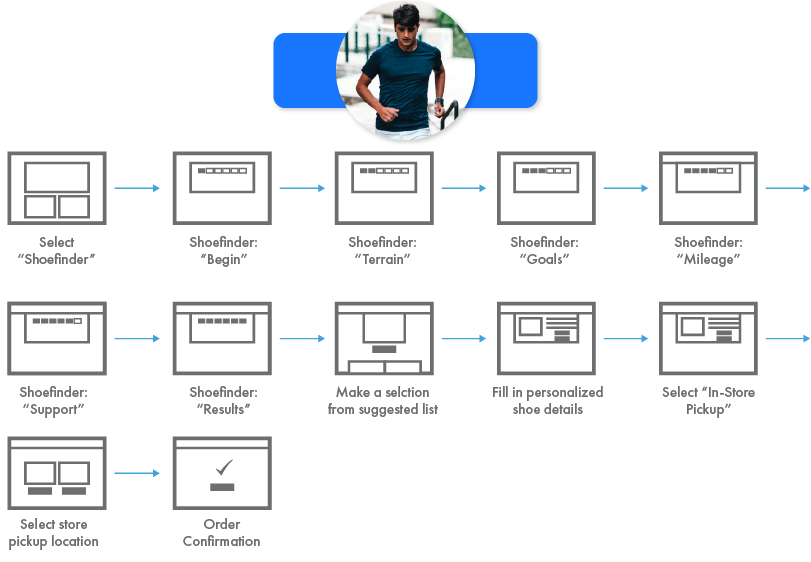

Information architecture
Determining which Runners High products would be featured on the site, allowed me to organize the infrastructure and navigation.

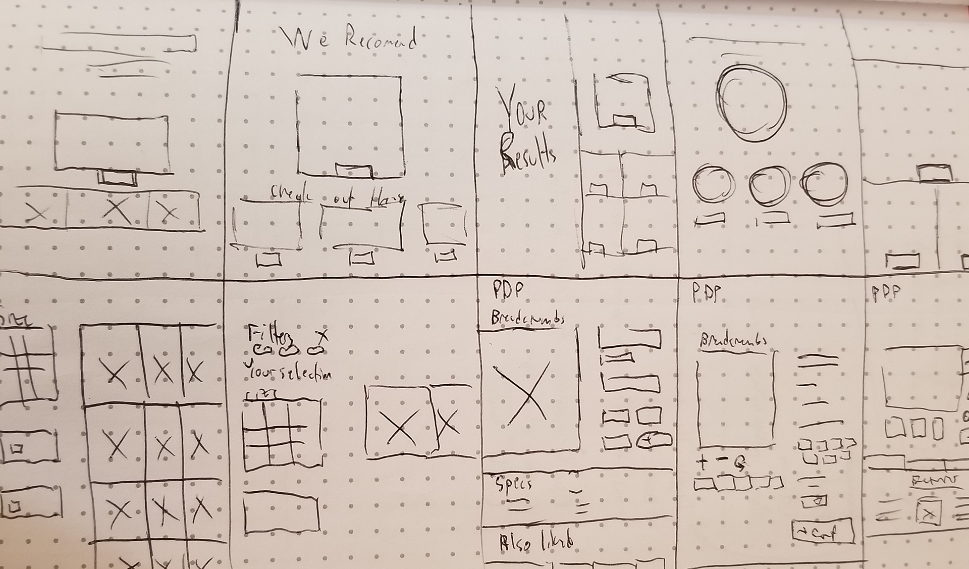
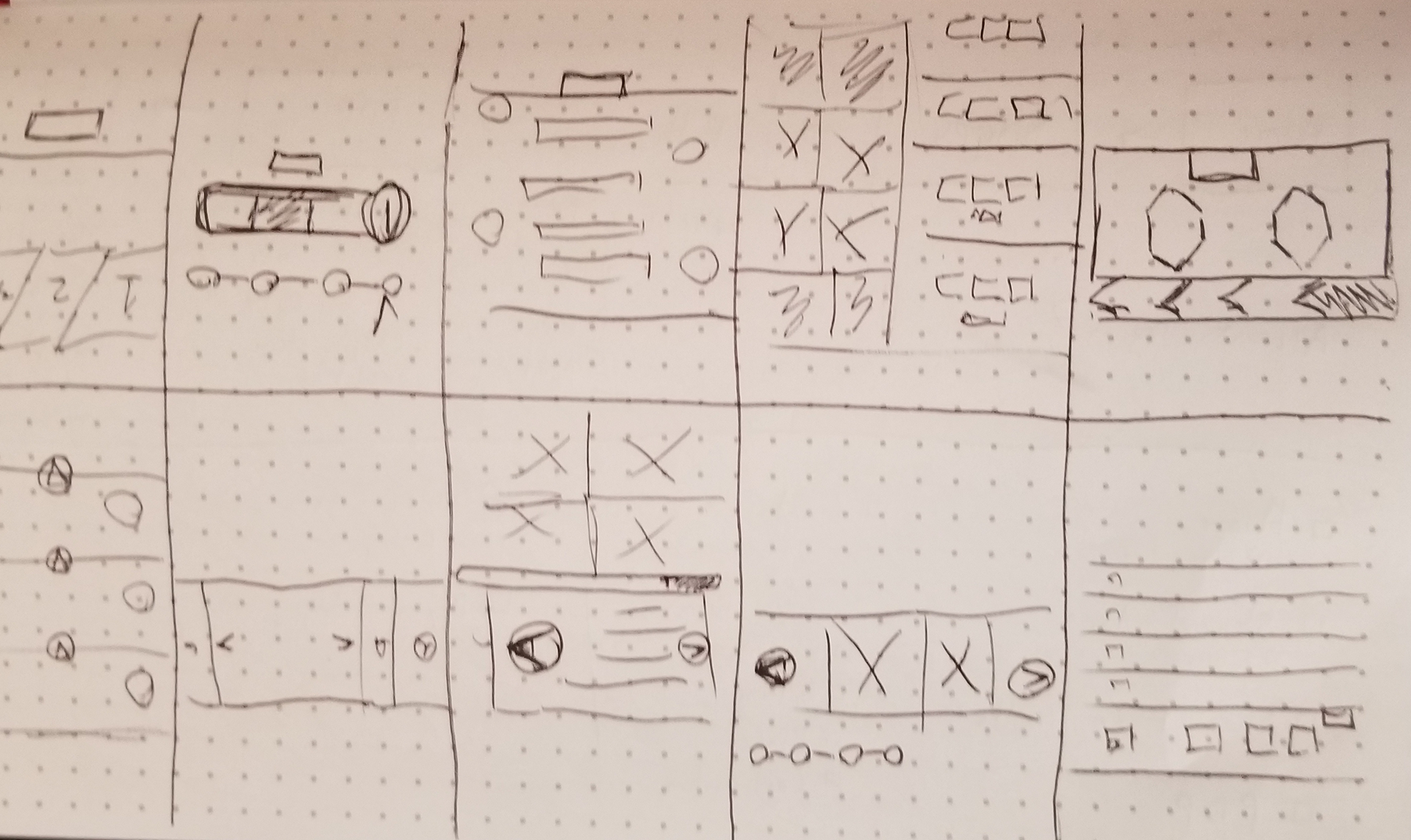
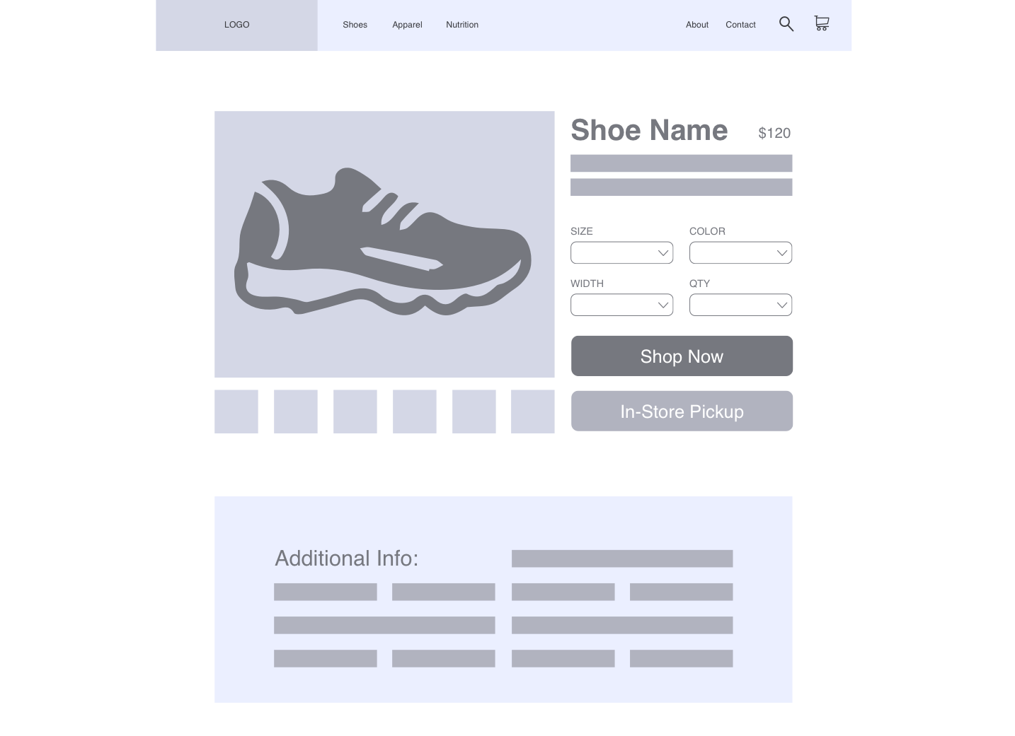
Sketches & wireframes
User testing results
These were the main takeaways I received from tested my wireframes in an interactive prototype:
• The checkmark icons above the shoe finder and checkout screens were redundant
• Spacing on the home and product description pages was extremely tight
• Reconsideration of the alignment and sizing of top navigation was needed
• The checkmark icons above the shoe finder and checkout screens were redundant
• Spacing on the home and product description pages was extremely tight
• Reconsideration of the alignment and sizing of top navigation was needed
Branding
I created a logo, color scheme and the visual tone of imagery and illustration to be utilized.


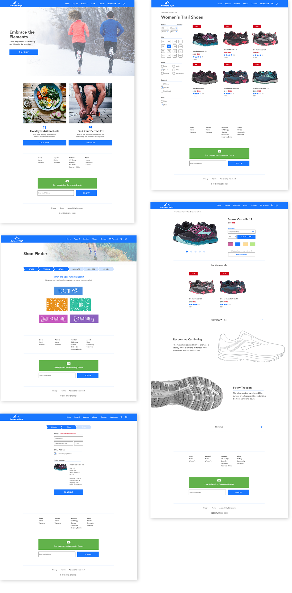
Mockups
While designing these screens I factored in persona goals, testing results, common UI patterns, and competitor sites.

Prototype screen recording