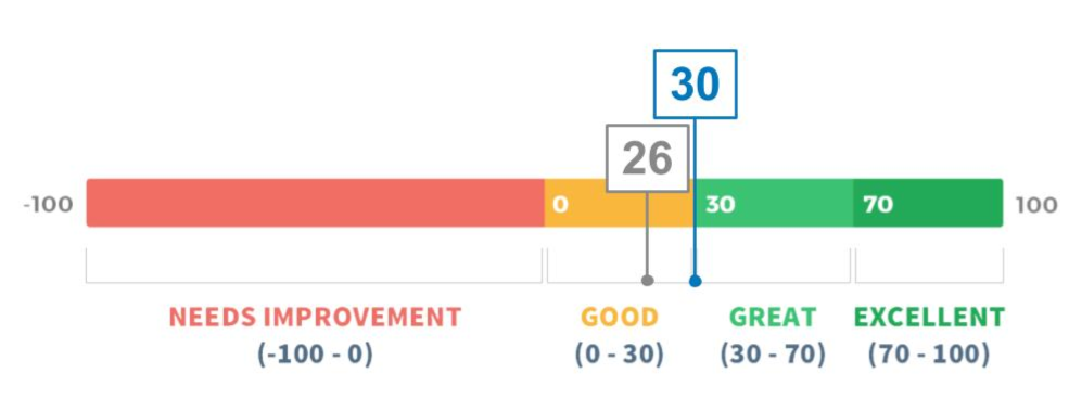
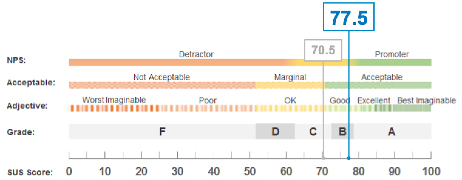
NPS measures customer loyalty and satisfaction.
• UX Designer at Spectrum Reach
• 4 months
• 1 UX Director
• 1 UX Designer
• 1 Product Manager
• 4 Engineers
• 1 Product Marketing Team Lead
• 1 Accessibility Team Lead
• 1 User Testing Recruitment External Partner
• Responsive B2B Web Application
• Sketch
• Axure RP
• Tobii Eye Tracker
• Heap

- Usability test participant
Previous UI screens at various points in the process.
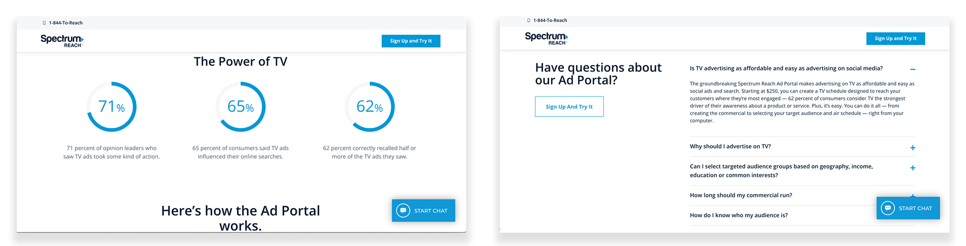
The previous landing page provided some stats and FAQs to potential users.
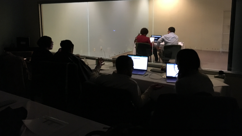
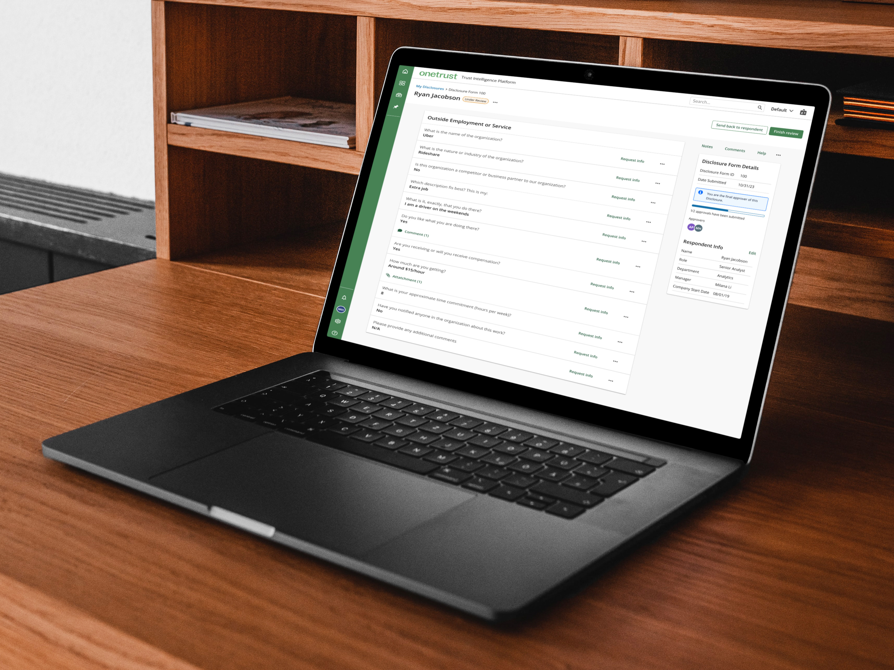
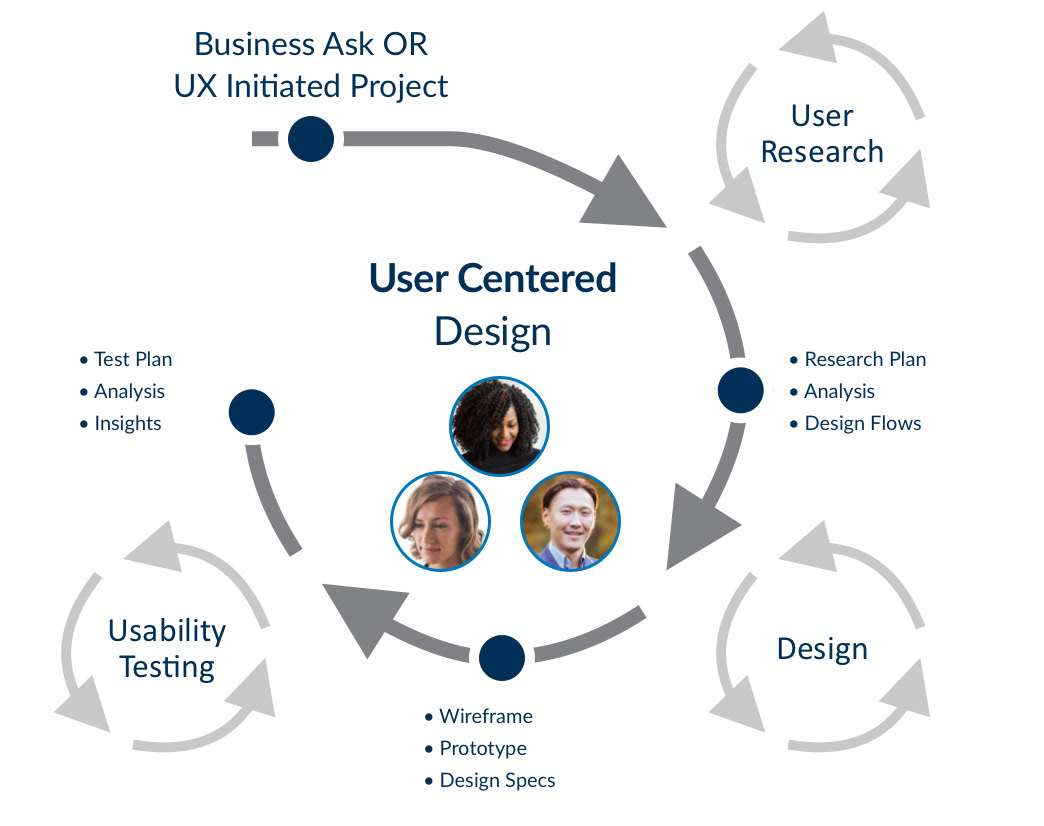
My team interviewed and conducted usability testing with participants at a testing facility.
Recommendation: Reinforce Spectrum Reach’s expertise to build trust and guide decision-making.
Recommendation: Add clear value propositions supported by data and recognizable cable channel logos (e.g., “For $450, reach 50% of your audience three times”).
Recommendation: Reduce technical jargon and introduce contextual guidance where needed.
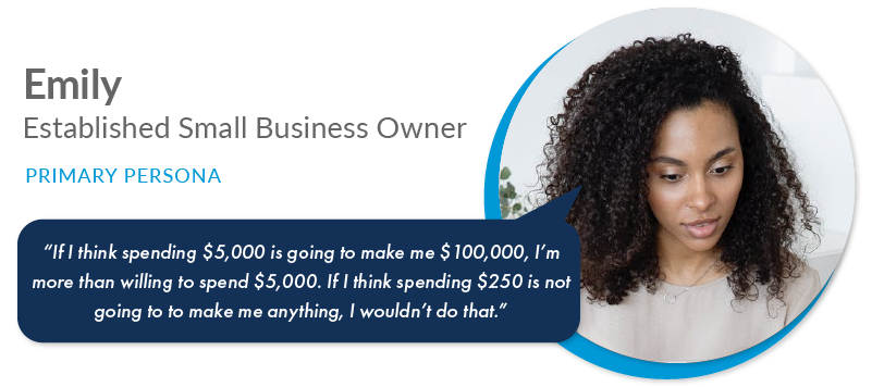
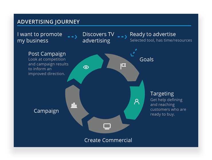
• Gain new customers
• Thinks TV advertising is expensive

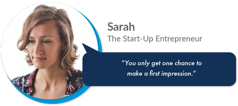
• Gain new customers
• No dedicated marketing budget
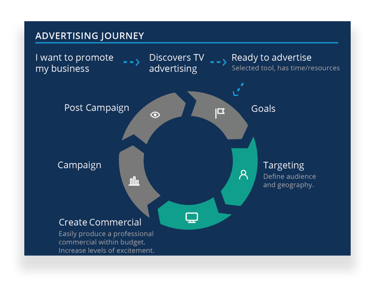
• Compete against larger industry rivals
• Has a moderate understanding about effective advertising
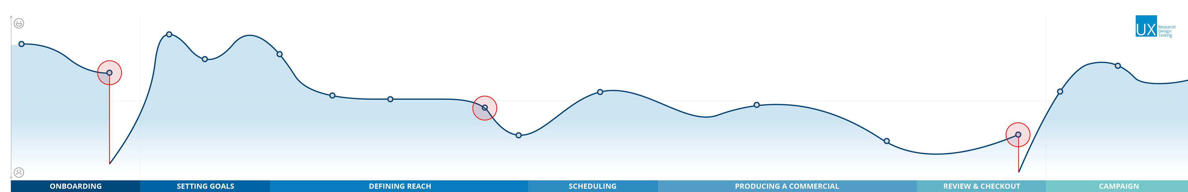
Major user drop-off points were identified using Heap analytics and mapped across the user journey.
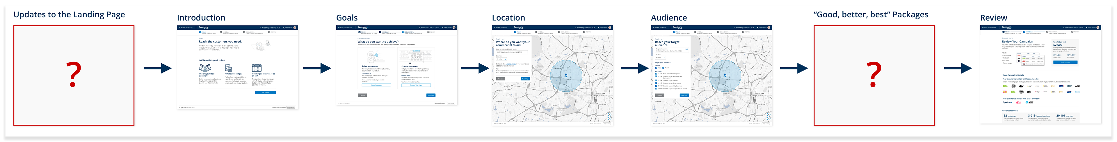
Based on research and analytics, I identified the Landing and the "Packages" pages as the highest-impact areas for improvement.

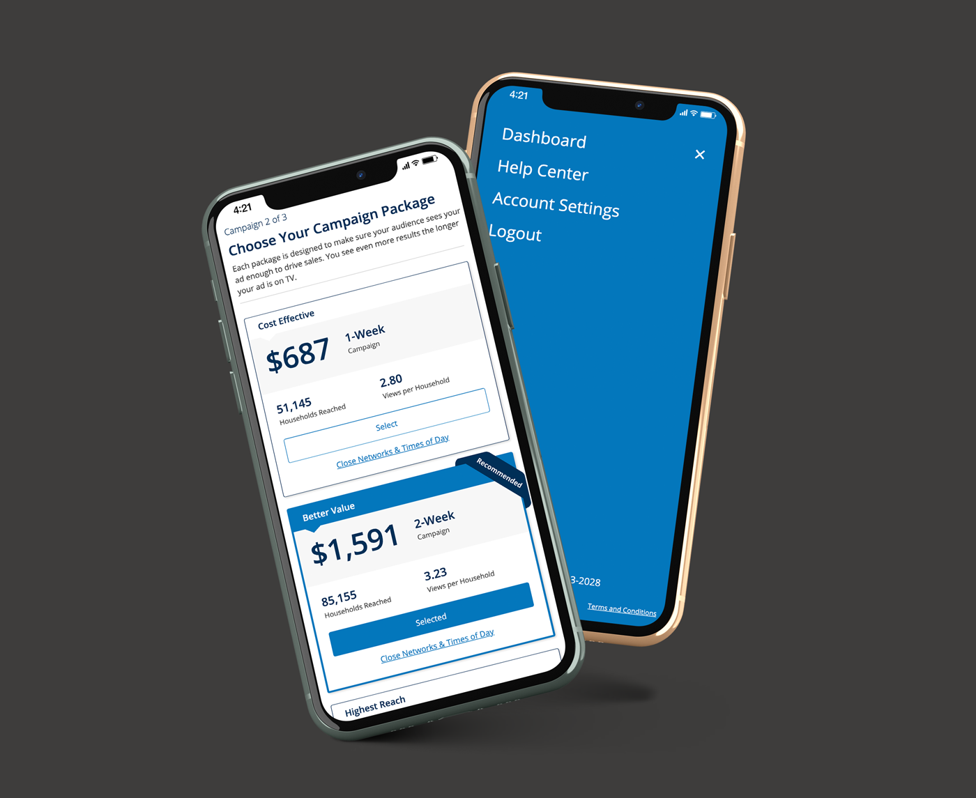
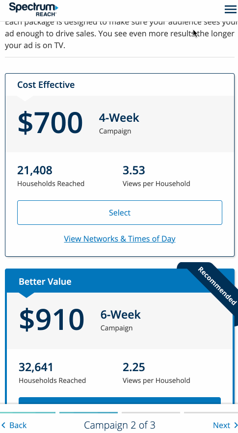
Early iterations for Campaign Packages, which enable users to choose which ad campaign works best for them.

The previous version (left) was not concise while the revised version (right) solves for the above user feedback.
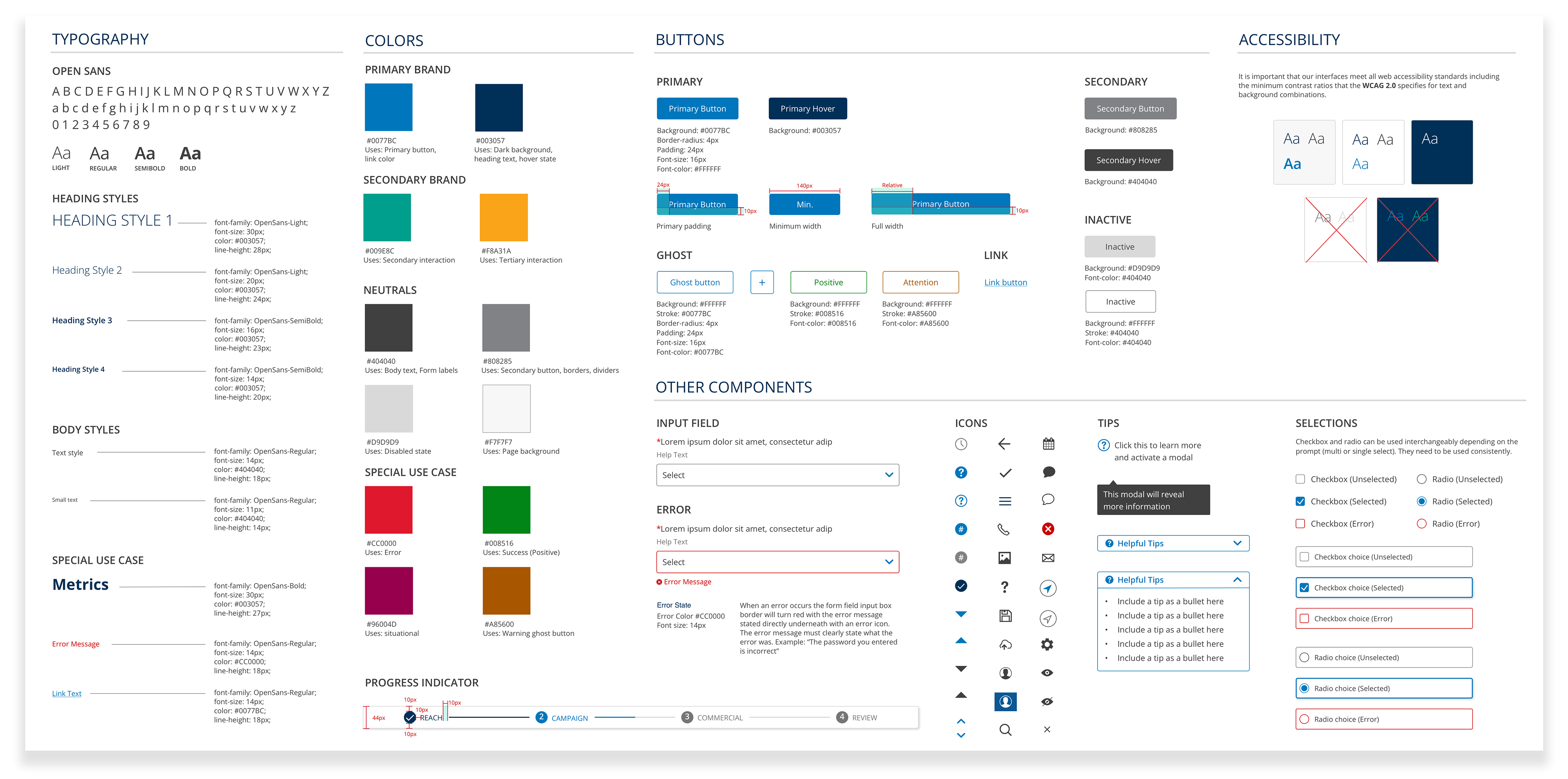
A consolidated style guide outlining accessibility, typography, colors, and the majority of components.
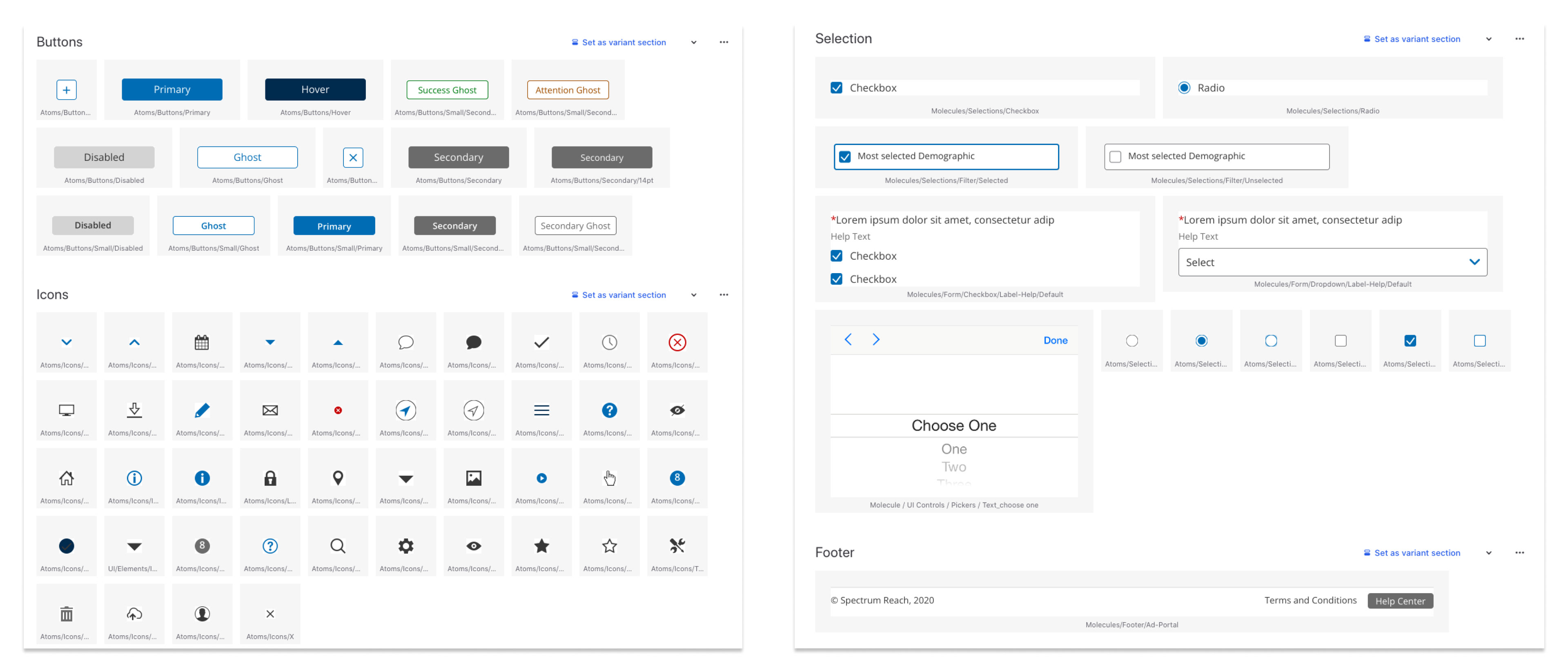
A Zeplin style guide that I created and shared with engineering. It outlines error states, focus states, responsiveness, documentation, and interaction design specifications.
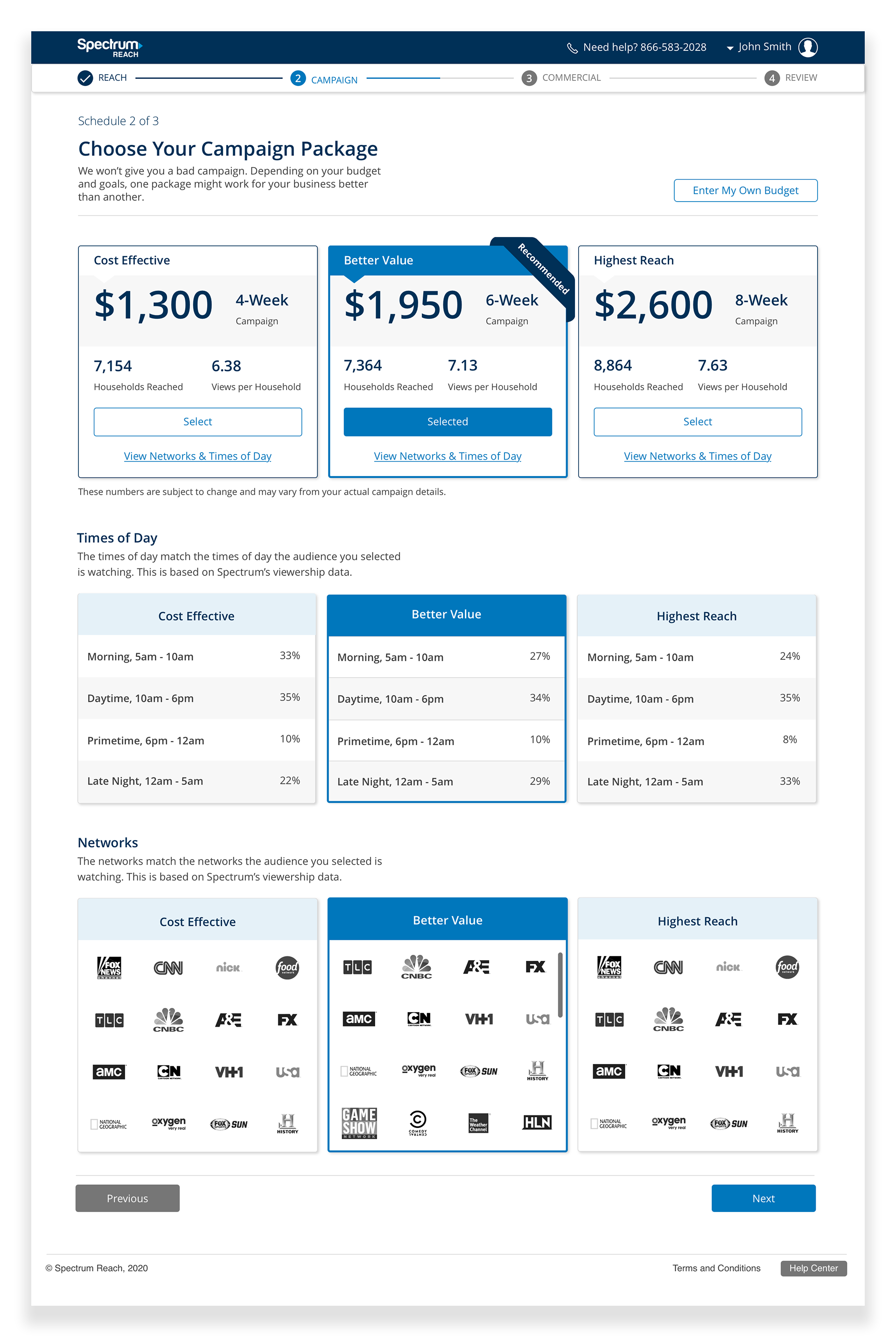
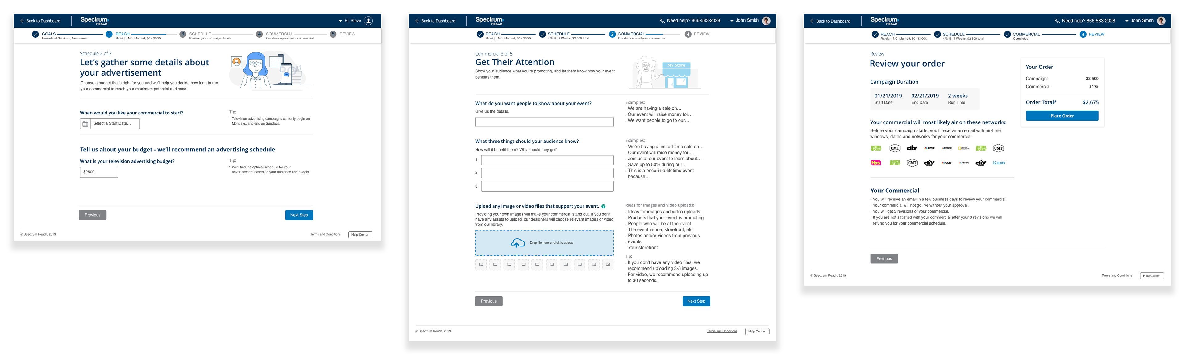
Campaign Packages are a key step where users make an informed decision when building their Ad Campaign.
A mobile view of the Campaign Packages screens.