Impact
Improved site-wide navigation and restructured information architecture elicited positive user satisfaction and an estimated 25% faster task completion, helping developers find critical documentation and complete key flows more efficiently.
Overview
ROLE
• UX Designer at Cloud Elements (Internship)
• UX Designer at Cloud Elements (Internship)
Timeline
• 3 week agile sprint
• 3 week agile sprint
TEAM
• 1 Lead UX Designer
• 3 UX Designers
• 2 Engineers
• 1 Product Manager
• 1 Lead UX Designer
• 3 UX Designers
• 2 Engineers
• 1 Product Manager
PLATFORM
• Responsive website
• Responsive website
TOOLS
• Sketch
• Adobe Illustrator
• Sketch
• Adobe Illustrator
What is Cloud Elements?
A company that provides an application programming interface (API)-based service with a catalog of over 150 pre-built connectors, or “Elements."
• They allow customers to set up integrations between platforms that otherwise would not be able to communicate
• A common use case is a customer using Cloud Elements to connect Salesforce to Slack to notify employees about the closing of a recent deal
“API Integration – it's that pesky part of making a product that no company actually wants to do. Who can blame them? It's not so easy!”
- Greg Lindahl, lead UX Designer at Cloud Elements
- Greg Lindahl, lead UX Designer at Cloud Elements
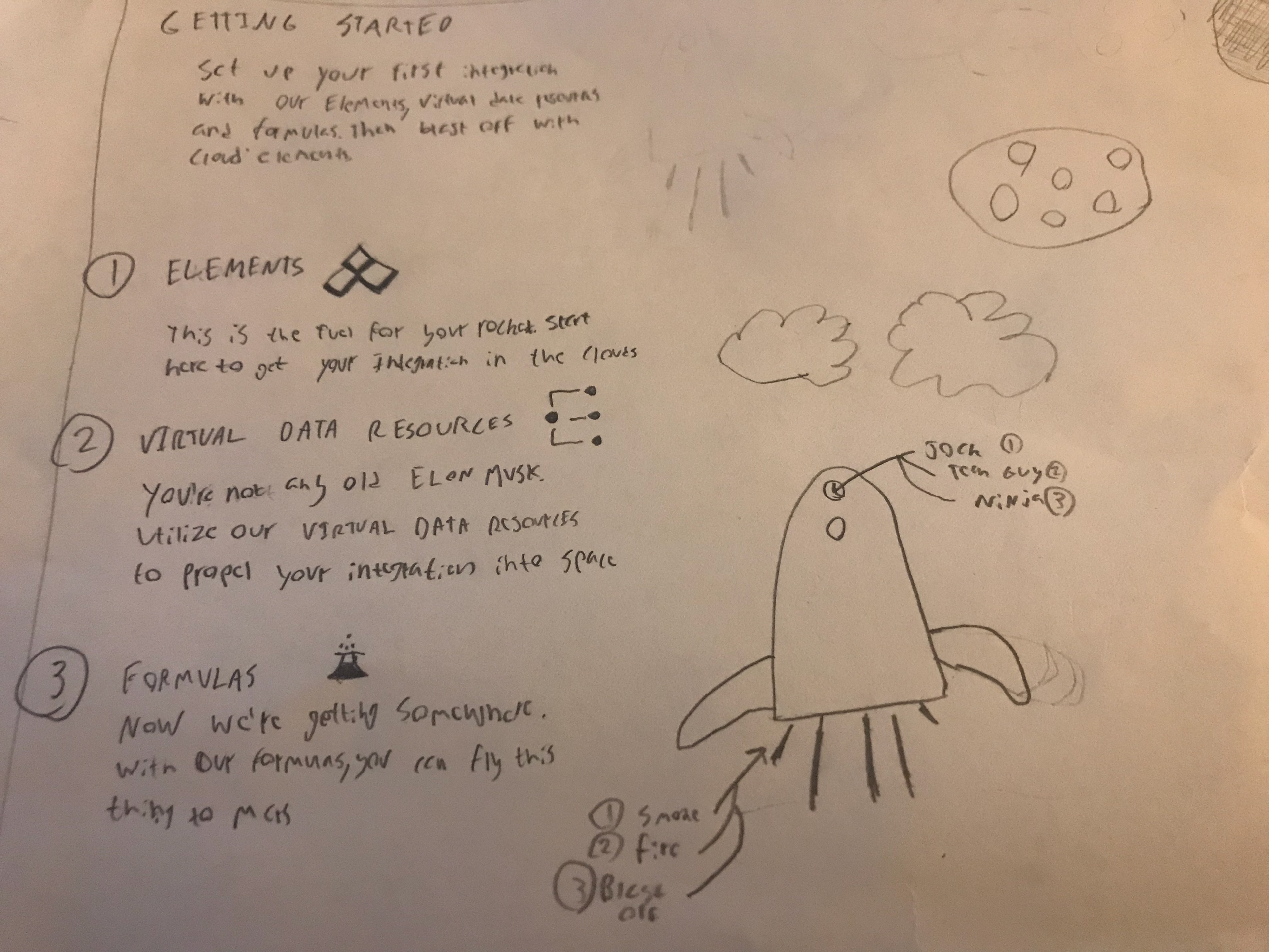
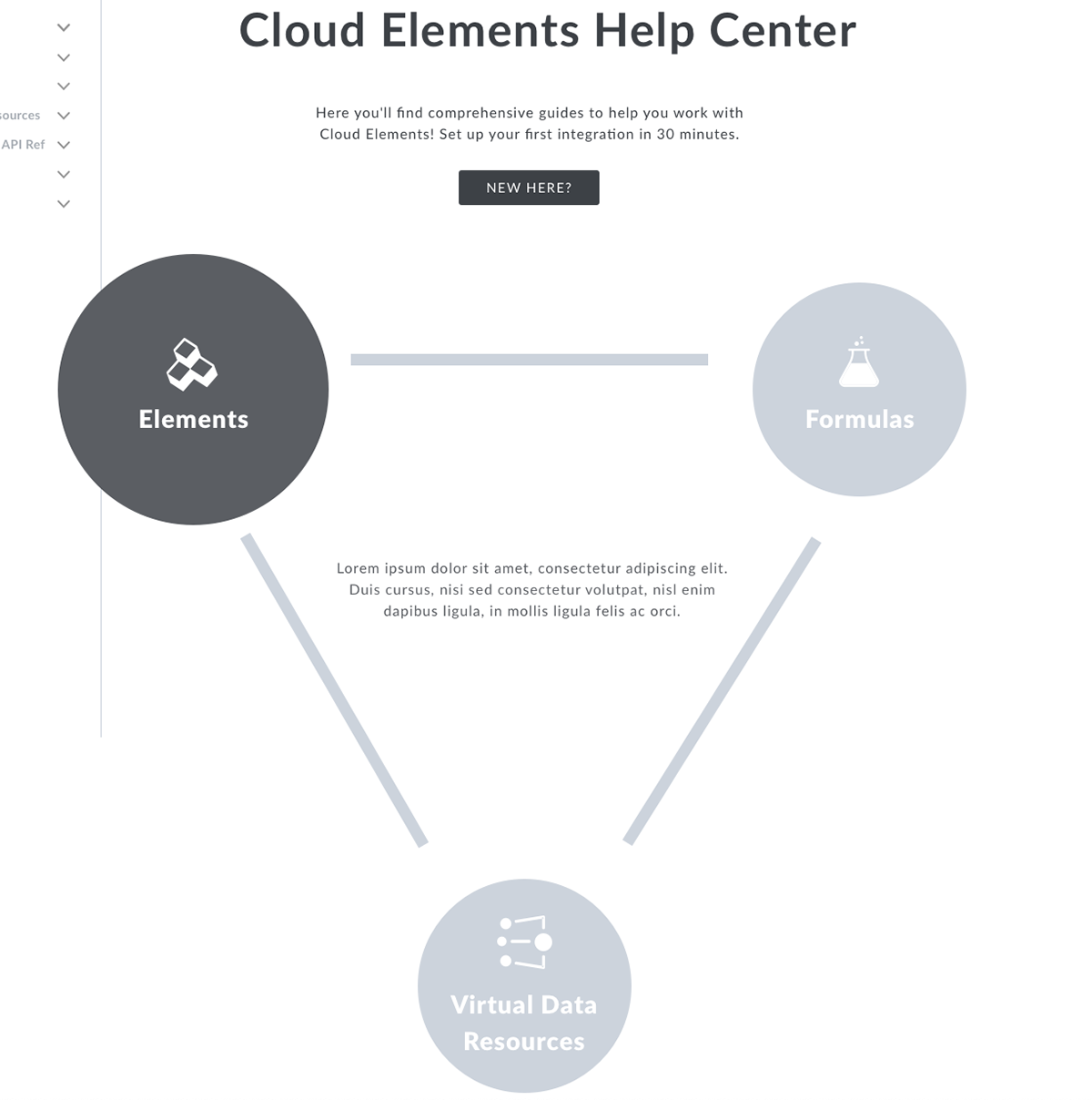
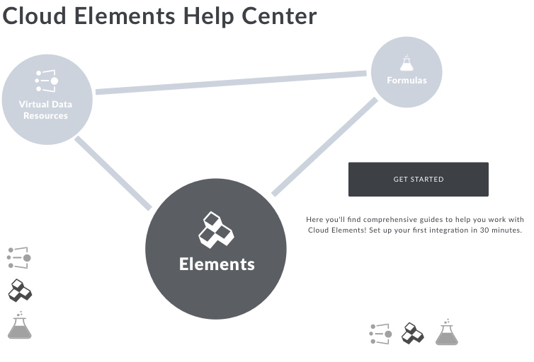
To Cloud Elements, integration is more than just one connection. By fully using its services users are able to do thousands of other functions. Their philosophy revolves around three main pillars: elements, virtual data resources, and formulas.

The problem
Cloud Elements had 9 different sources of documentation including guides, reference materials, and FAQ content.
• This was a major issue for users to onboard effectively and minimizes the likelihood that they'll return to the site
• Upon the first arrival, most users were unclear about what to do
• This increases user frustration and translates to a lower conversion rate of new customers
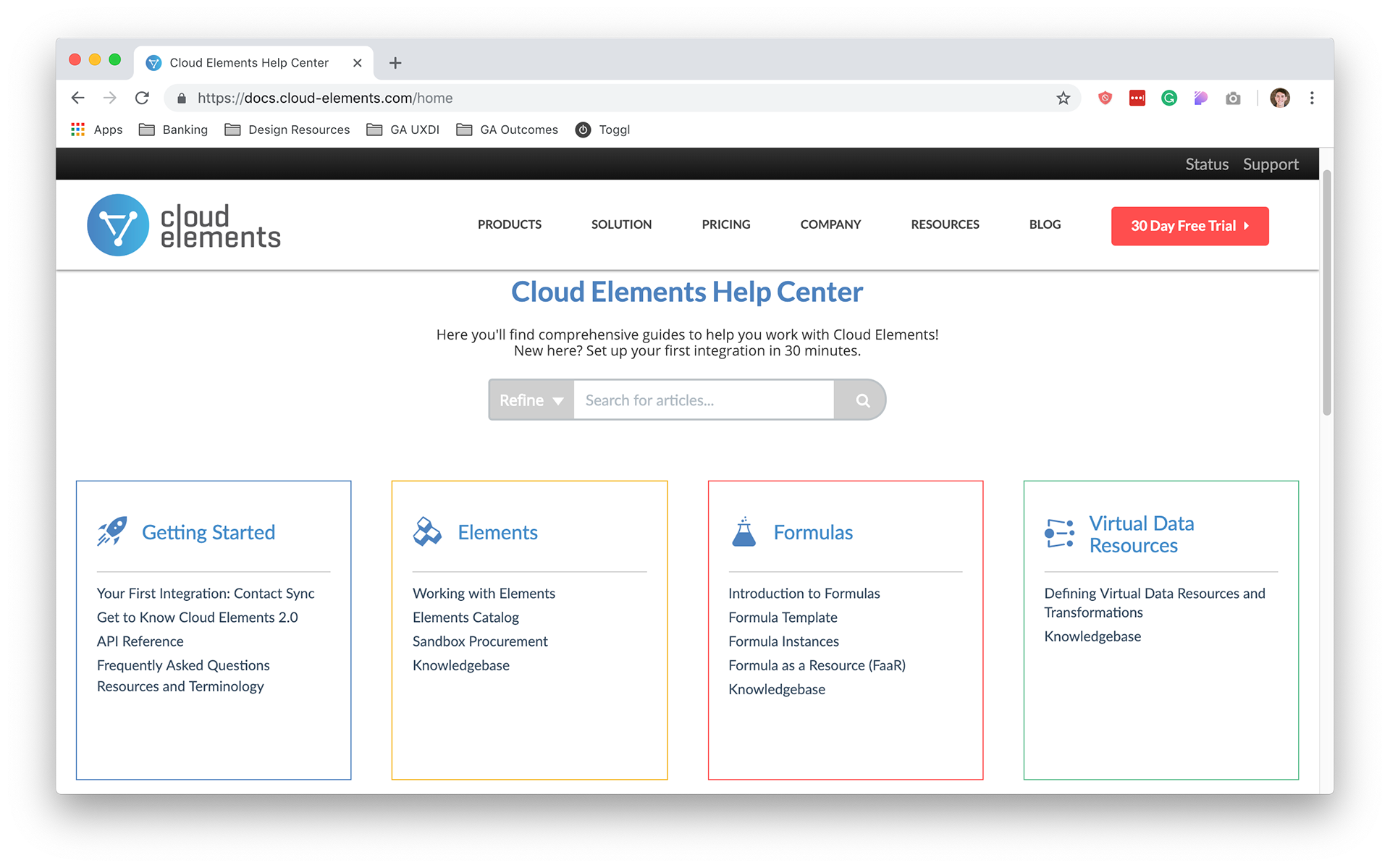
Initial state of the Cloud Elements Documentation website.
Research
Competitive analysis
Although documentation is an invaluable resource for users, all documentation sites have different approaches to displaying intuitive, efficient, and up-to-date content. Analyzing UX delights and pain points for a variety of competitors and industry leaders was an essential part of my design process.
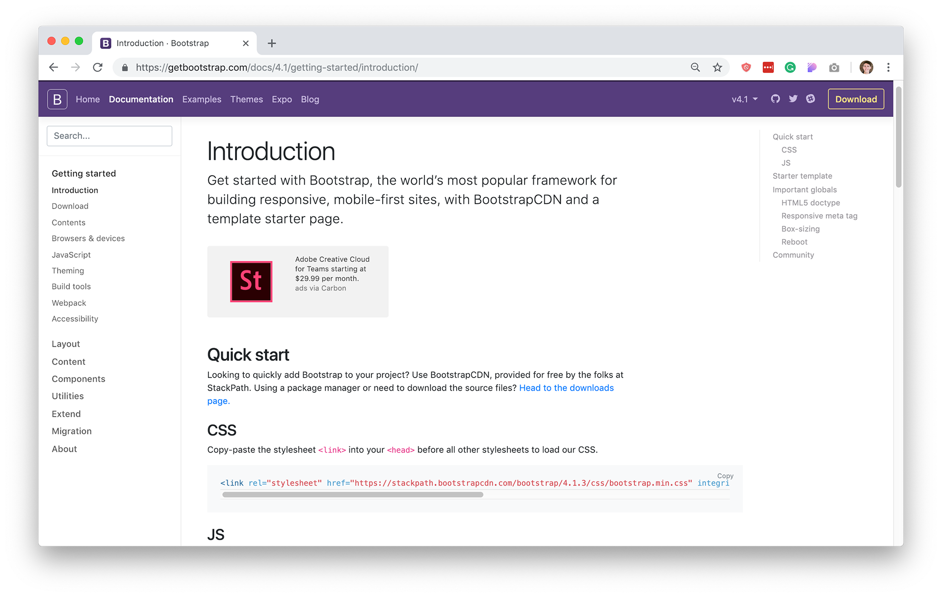
Bootstrap
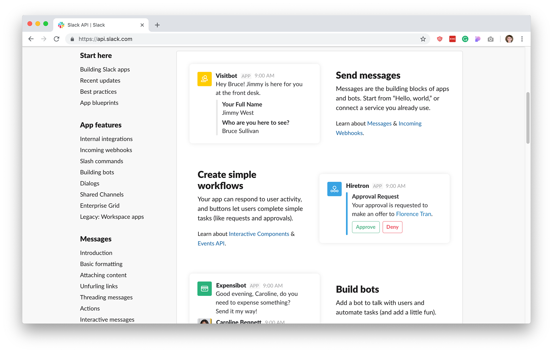
Slack API
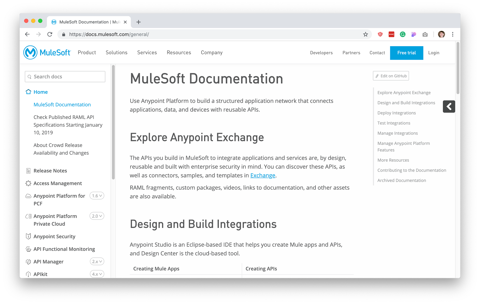
MuleSoft
Delights
• White/grey contrast draws attention to content
• Symmetrical three column layout
• Sticky global search sorted by category
Pain points
• Right-hand nav has no current placement indication
• Inconsistent search bar placement
• Cluttered left nav with unnecessary icons
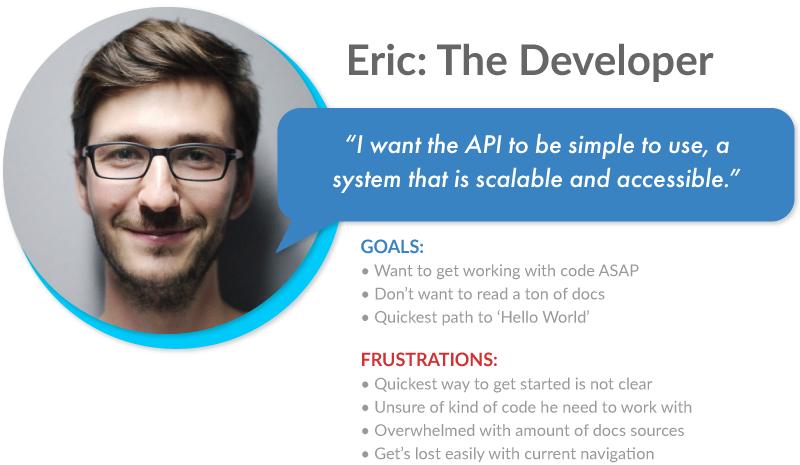
Who is using this documentation?
I created this primary persona after engaging in user interviews and communicating with subject matter experts at Cloud Elements.
• When his company closes a deal with Cloud Elements, Eric is tasked with learning and utilizing their software
• He needs to do so quickly and efficiently – when he arrives on the documentation website, he may be reluctant to learn a new series of steps and sift through seemingly endless information
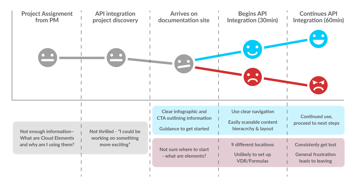
Below is Eric's journey using the documentation of Cloud Elements.
• Outlined in red is his previous experience with the current version of the site
• In contrast, the blue line showcases a much more positive experience with my solution
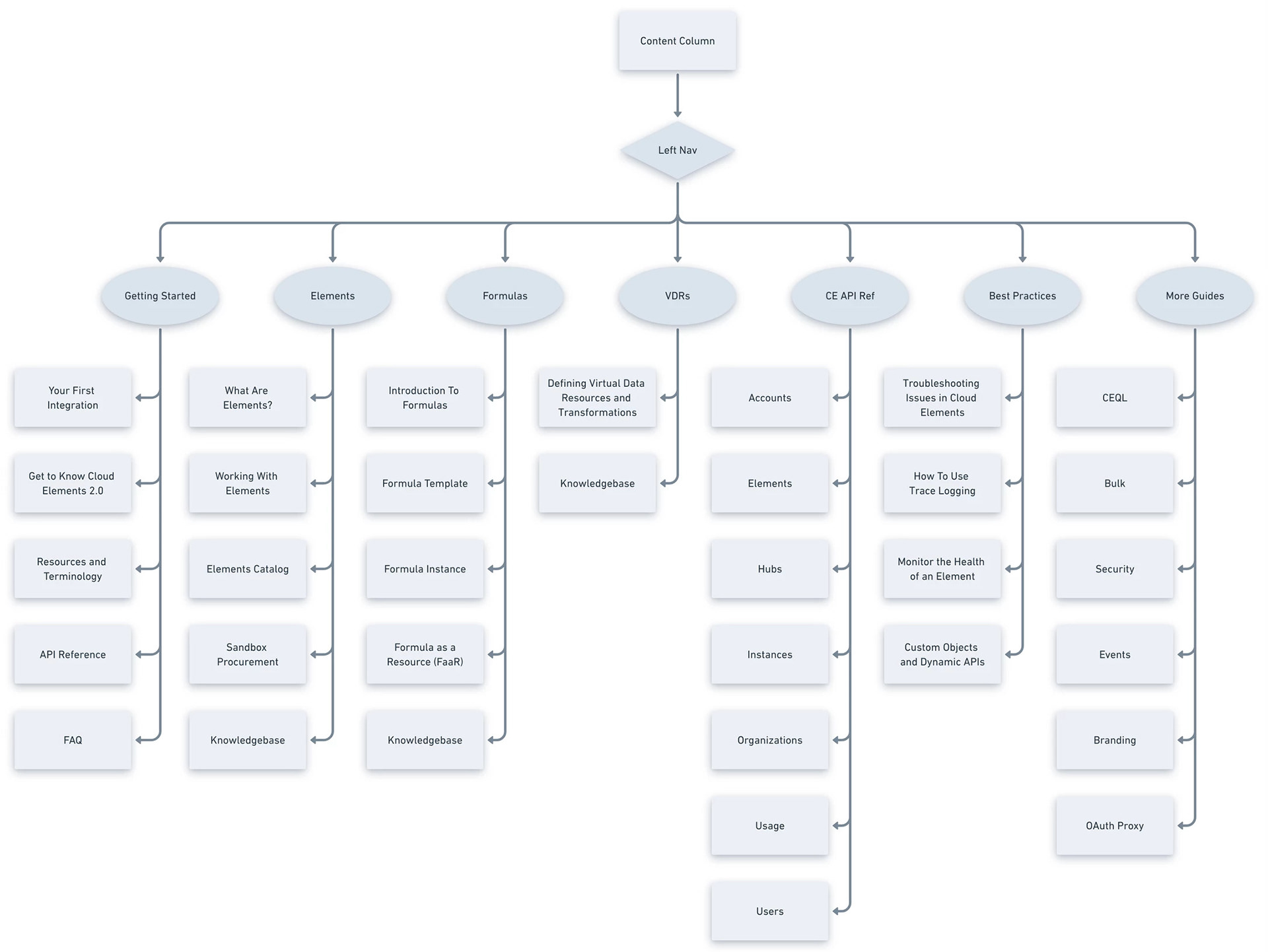
Information architecture
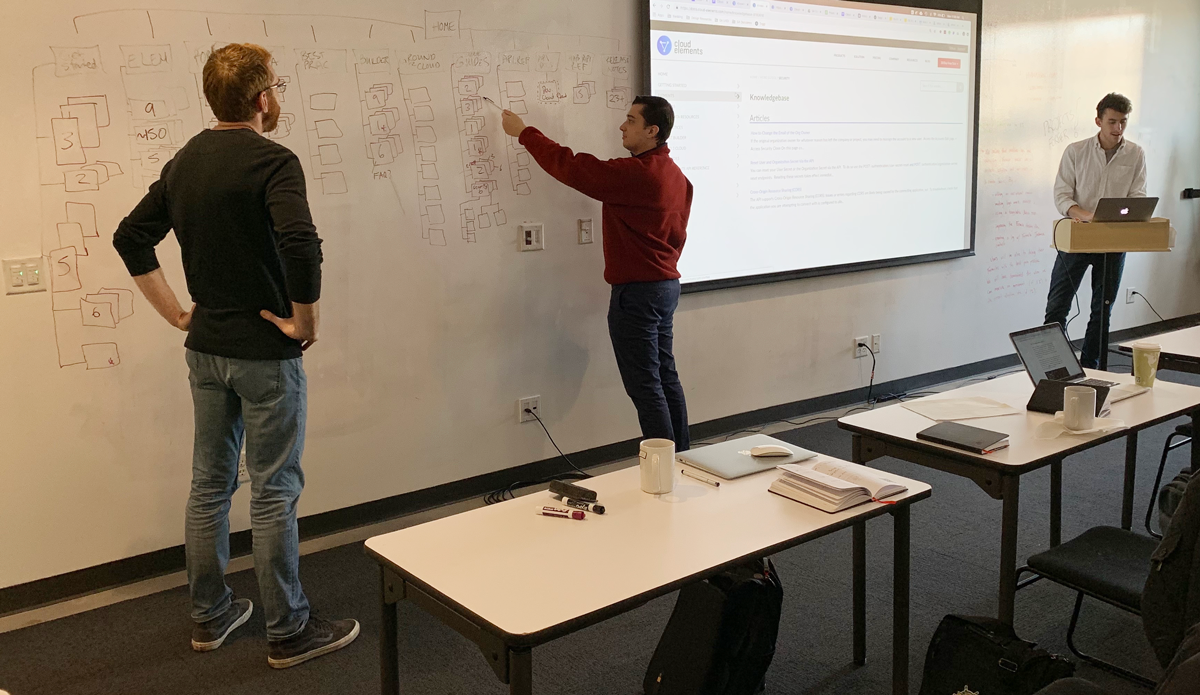
The image above shows the initial map that my group and I created for the existing site. There were 12 parent menus with some of them going 5 levels deep.
• Client communication and refinement of page redundancy helped solidify a more straightforward architecture
• Below is the redesigned sitemap in which relevant documentation is accessible within 2 clicks or less
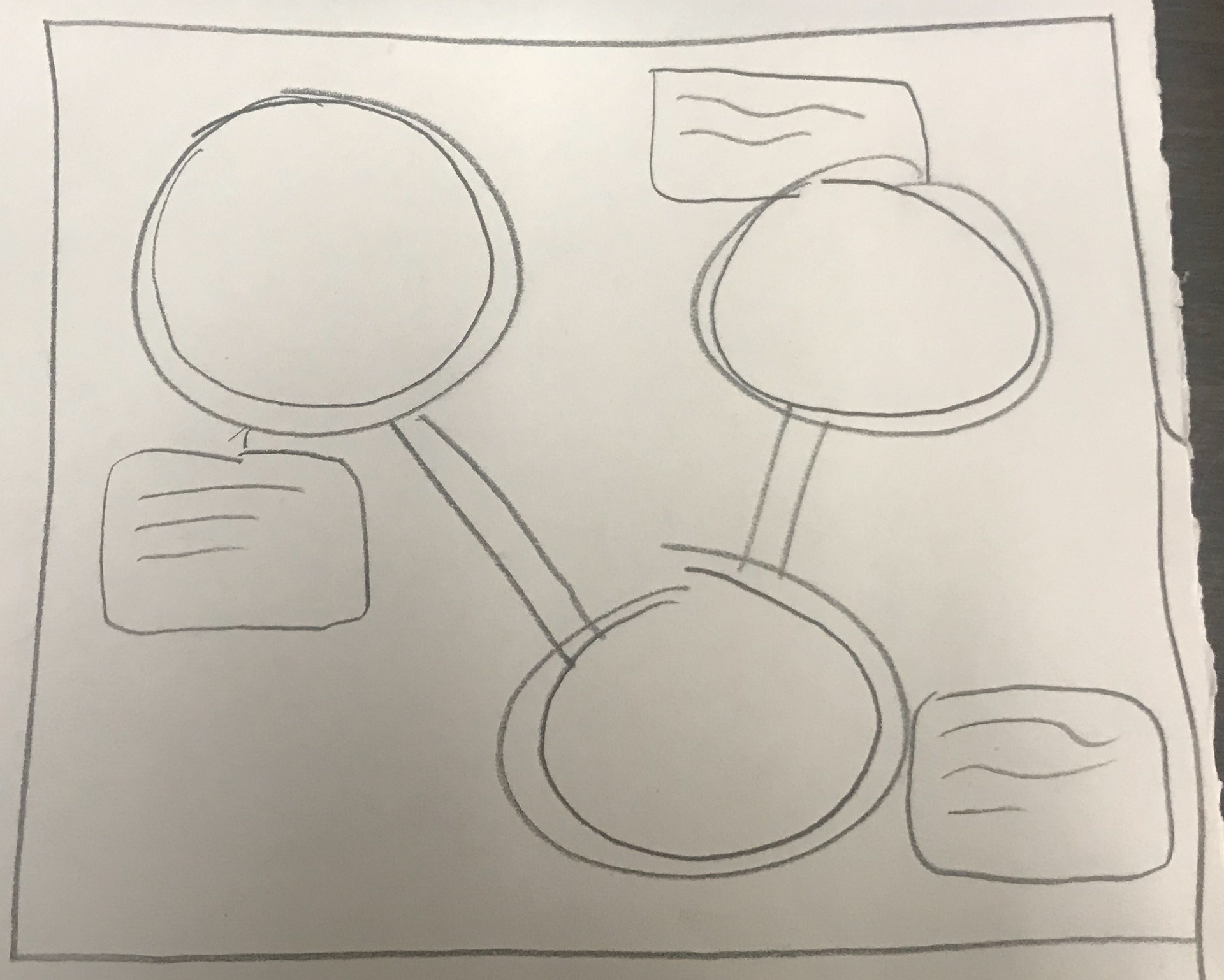
Challenge: infographic exploration
During an initial stakeholder meeting showcasing early concepts, the idea of an interactive – or even animated – educational infographic was advocated for.
• This evolved from a minimal triangular-shaped diagram emphasizing the three pillars of Cloud Elements' business model as well as their logo
• After additional research and information gathering, I determined that developers, like Eric, would not benefit from something like this
Wireframes
After synthesizing data and consolidating visual design ideas, I moved to creating wireframes.
• I experimented with 3-column layouts with a focus on content hierarchy
This led to the creation of the prototypes with which I conducted user testing
Usability testing
I had 10 members of the development team walk through various flows to obtain feedback about their overall experience. This was broken down into three main comparisons outlined below:
Column navigation
Users preferred the left-hand setup. They found navigation was easier and liked the control of being able to see what was in each section by using progressive disclosure.
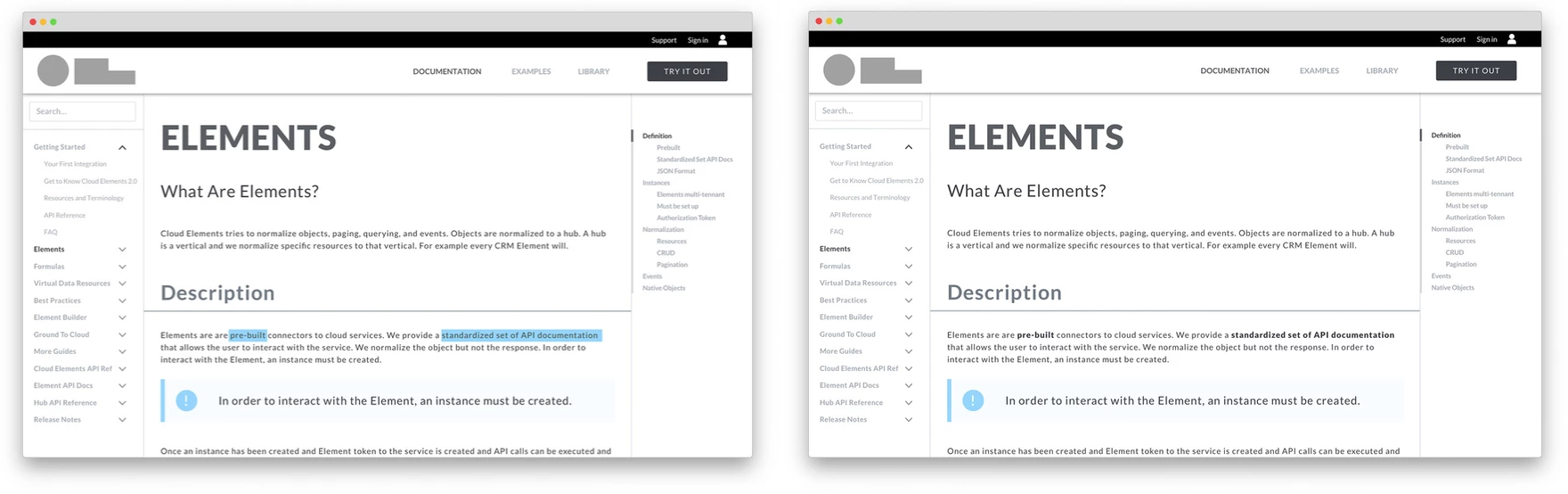
Key terminology
Users preferred the right-hand layout. They found bolding was enough of a difference to emphasize important content. In contrast, they found the bright blue highlighting alarming to their vision, which prevented the inclusion of a possible accessibility issue.
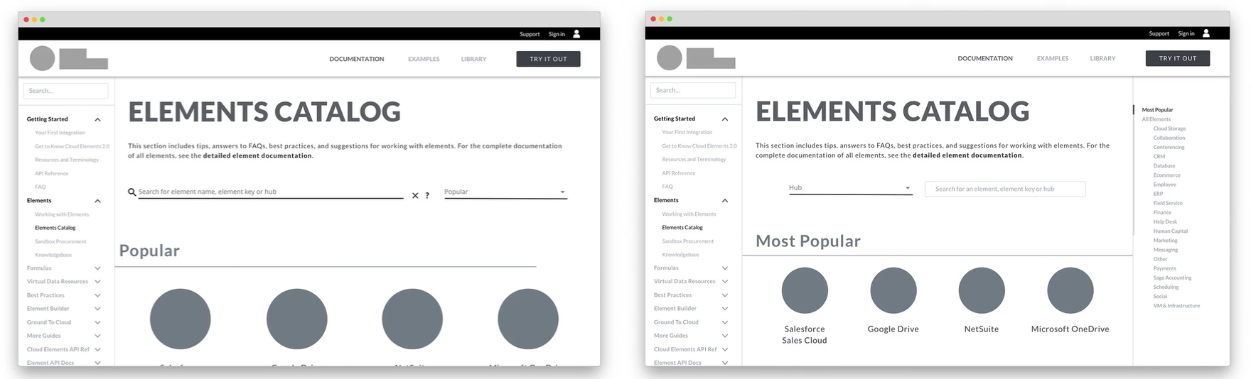
Catalog layout
Users preferred the right-hand choice. They utilized the column on the right and enjoyed the overall layout of the page. They claimed it felt familiar to the rest of the site.
Prototype recording
High-fidelity mockups
After implementing design changes based on testing results, I moved to high-fidelity mockups. I worked with Cloud Elements' product branding, guidelines, and icons.
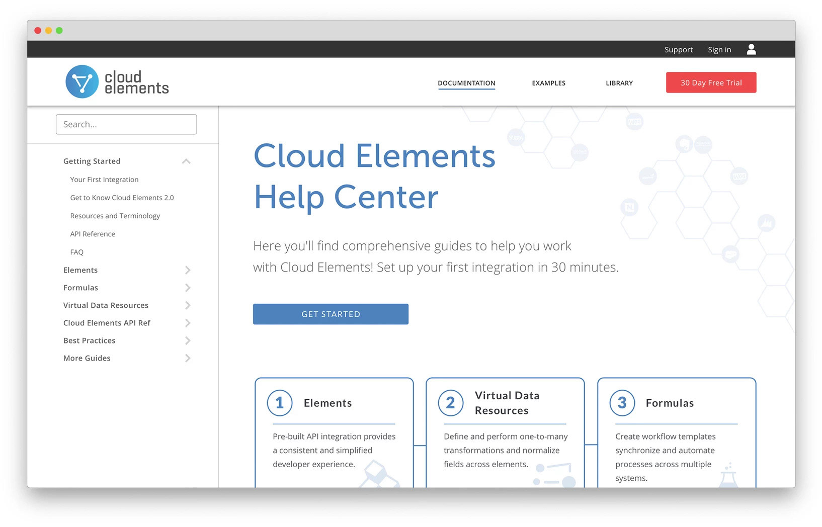
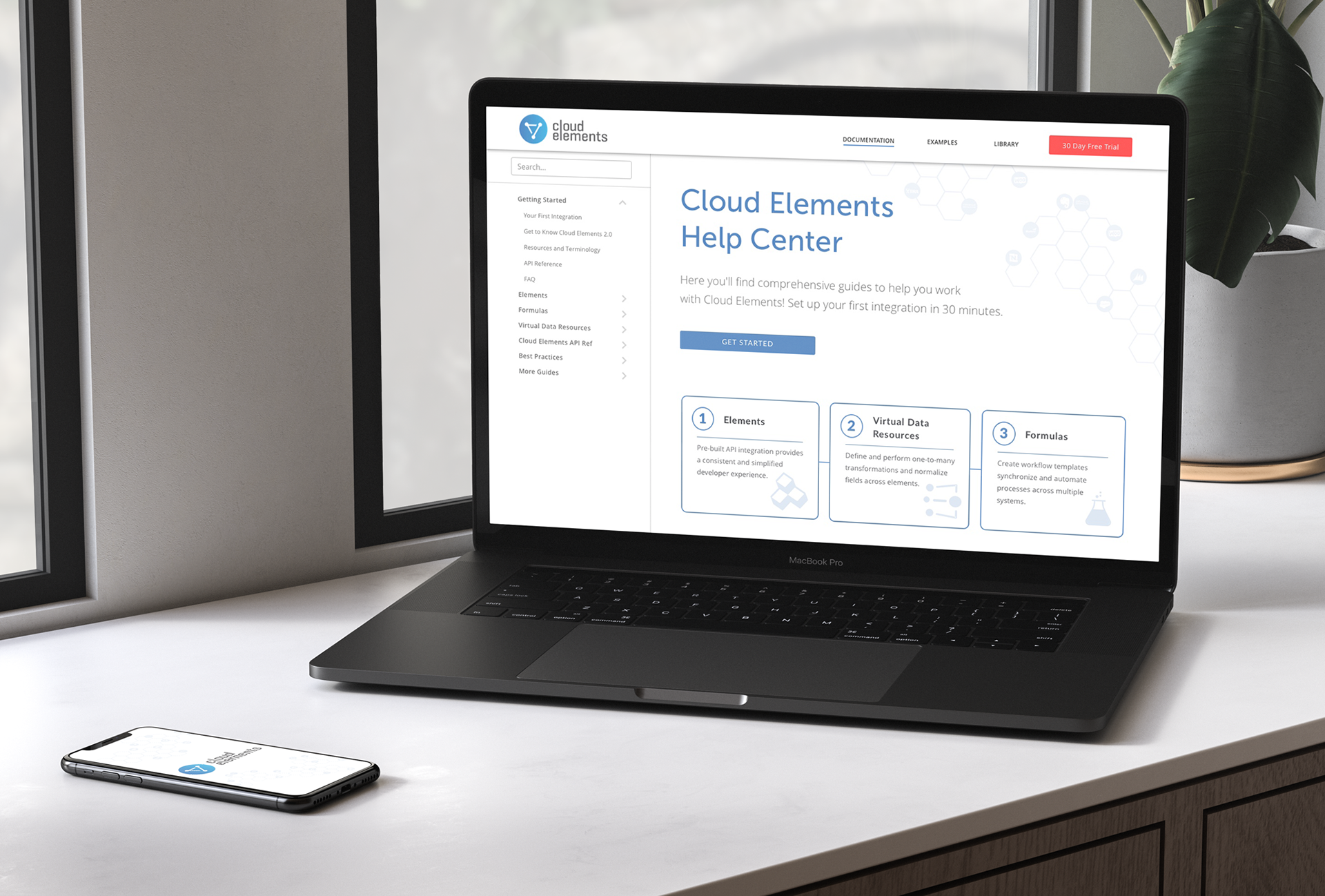
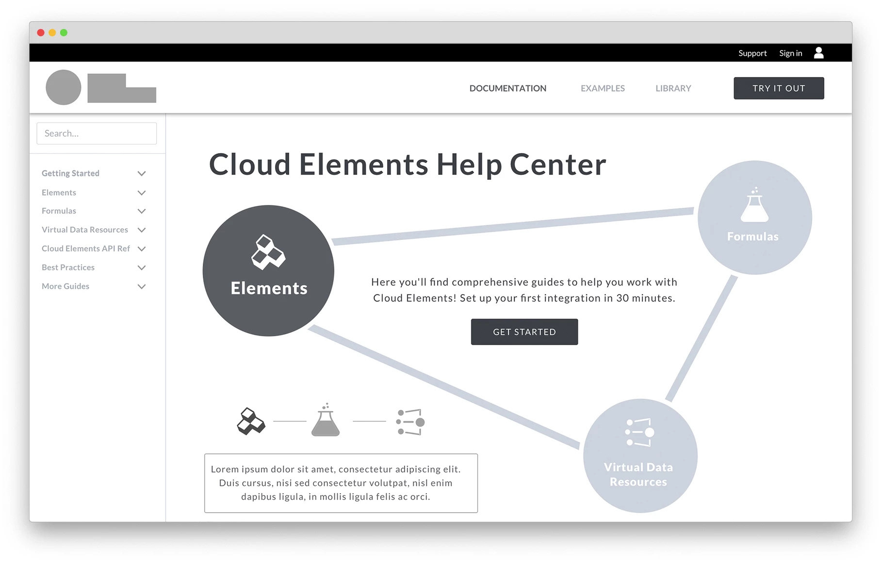
Home page for the documentation site including a clear call to action and refined information architecture.
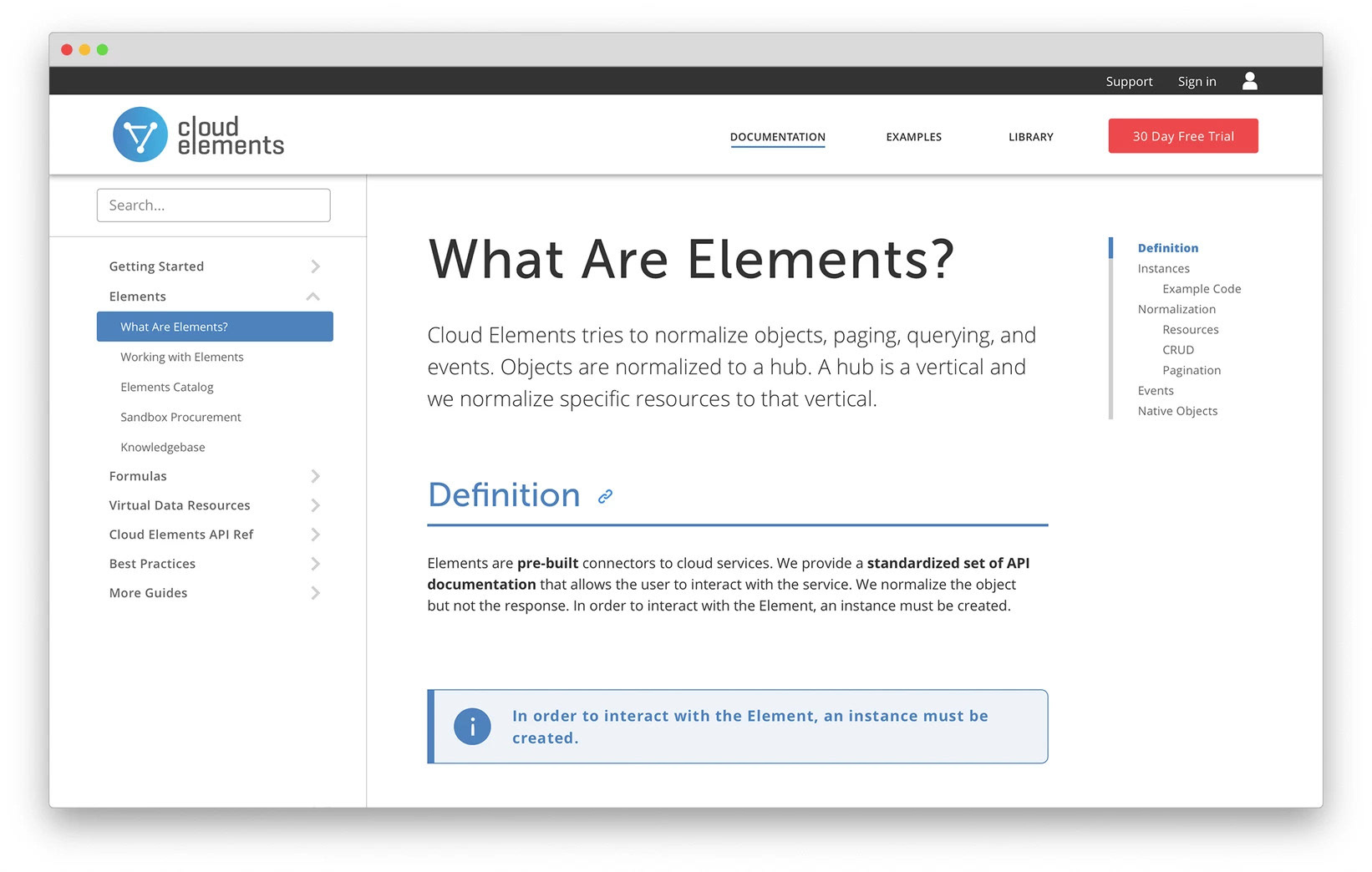
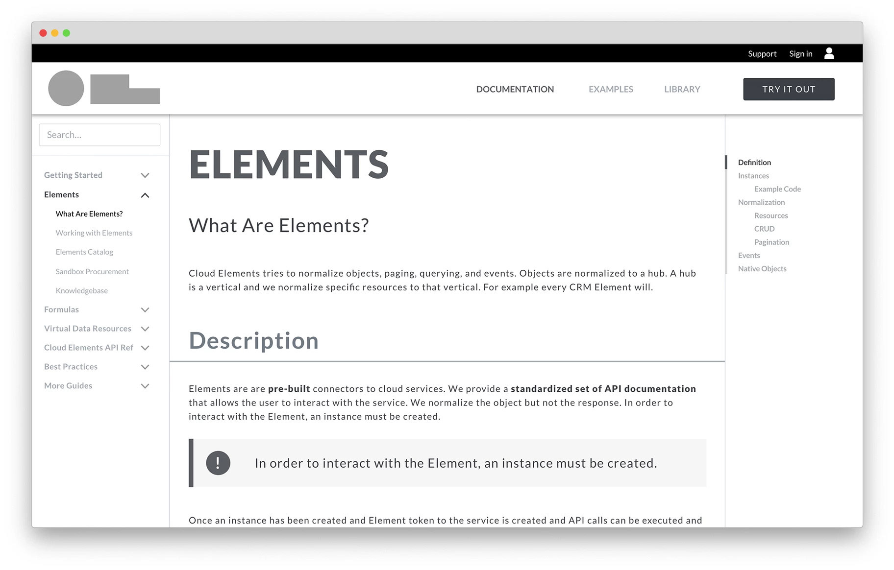
One of the introductory pages on the site including bolded words and anchor links for faster navigation.
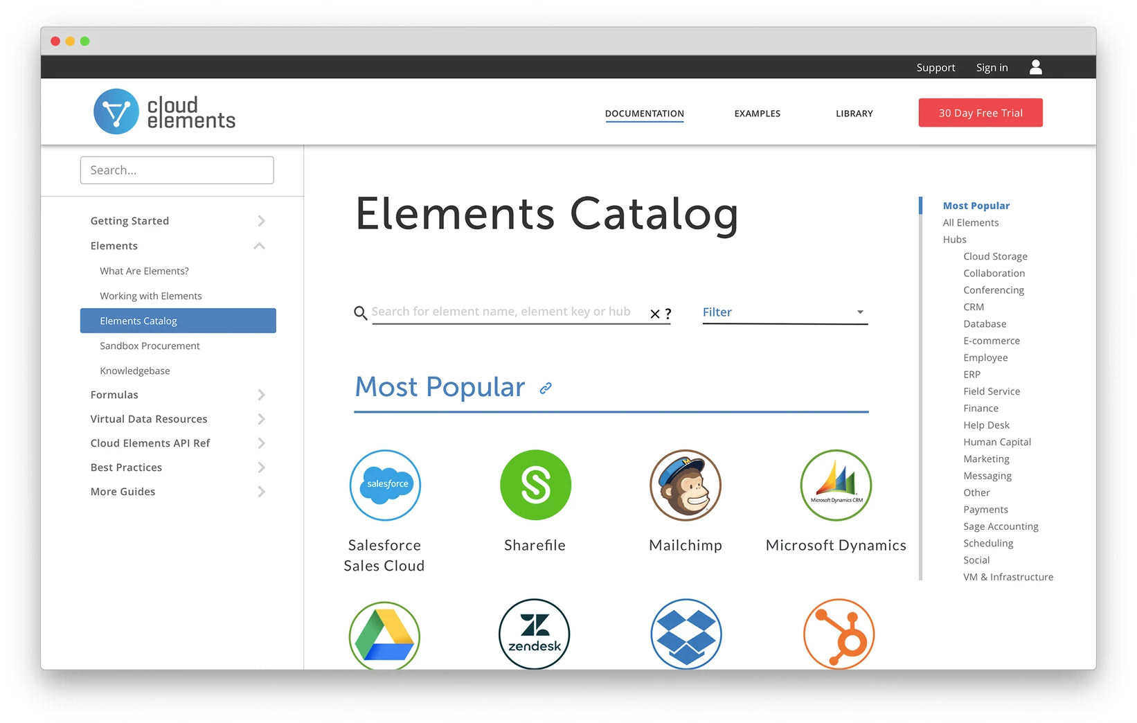
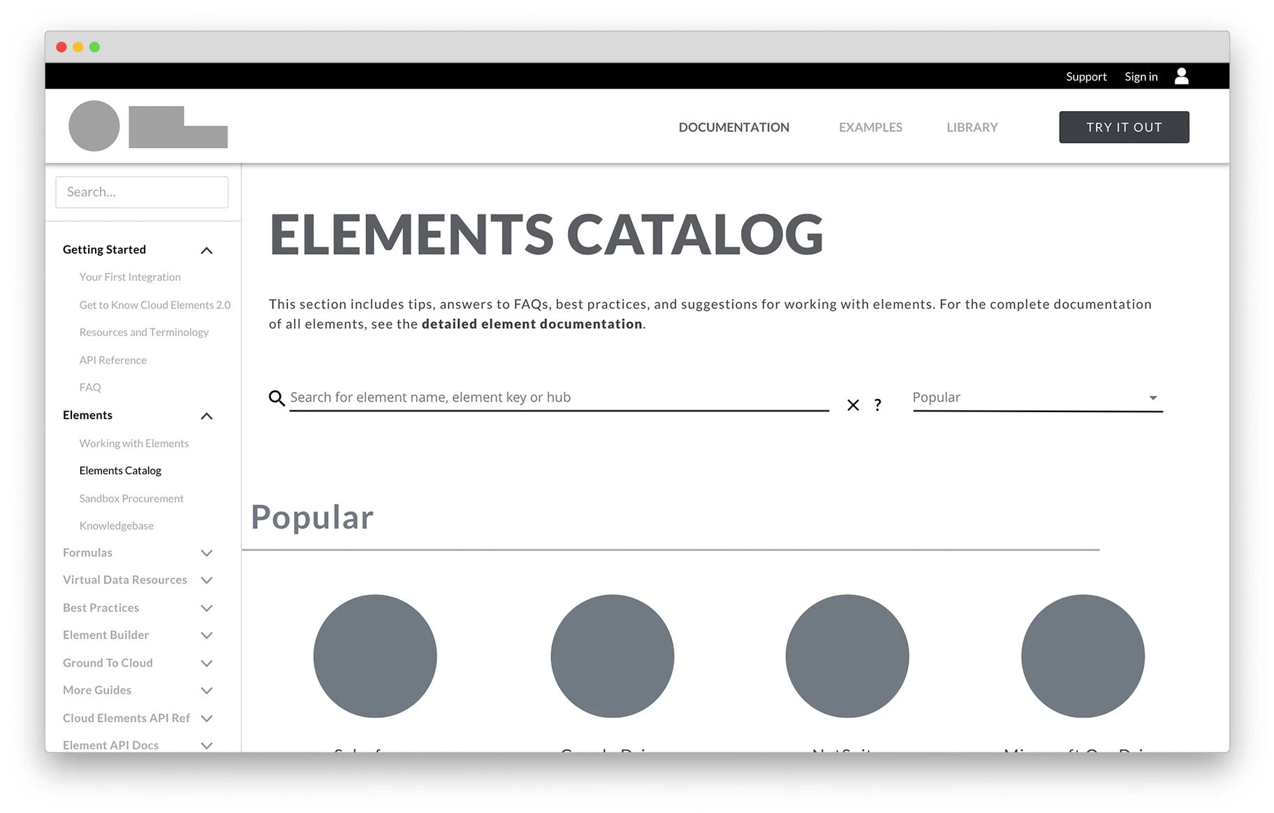
A page dedicated to all of the APIs available to choose from, including search and filter capabilities.
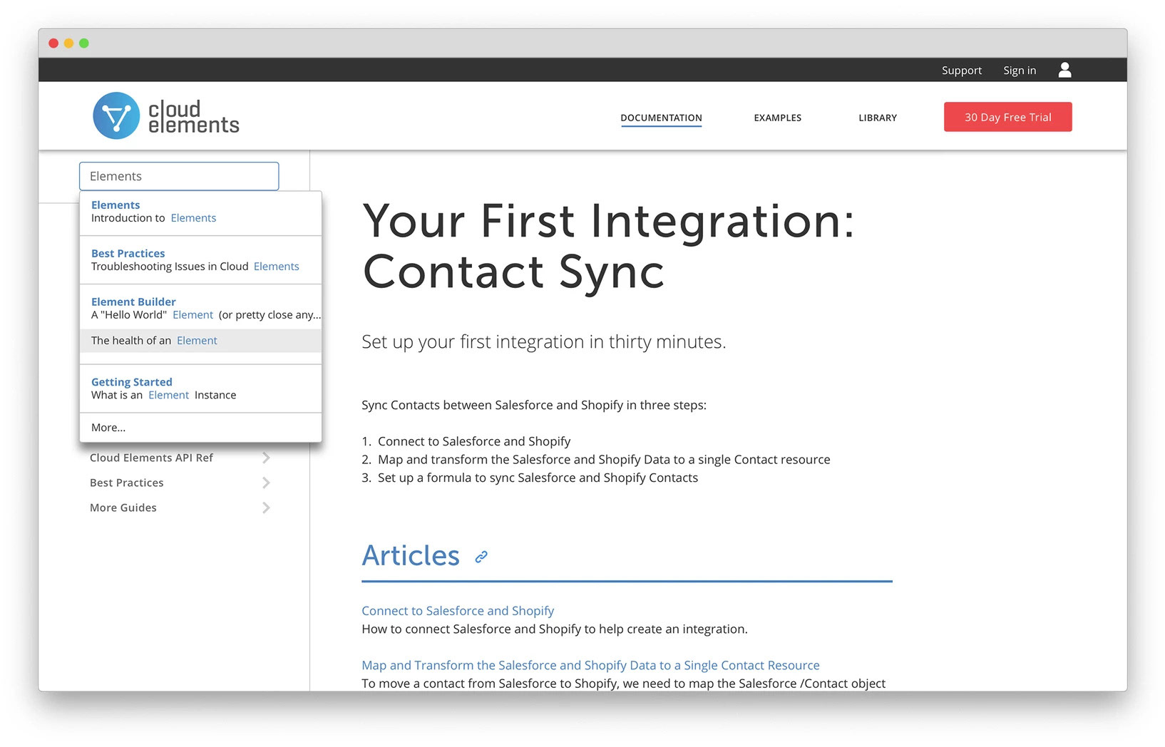
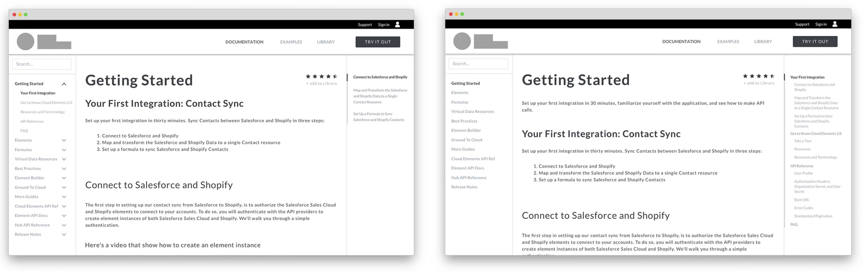
Enhanced type-ahead search capabilities to find information more efficiently.