Impact
End-users and the internal team both showcased positive reviews for the UI and usability updates.
The internal web team identified a reduction of steps needed to perform basic actions due to streamlined content publishing processes.
Overview
A website redesign for a Colorado-based school, SkyView Academy, a charter school founded by a group of parents to create a more challenging and meaningful educational program for their children and the community.
ROLE
• Freelance UX Designer partnering with Atomic Idea
• Freelance UX Designer partnering with Atomic Idea
TIMELINE
• 3 weeks
• 3 weeks
TEAM
• 1 Brand Strategist (Atomic Idea)
• 1 Content Management System Admin (SkyView Academy)
• 1 Brand Strategist (Atomic Idea)
• 1 Content Management System Admin (SkyView Academy)
PLATFORM
• Responsive Website
• Responsive Website
TOOLs
• Sketch
• Overflow
• Sketch
• Overflow
The problem
There were numerous complaints from students, parents, and staff about the usability of the previous version of the website. The old site was outdated and difficult to navigate. Example images are below:
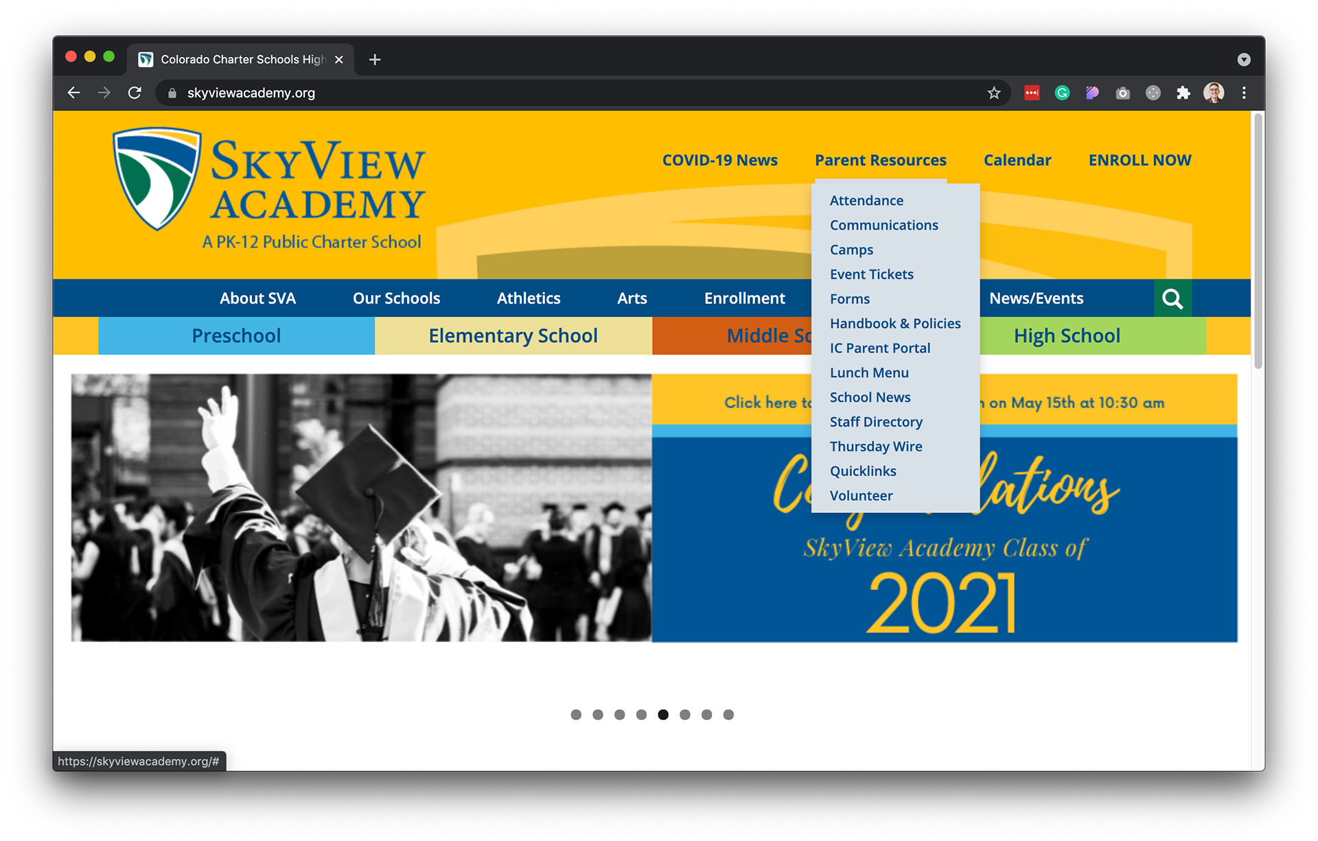
Previous SVA homepage
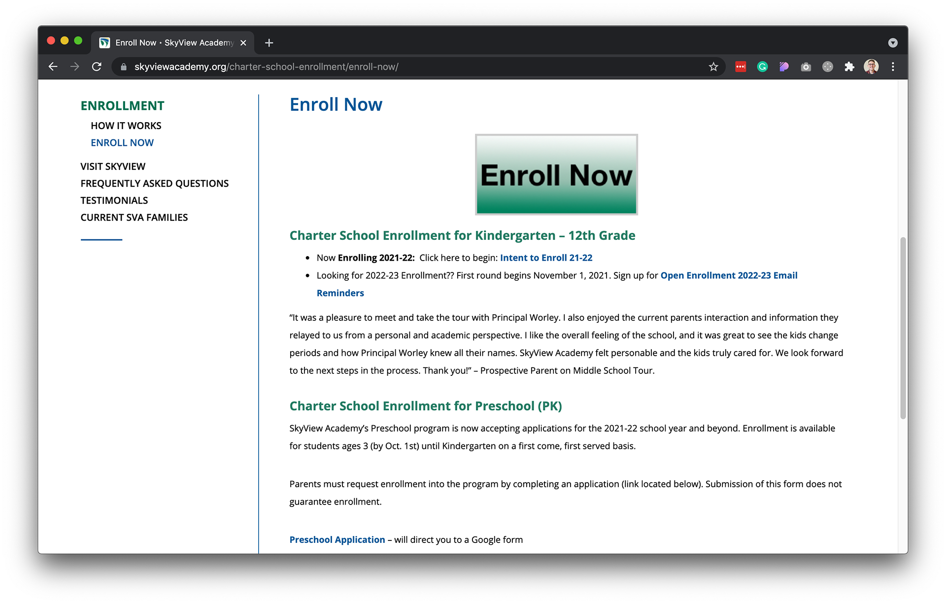
Previous placement for users to Enroll, a vital feature
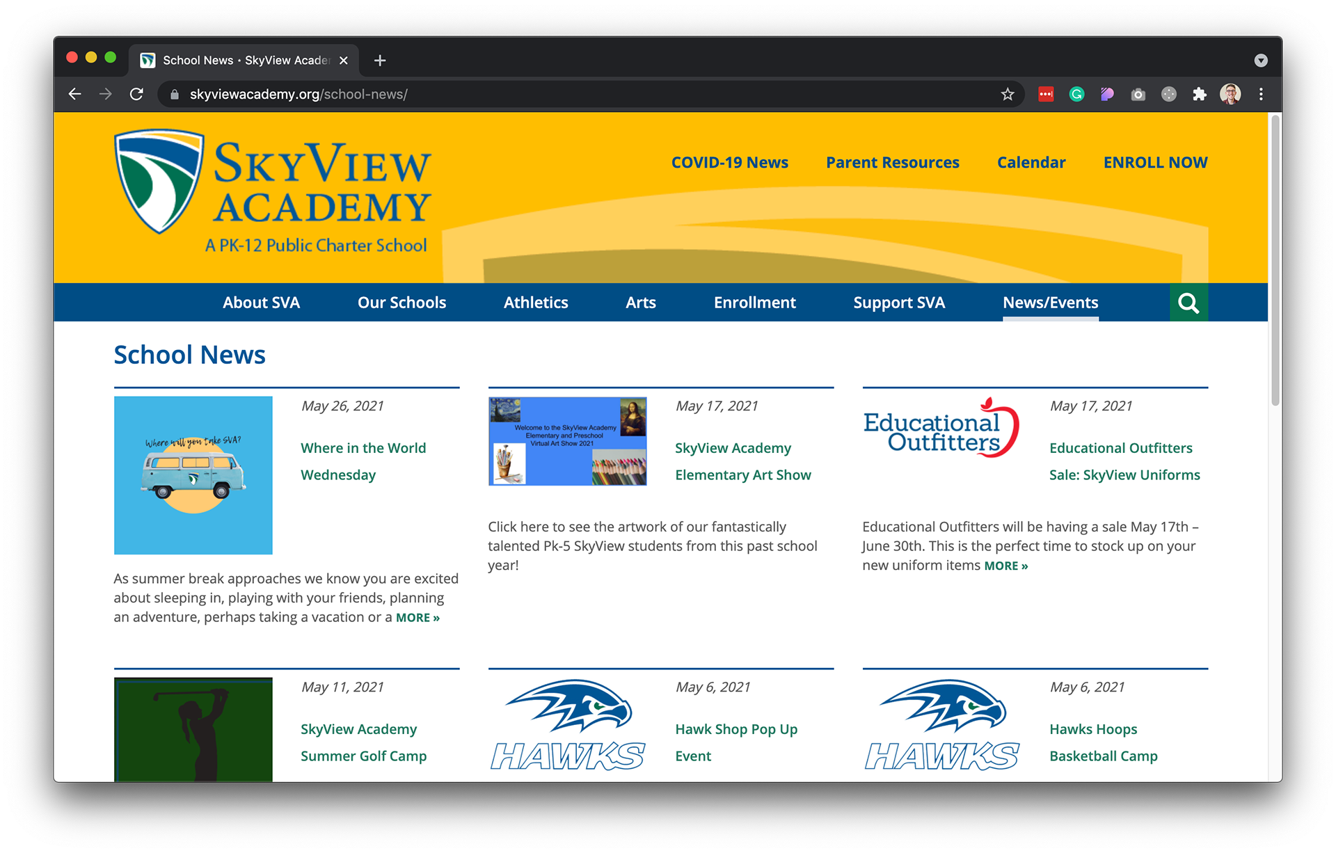
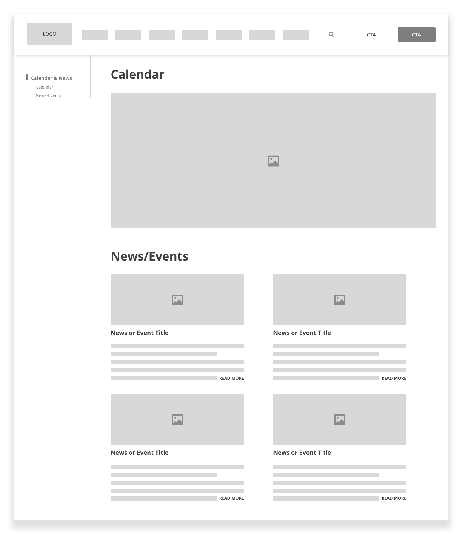
Previous iteration of school News/Events
Research
User survey & remote interviews
Working with Atomic Design, a series of open-ended questions were asked to staff members, parents, and current students to gain qualitative feedback. Example questions included:
• "What are you looking for when you first arrive on the school's website?"
• "What pages or sections do you visit most often?"
• "Please describe your experience of the current website"?
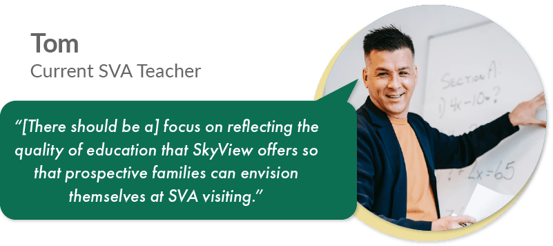
“The website needs to be more visually appealing...[with] less content overload."
- User interview participant
- User interview participant
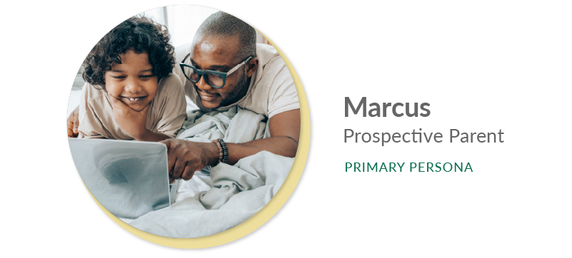
Who are the users?
I was provided with a vague assumption about who the main user groups were.
• I was able to validate and establish one primary and three secondary personas
• This was based on qualitative research above and quantitative data gathered from the content management system admin
Goals:
• Gain general school information
• Compare info from multiple schools quickly
• Understand parent, child, and school policies
• To communicate with staff to learn more
• Gain general school information
• Compare info from multiple schools quickly
• Understand parent, child, and school policies
• To communicate with staff to learn more
Frustrations:
• Not always sure what to look for in a school
• Unclear on how to best compare SVA to others
• Inconsistent ways to access some pages of the site
• Wastes time on sections with a lot of content
• Not always sure what to look for in a school
• Unclear on how to best compare SVA to others
• Inconsistent ways to access some pages of the site
• Wastes time on sections with a lot of content
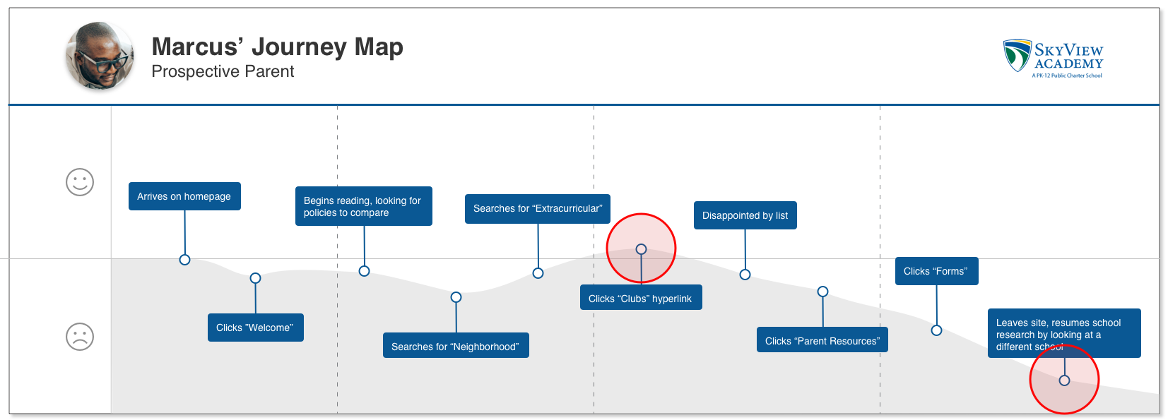
The peak and end of his journey show that improvement is needed with the hyperlinks section of the navigation.
According to Nielsen Norman Group, these two points are what the human brain remembers most clearly about an experience.
According to Nielsen Norman Group, these two points are what the human brain remembers most clearly about an experience.
Synthesis & information architecture
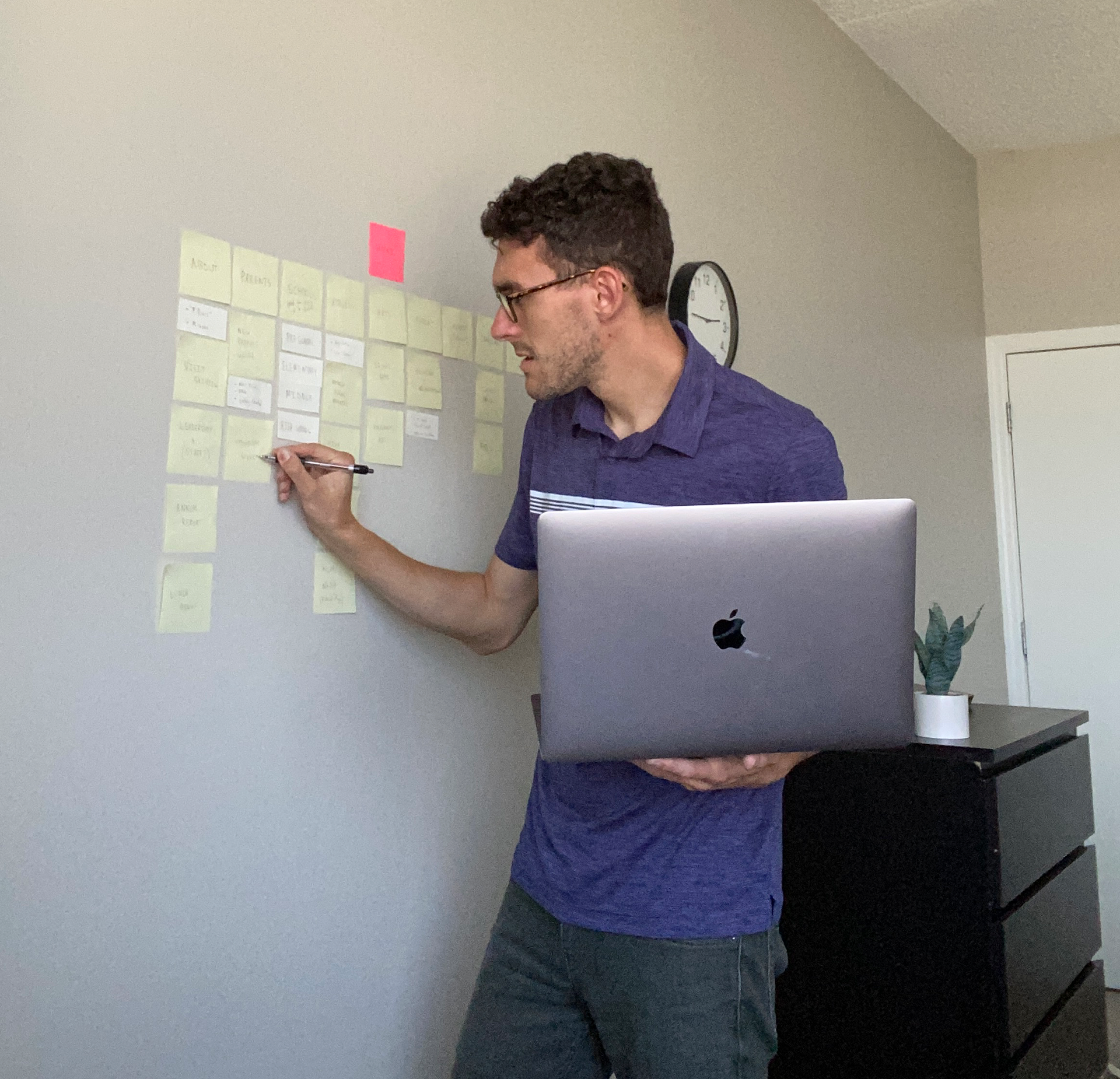
My data synthesis process.
During the initial user survey, I included a list of categories (representing a consolidated navigation list) and a wide variety of sub-categories and asked participants to associate the two groups.
• Utilizing card sorting, I was able to understand the mental models of users
• The "Parent Resources" category required the most attention to fulfill the primary persona's needs
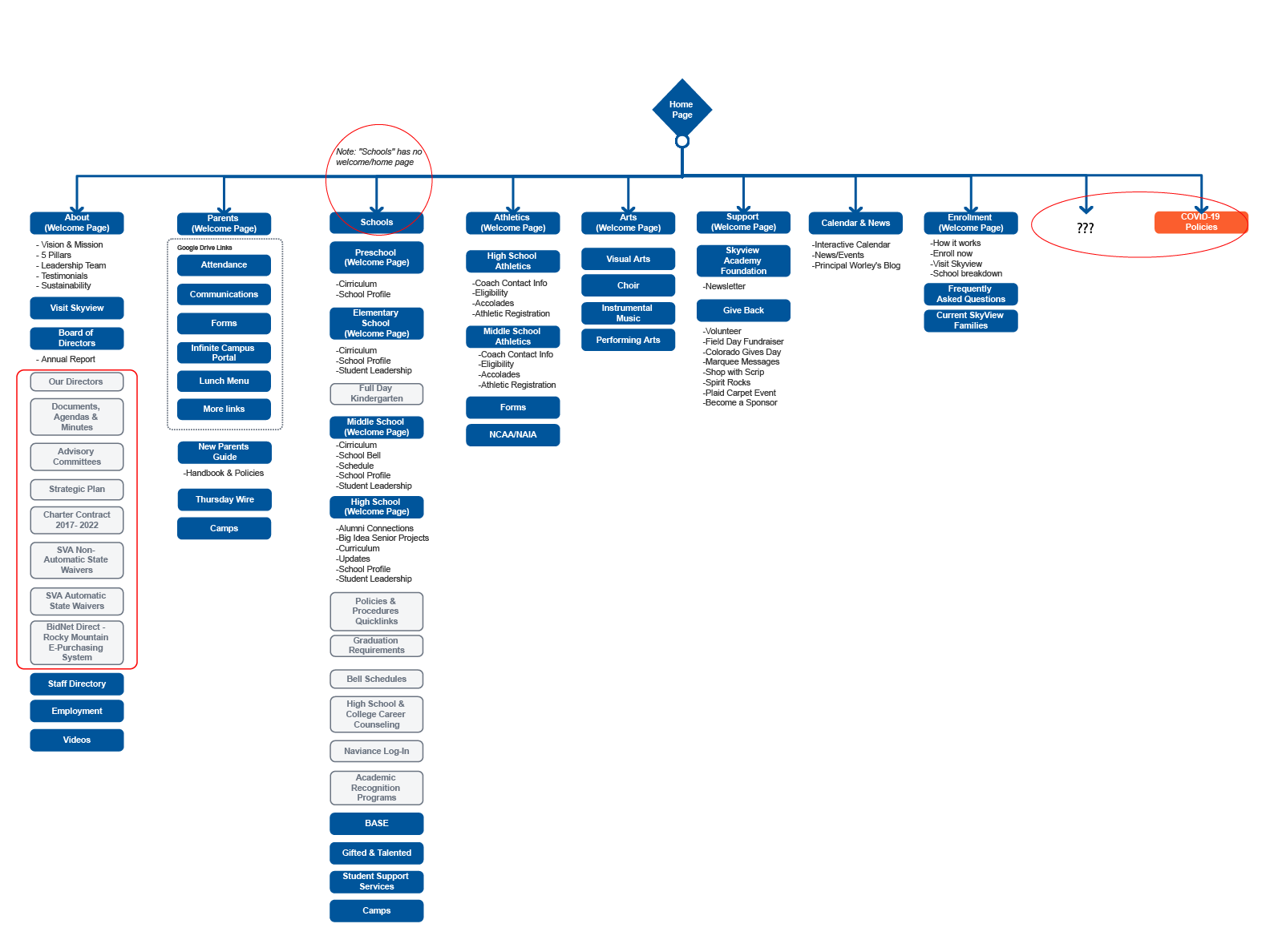
Highlighted in red are some areas and categories that required iteration.
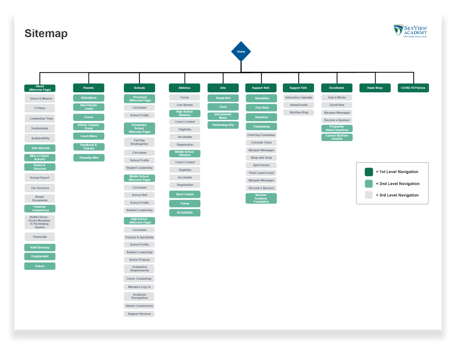
Final sitemap presented to the internal SkyView team.
Wireframes
Client & user feedback
Navigation
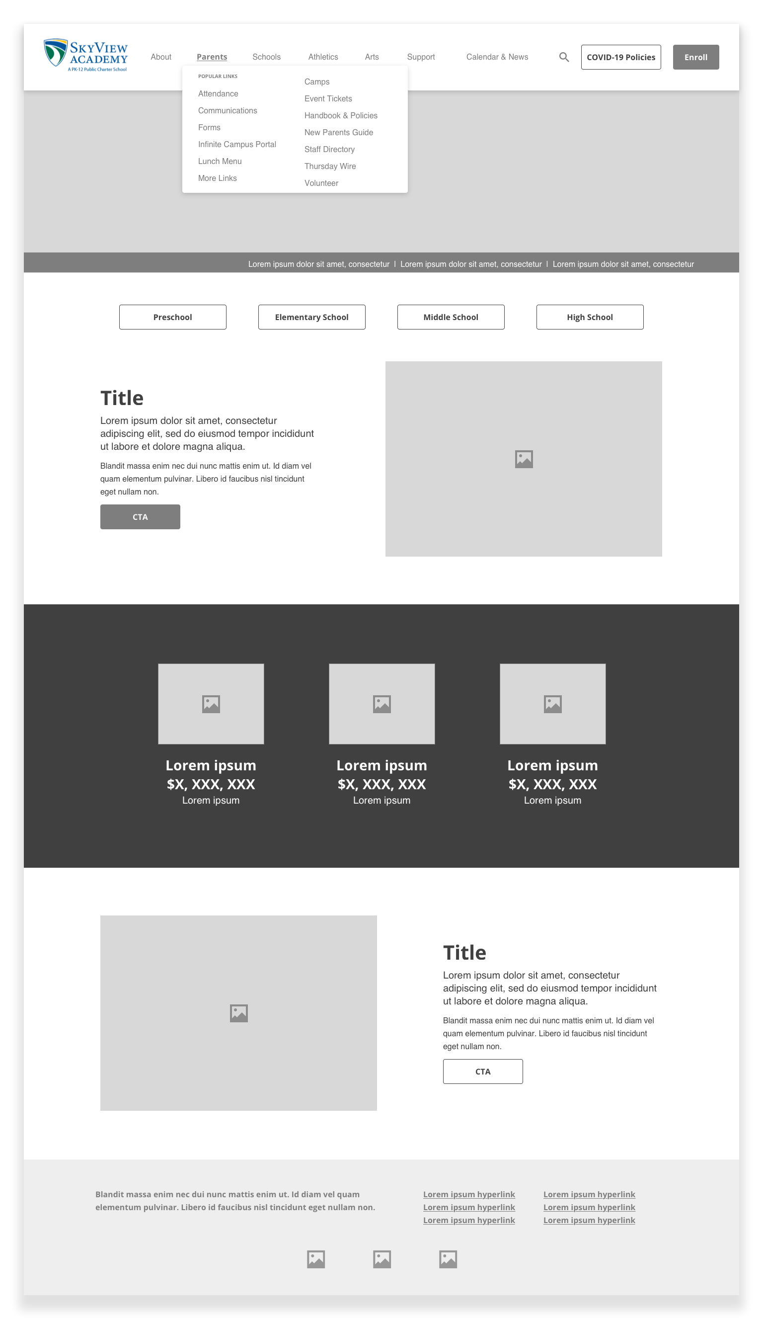
The "sticky" left-hand navigation in the proposed wireframes was altered due to feedback. This led to the main navigation needing to include more content and the introduction of breadcrumbs.
Additional template page refinement
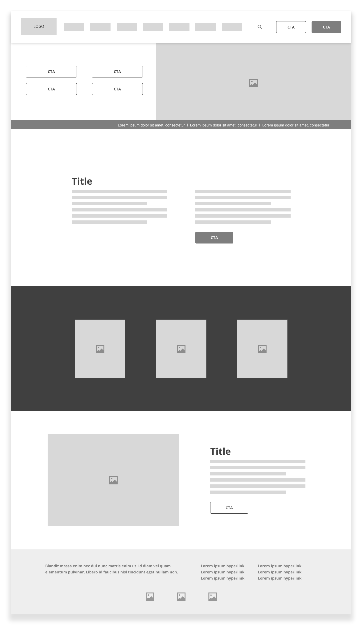
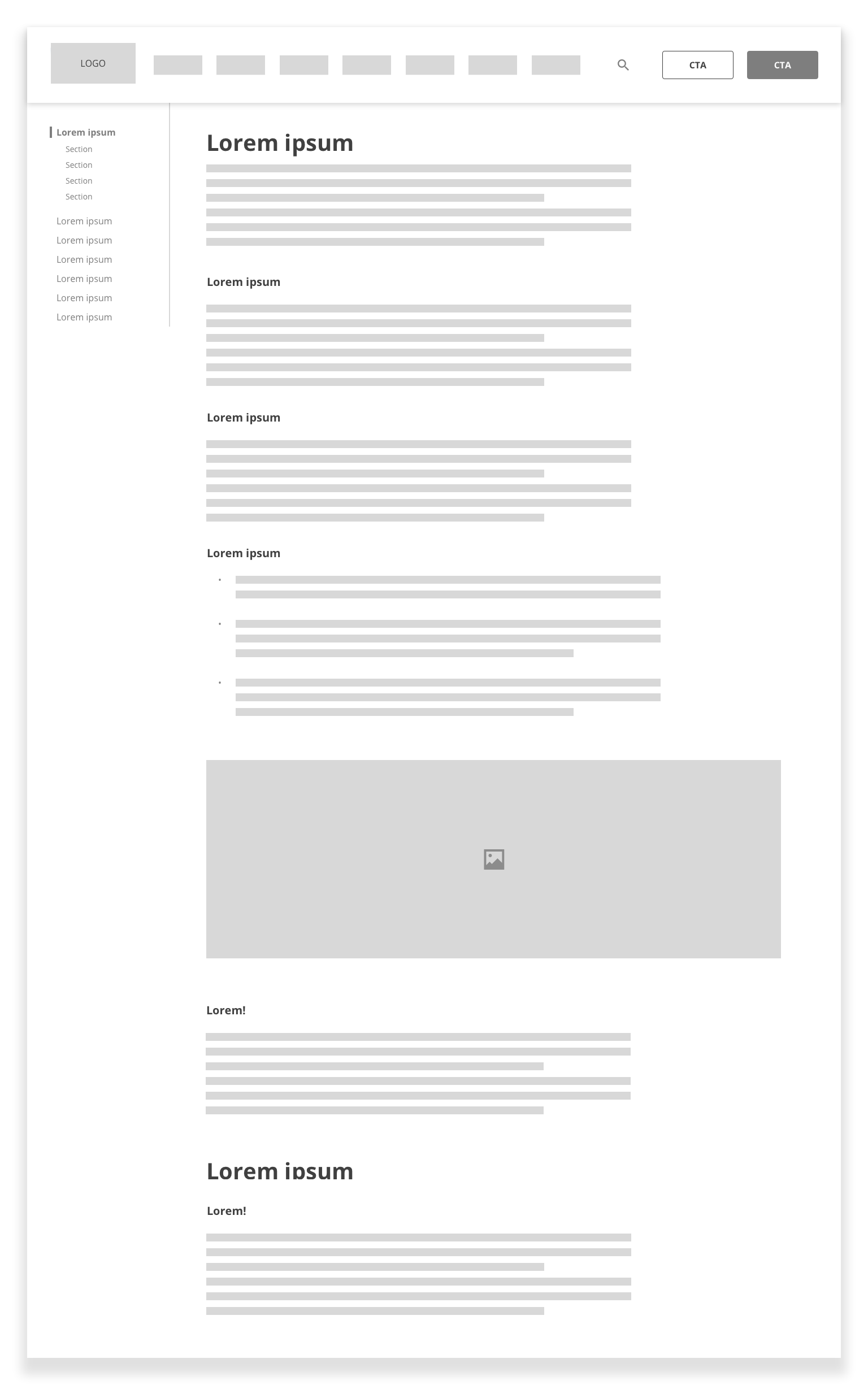
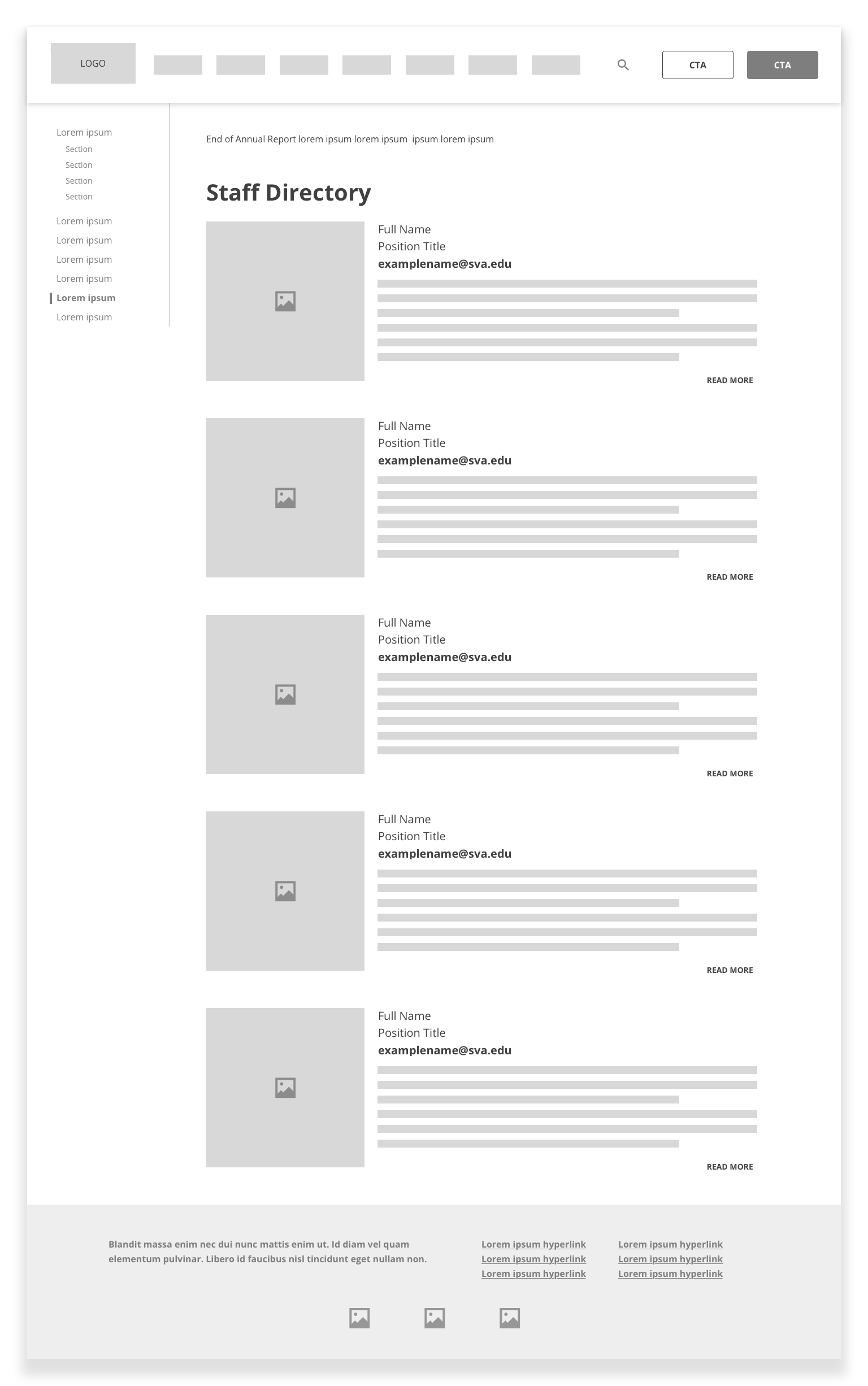
High-fidelity mockups
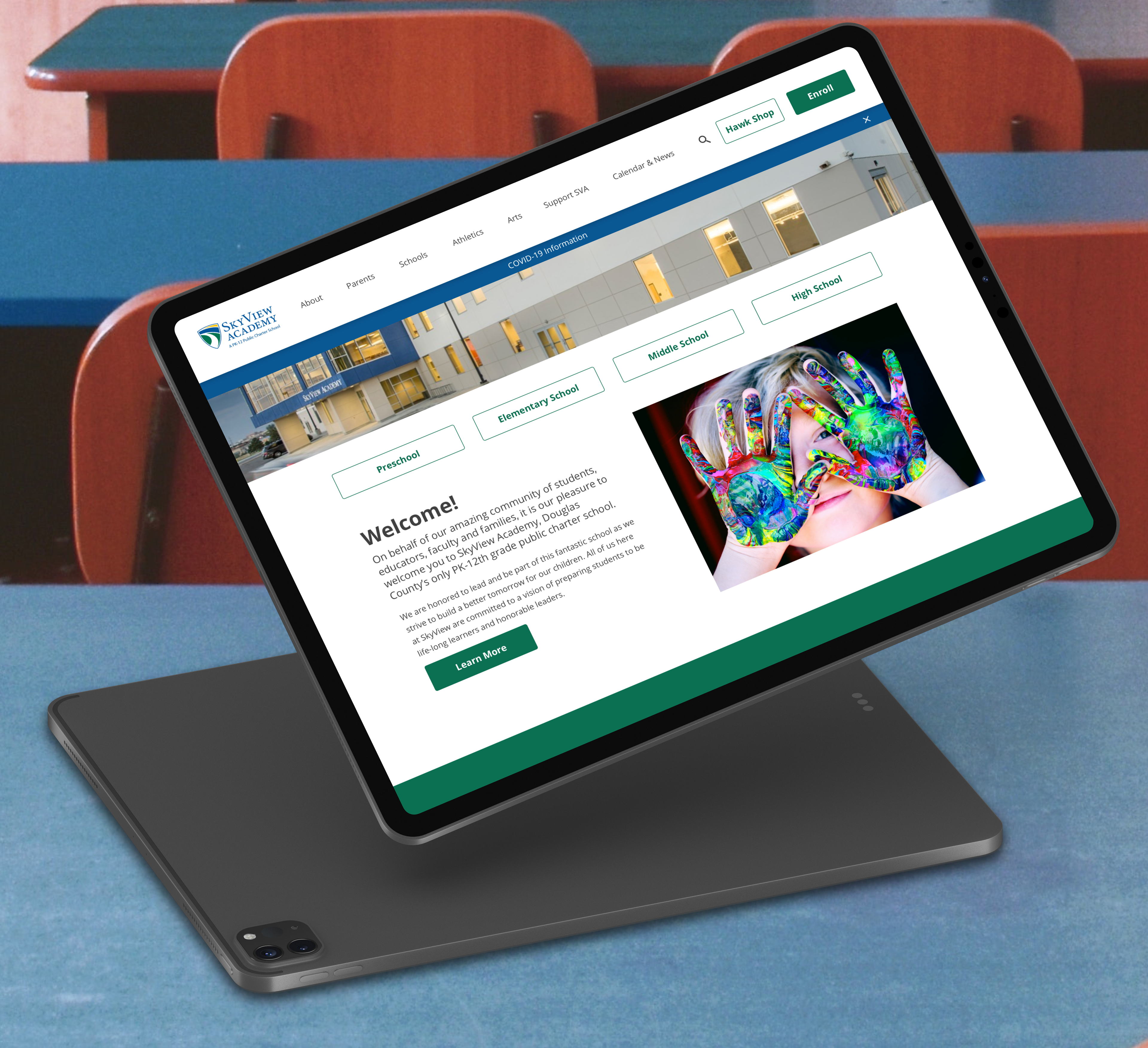
After implementing design changes based on feedback and additional research on web best practices, I moved to high-fidelity mockups. I worked within SkyView Academy's branding guidelines.
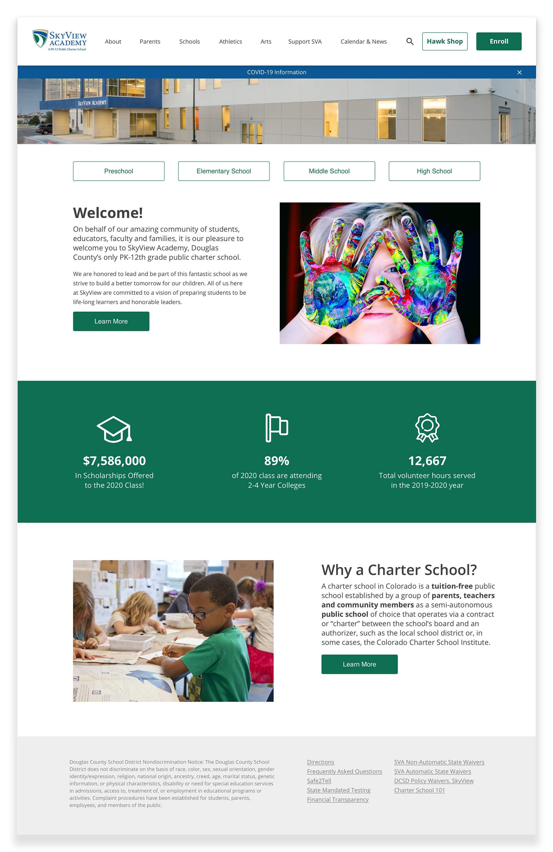
Revised homepage, with clear calls to action/navigation and less visual clutter.
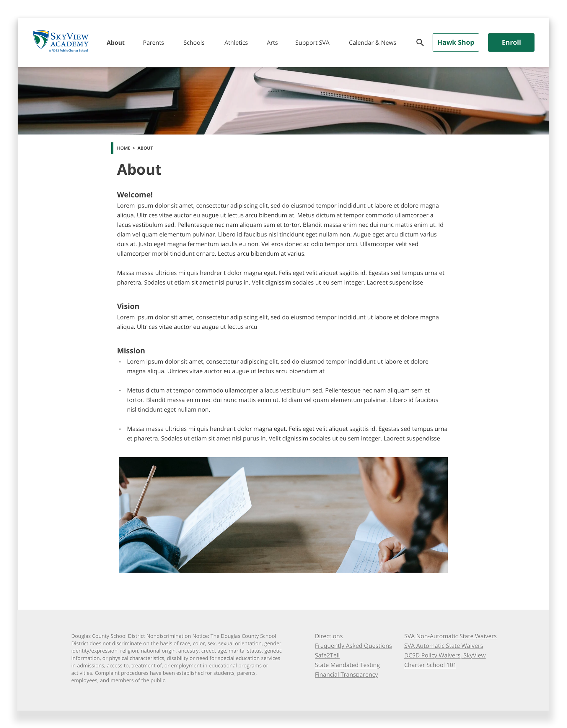
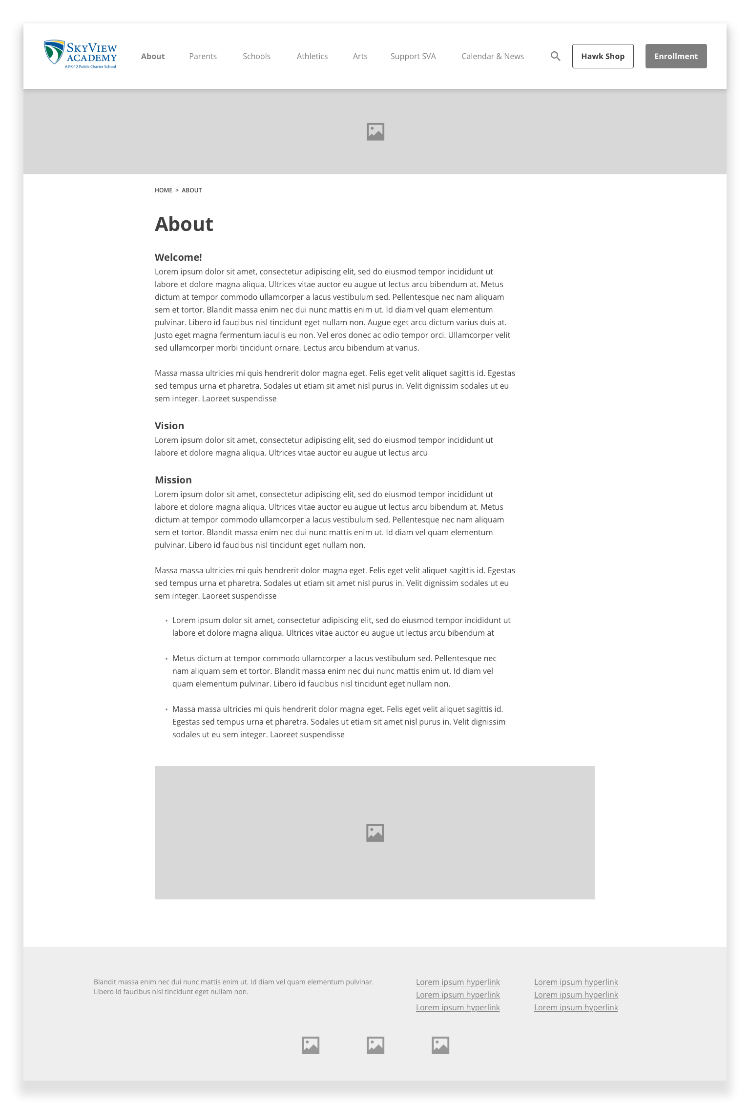
An example page template showcasing enhanced readability for large blocks of text.
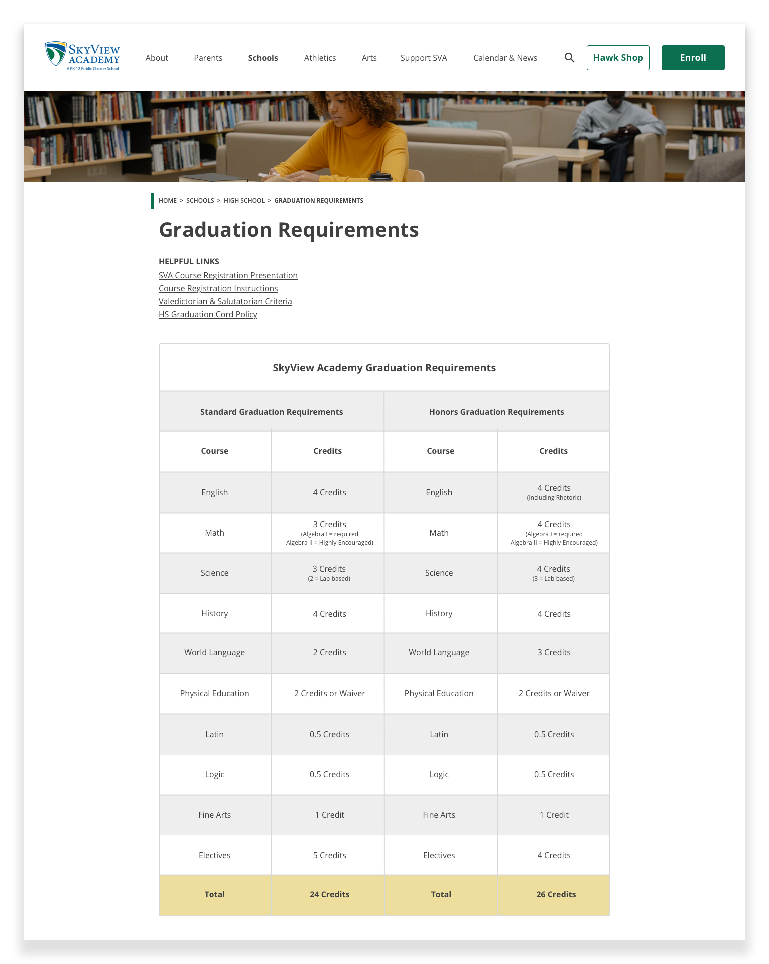
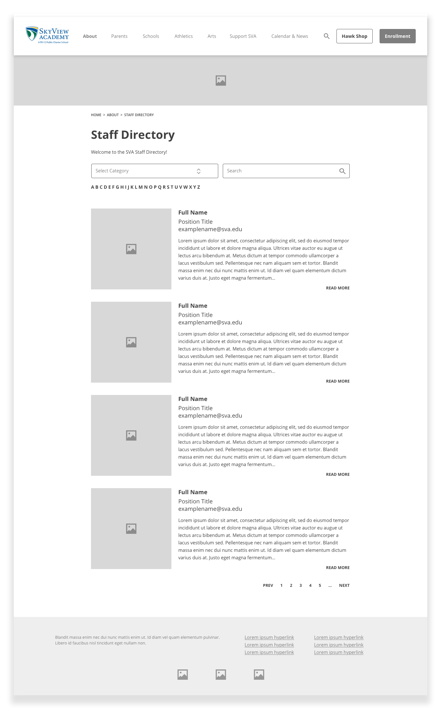
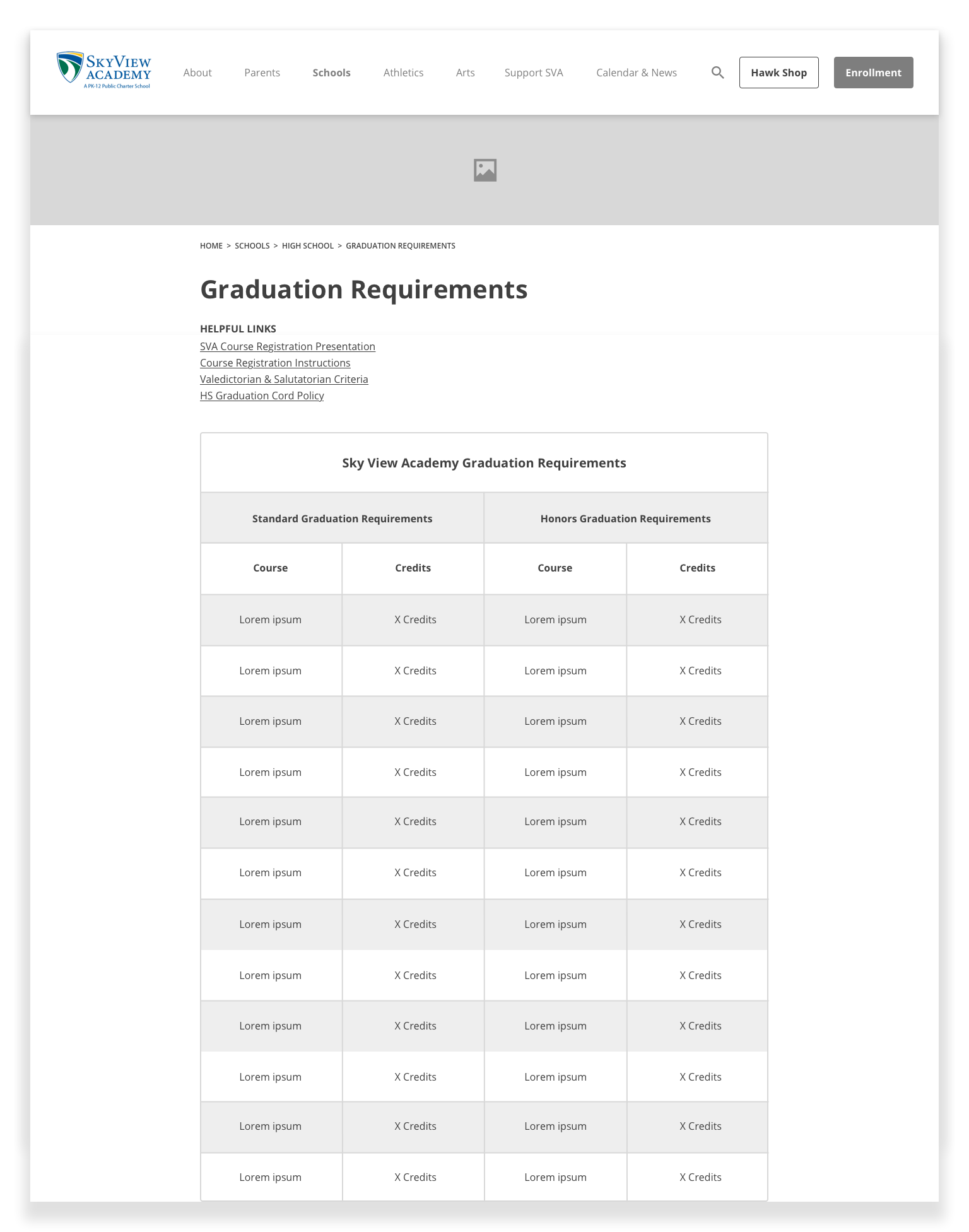
An example page template showcasing content other than text.