Achieved high sentiment survey scores from users during post-launch testing.
Streamlined the workflow by decoupling the two different views, ensuring users only interact with relevant data.
Decreased uncertainty for infrequent users by implementing proactive in-app guidance and context-rich notifications.
ROLE
• UX Designer at OneTrust
• 3 months
• 2 UX Designers
• 1 UX Researcher
• 2 Product Managers
• 1 Front-End Engineering Lead
• 1 Back-End Engineering Lead
• B2B Web Application
• Figma
• Maze
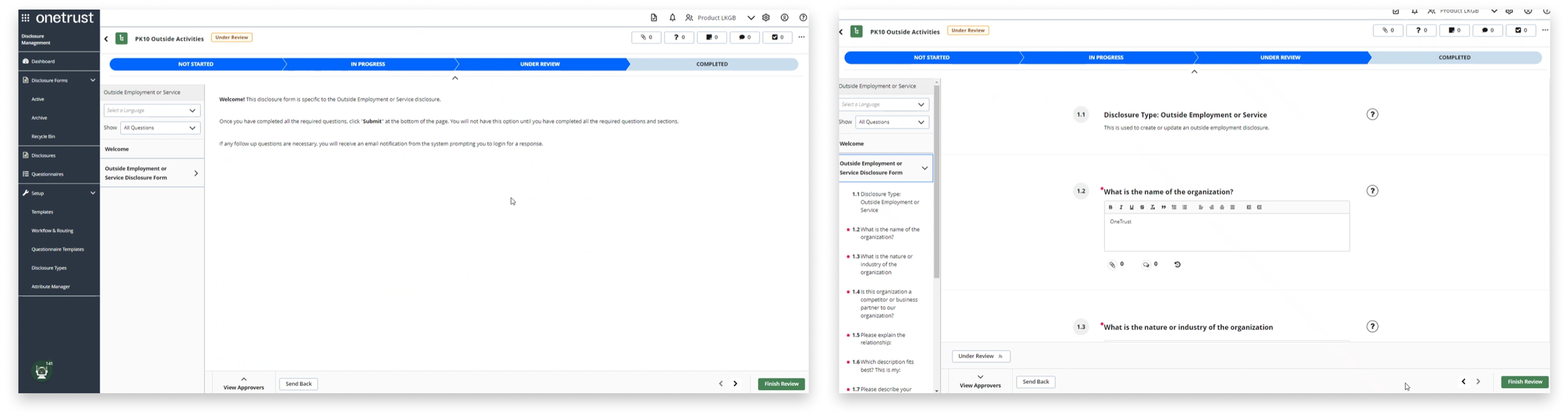
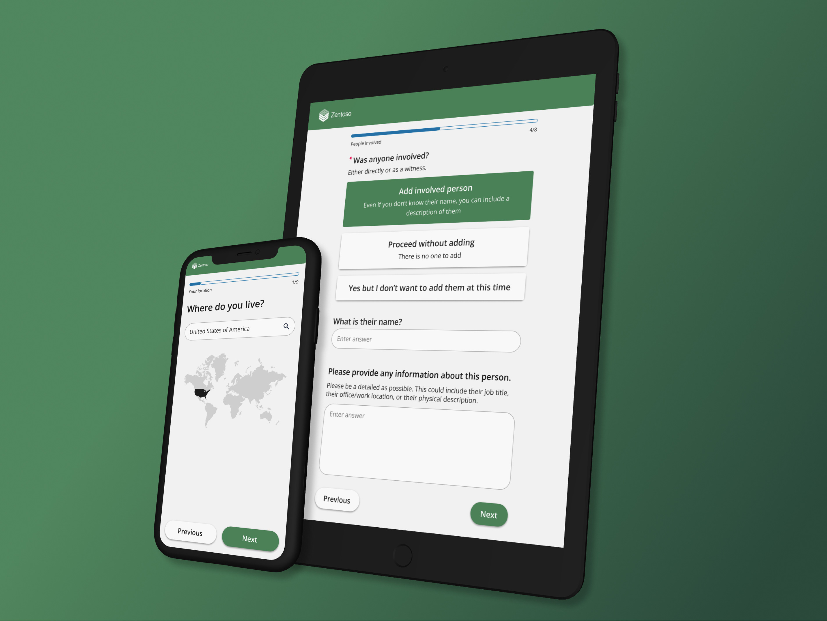
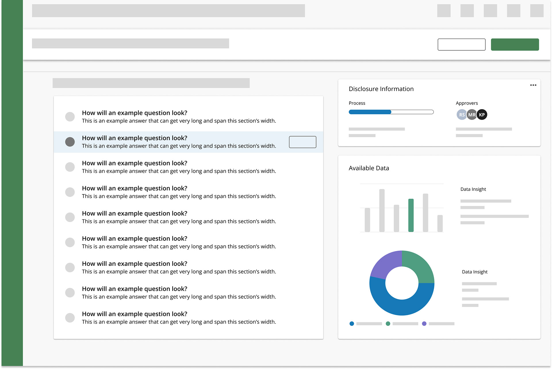
On the original screens, users needed to click the bottom right arrows on the page to enter the view they needed to review (Left). Users were also presented with a redundant way to navigate the questions (Right).
- User interview participant
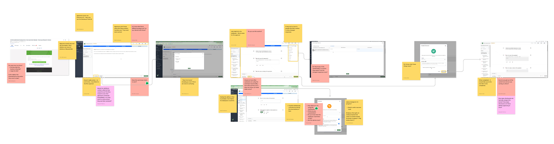
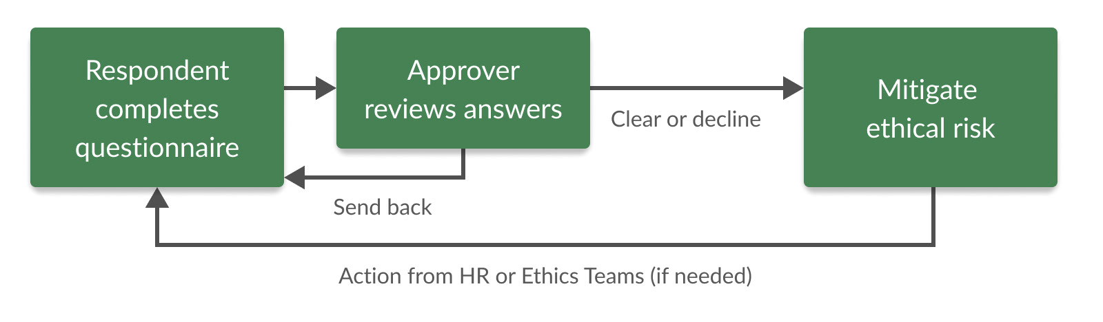
Working with PMs and Engineering, I went through each screen of the approval flow to understand the technical limitations, assumptions, and historical context before beginning research.

Recommendation: Implemented step-by-step tip modals and stripped the UI of respondent-only features to minimize distractions.
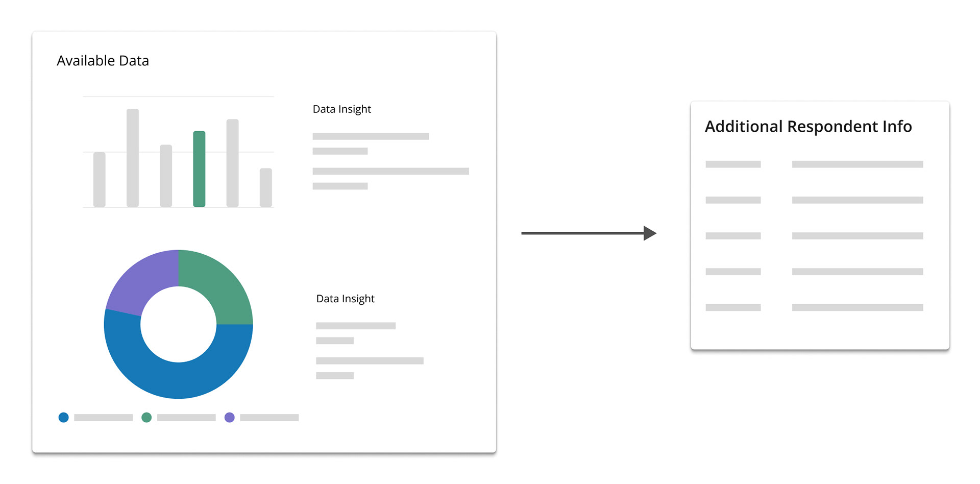
Users often leave the workflow to search for more context.
Recommendation: Added a configurable side-drawer that surfaces HR data and disclosure history directly within the review screen.
Users can be uncertain about what they need to do after they submit their review.
Recommendation: Created an automated redirect to a prioritized task list, ensuring the user always knows their next best action.

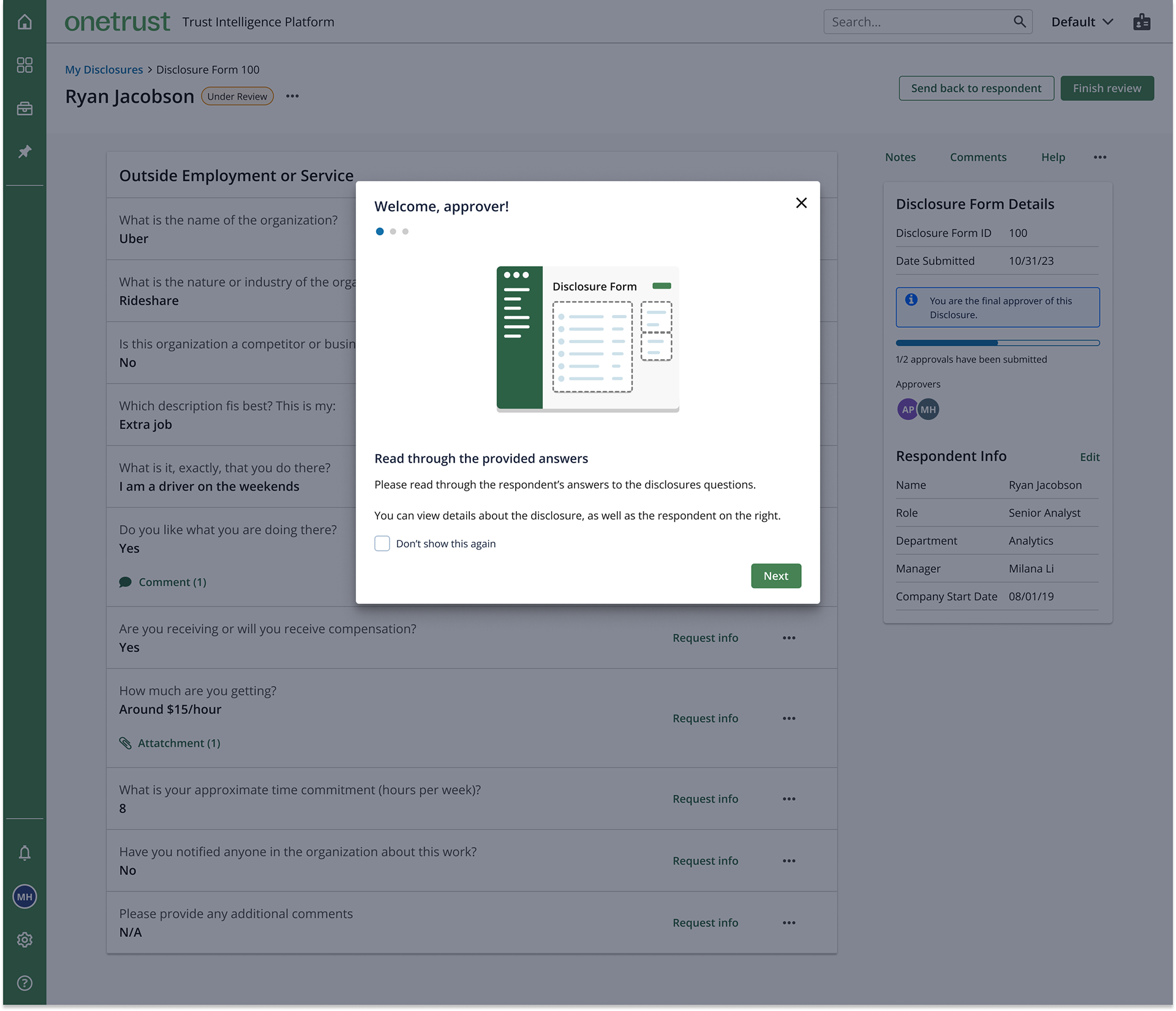
A tip modal with multiple steps to help guide the approver when they enter the flow. They can choose not to show it every time they log in. It addresses the insight that users may not know what actions to take.
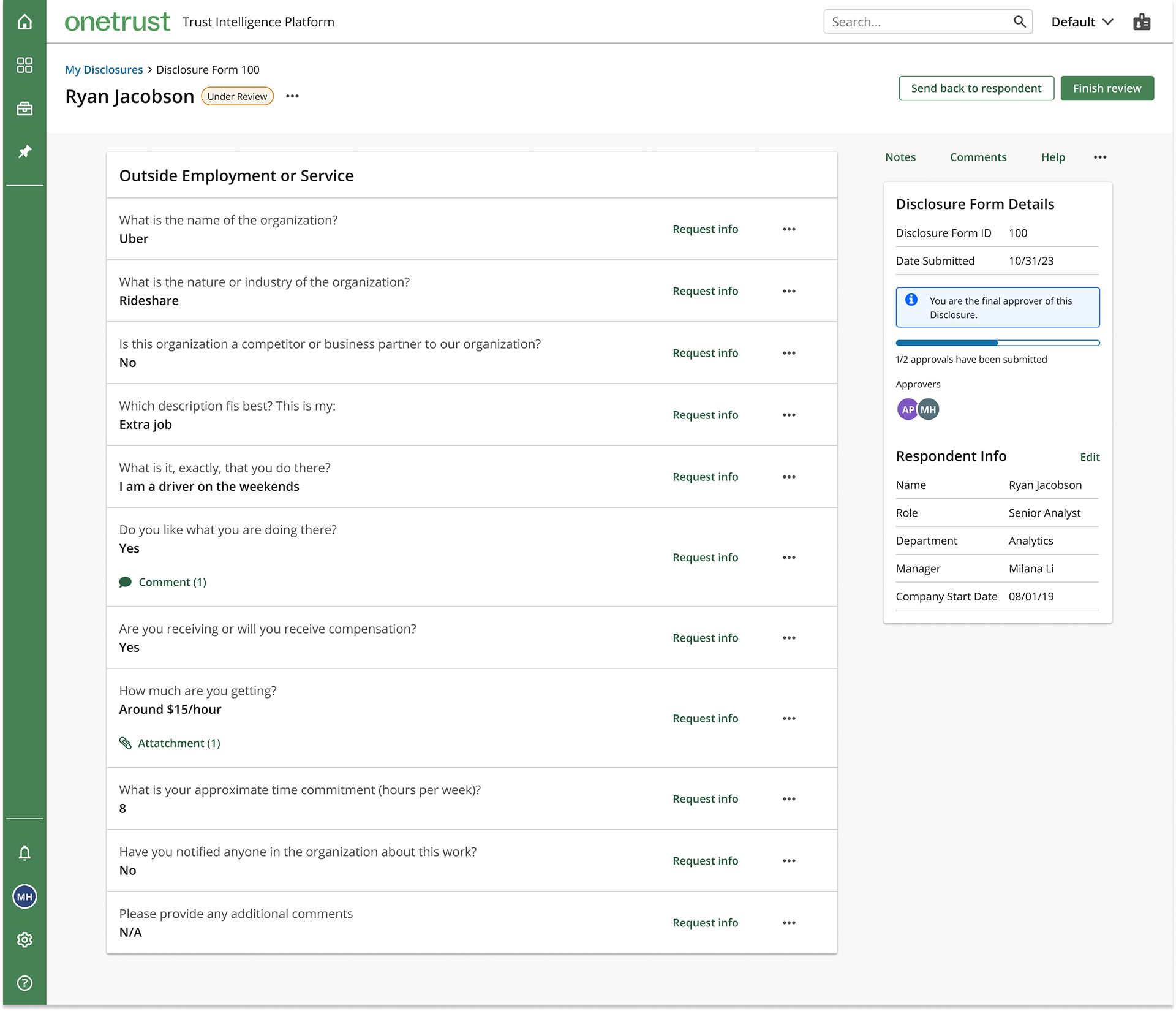
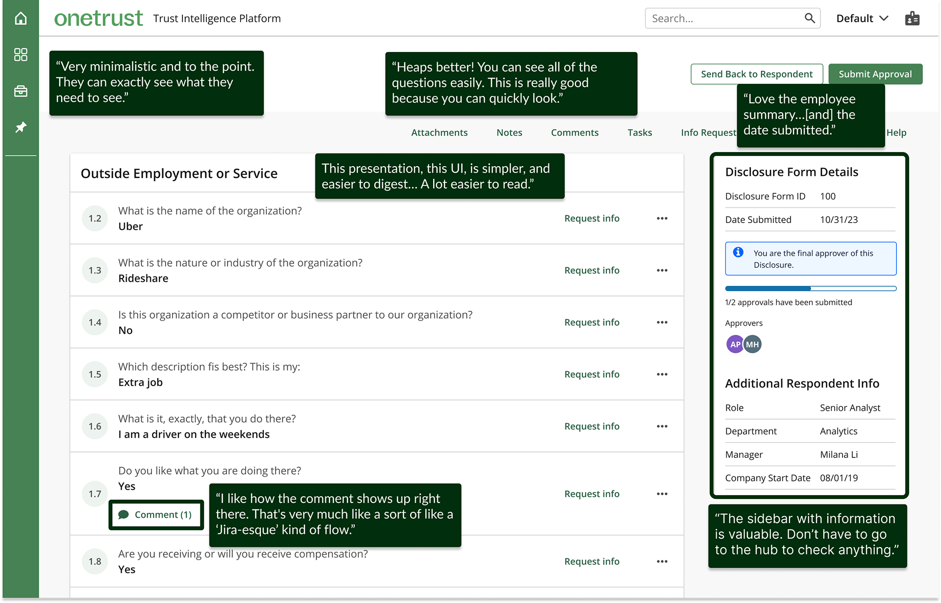
An updated approver view of a disclosure. It is a more condensed and efficient way of showing the responses. It also addresses the insight that approvers may need to locate more information before finishing their review.
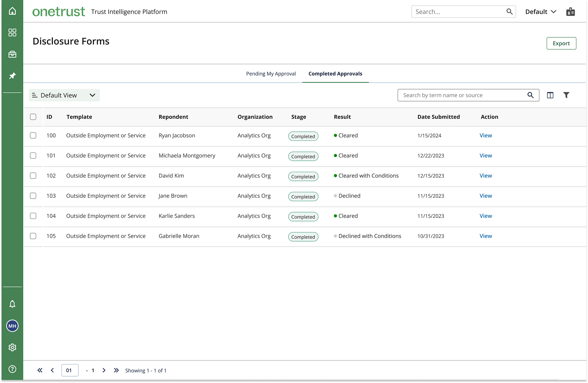
A new table view the user is navigated to after finishing their review. It shows which disclosures still need their attention and which ones they have completed. It addresses the insight that an approver may not know what to do after submitting a review.
- John Langford, previous UX manager at OneTrust