Impact
Systemizing for Scale
I architected a responsive design library specifically for Webforms, creating a reusable framework that solved the immediate needs of Speak Up while significantly reducing front-end development time for future OneTrust B2B applications.
Designing for Trust & Safety
I pivoted from dense, Admin-focused UI to a guided, B2C-inspired experience. By redesigning core components to prioritize anonymity and psychological safety, I reduced the cognitive load for reporters in high-stress situations.
I pivoted from dense, Admin-focused UI to a guided, B2C-inspired experience. By redesigning core components to prioritize anonymity and psychological safety, I reduced the cognitive load for reporters in high-stress situations.
Overview
ROLE
• UX Designer at OneTrust
• UX Designer at OneTrust
TIMELINE
• 4 Months
• 4 Months
TEAM
• 1 UX Director
• 2 UX Designers
• 1 Senior UX Researcher
• 4 Product Managers
• 1 Front-end Engineering Lead
• 1 Back-end Engineering Lead
• 2 Architecture Engineers
• 1 UX Director
• 2 UX Designers
• 1 Senior UX Researcher
• 4 Product Managers
• 1 Front-end Engineering Lead
• 1 Back-end Engineering Lead
• 2 Architecture Engineers
PLATFORM
• B2B Web Application
• B2B Web Application
TOOL
• Figma
• Figma
The problem
Employees of OneTrust’s customers need a way to report ethical concerns (also known as whistleblowing) or inquire about them.
• These users, known as reporters, need to be able to report safely, quickly, and securely
• Reporting an unethical situation can often be time-sensitive, fear-inducing, or even dangerous
• Ethical concerns can include smaller issues such as miscommunications, or can be more serious such as money laundering, misconduct, or abuse
“It takes courage for a reporter to raise their hand and tell their story. Making the process as simple as possible will help."
- Ethics Customer Advisory Board member
- Ethics Customer Advisory Board member
Research process
With research, I determined the solution needed to be...
Welcoming
• Users need to be reassured that this is a safe and open space for them to express ethical concerns
• They may be afraid of employer retaliation – this process should aim to reduce that fear or similar emotions
Intuitive
• Users need a process that is easy to use, so they can quickly go through each step
• They might only have a few minutes to report and cannot afford to get lost or encounter complexity
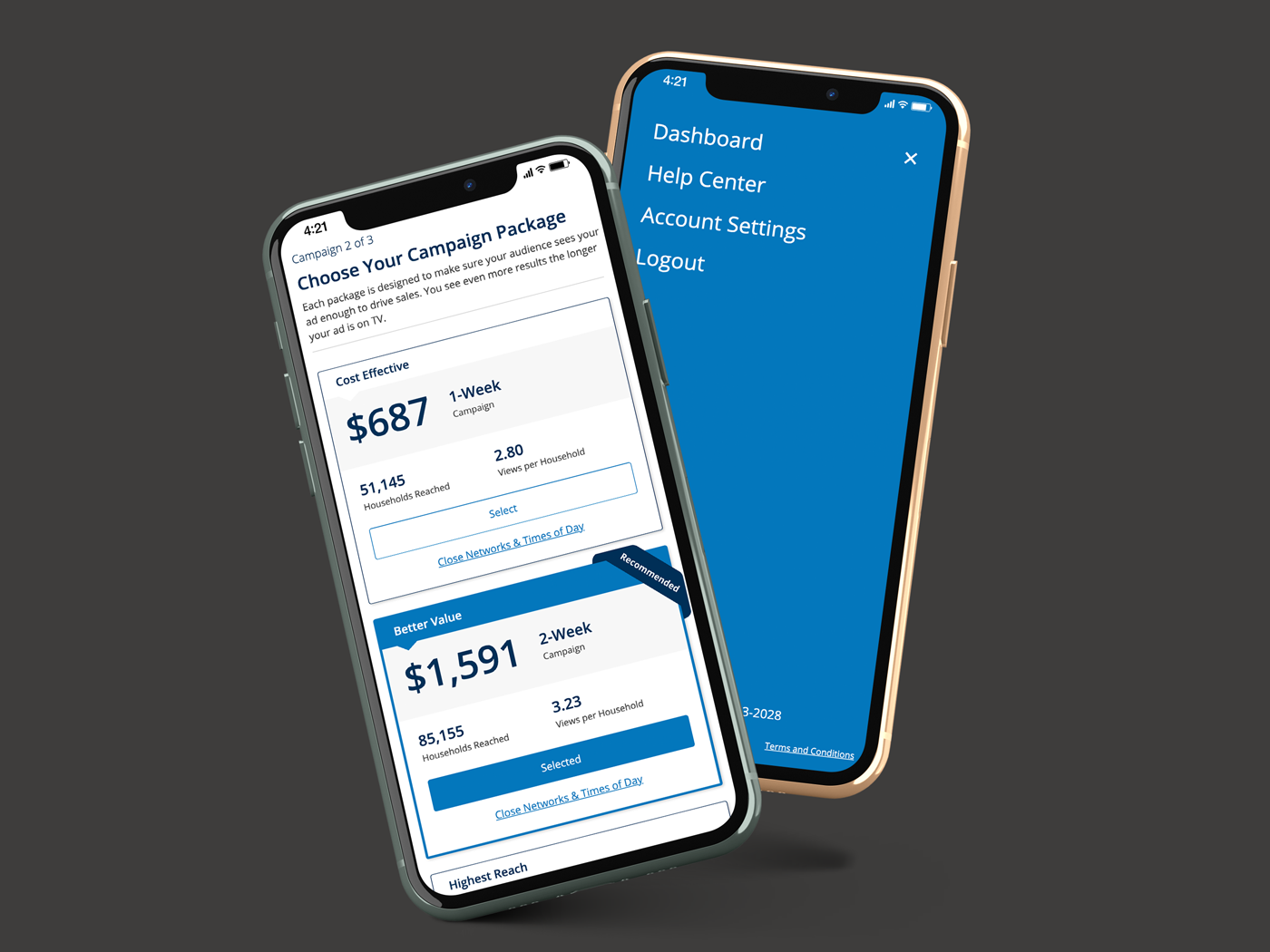
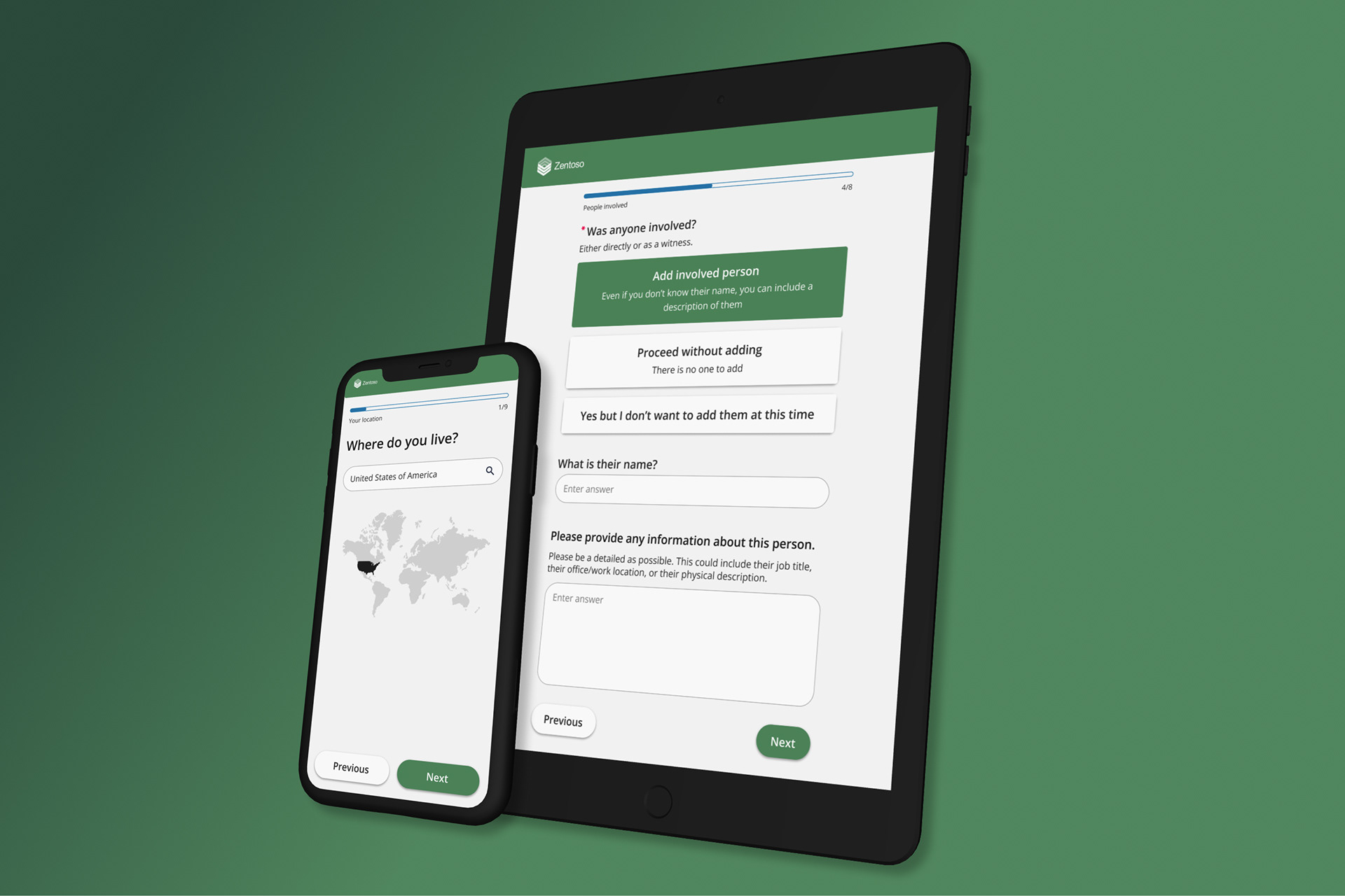
Responsive
• Users may want to access this application while on a mobile device or tablet, perhaps away from their office
• These users are unlike typical admin users of other OneTrust applications and need a different experience
Design ideation
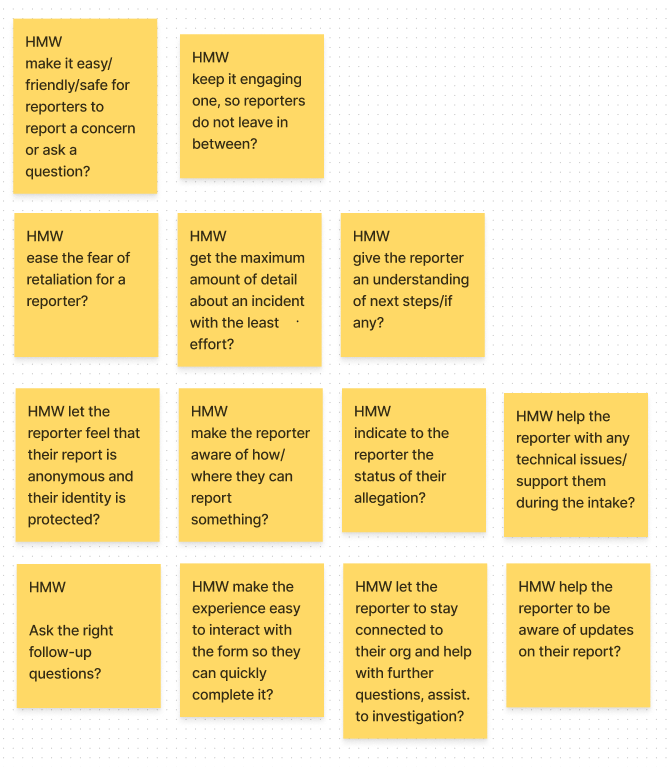
Collaborative brainstorming
I led a number of sessions discussing "how might we" statements on a shared FigJam board with designers, product managers, and engineers.
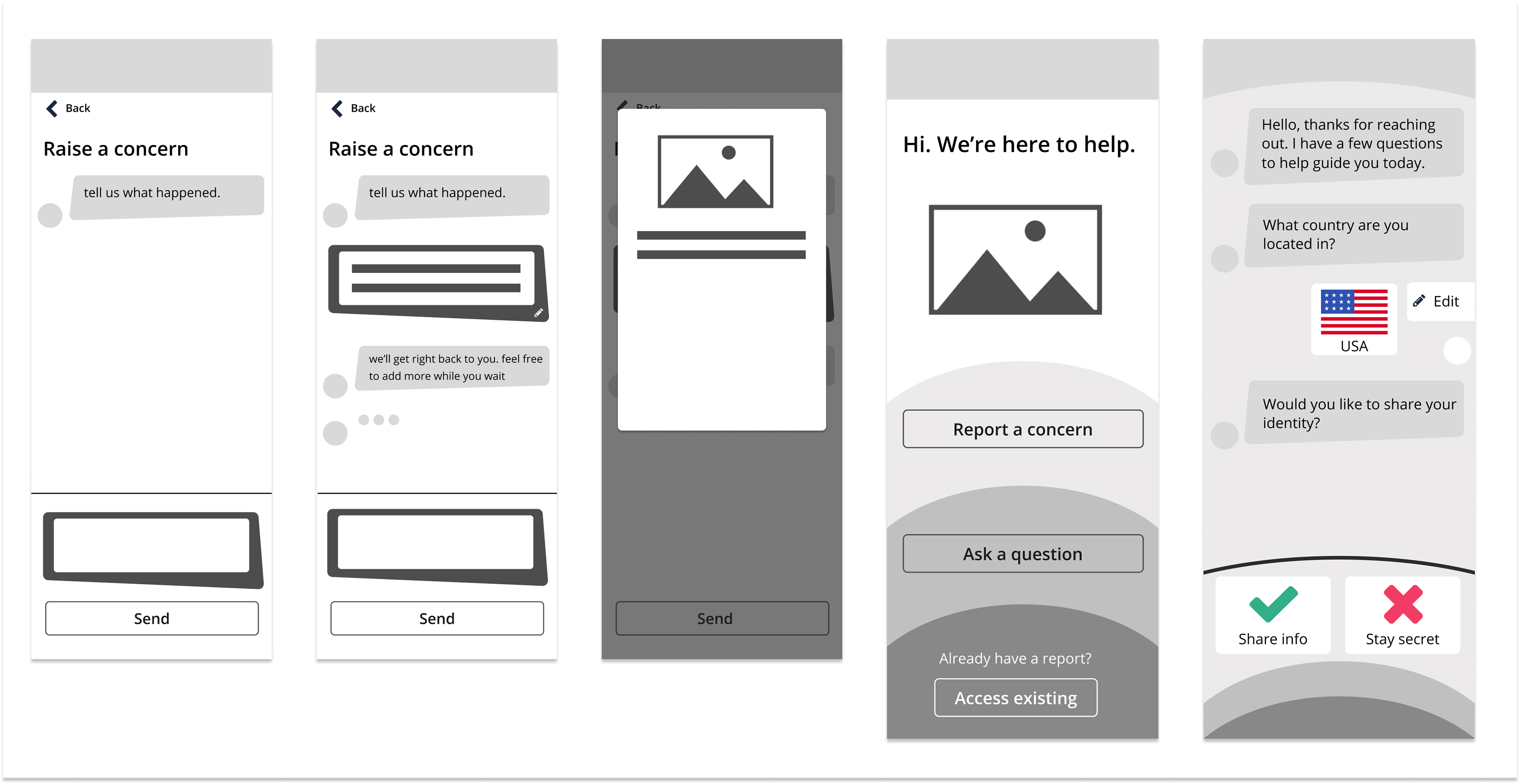
Wireframes
The earliest concepts were focused on a chat-type experience, where a reporter is having a mock conversation to guide them through their experience.
Exploration: Material design
I initially explored Material Design to leverage its established documentation and speed up development. However, I led a strategic pivot back to a custom solution after identifying critical misalignments with our long-term goals:
• Technical audits with Engineering and Architecture leads revealed that maintaining two separate component sets would create significant "design debt" and technical overhead for future updates
• Material Design’s rigid structure limited the deep customization required to make the tool feel like a seamless, trusted extension of a customer’s own brand
The need for new components
Conversations with Product, Engineering, and Architecture led to a new need: a design library within OneTrust's custom Design System to be built within Webforms. The library, made to fit the needs of reporters in Speak Up, included:
• Enhancements: to ensure a B2C look and feel within a B2B design system (including customer customization capabilities)
• New Components: to solve user needs not accounted for in the original Design System
• New Responsive Definition: certain components, such as modals needed responsive documentation defined

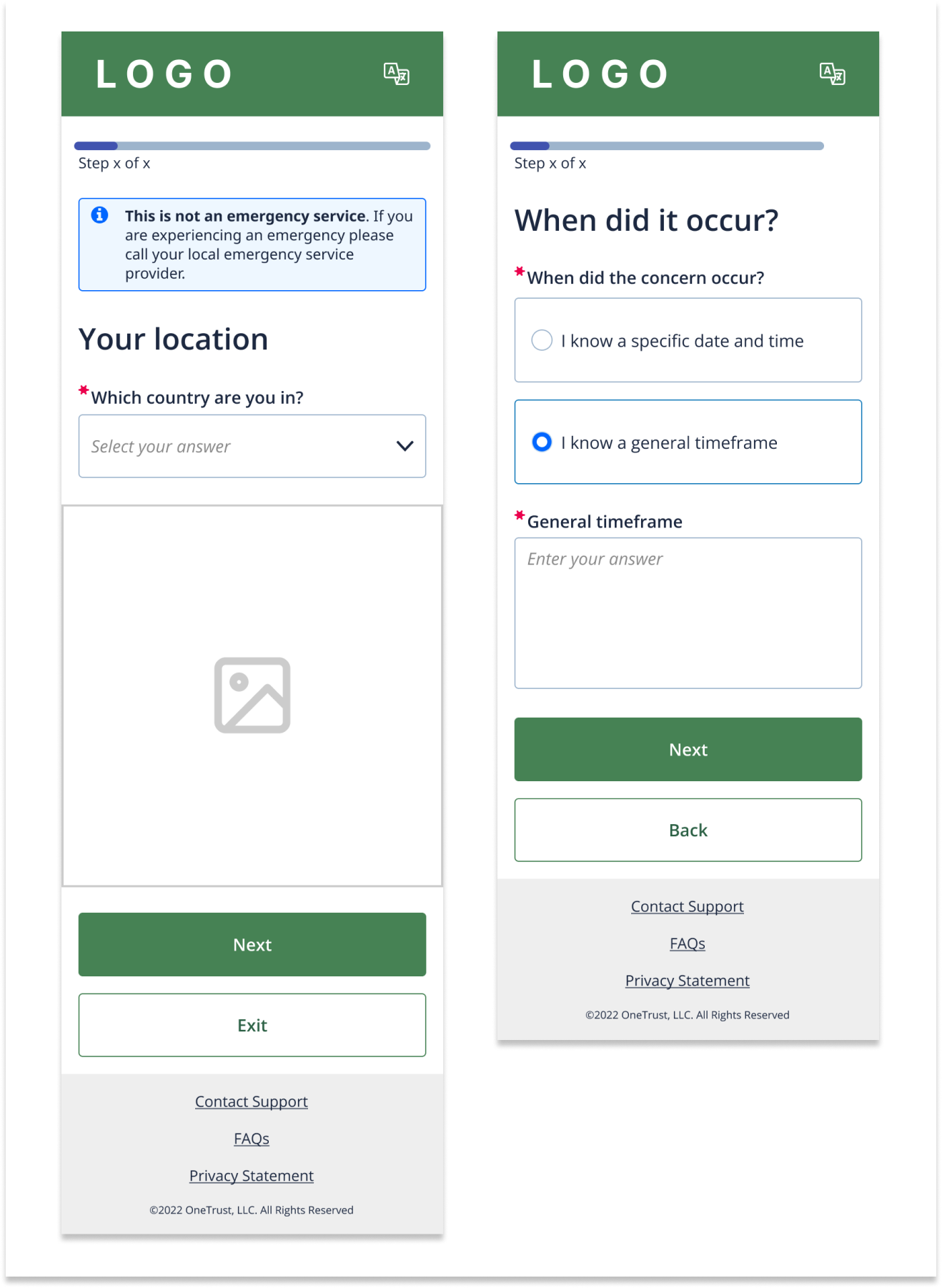
Primary/secondary button enhancements include larger text and customizable corner radius to ensure higher affordance for navigation.
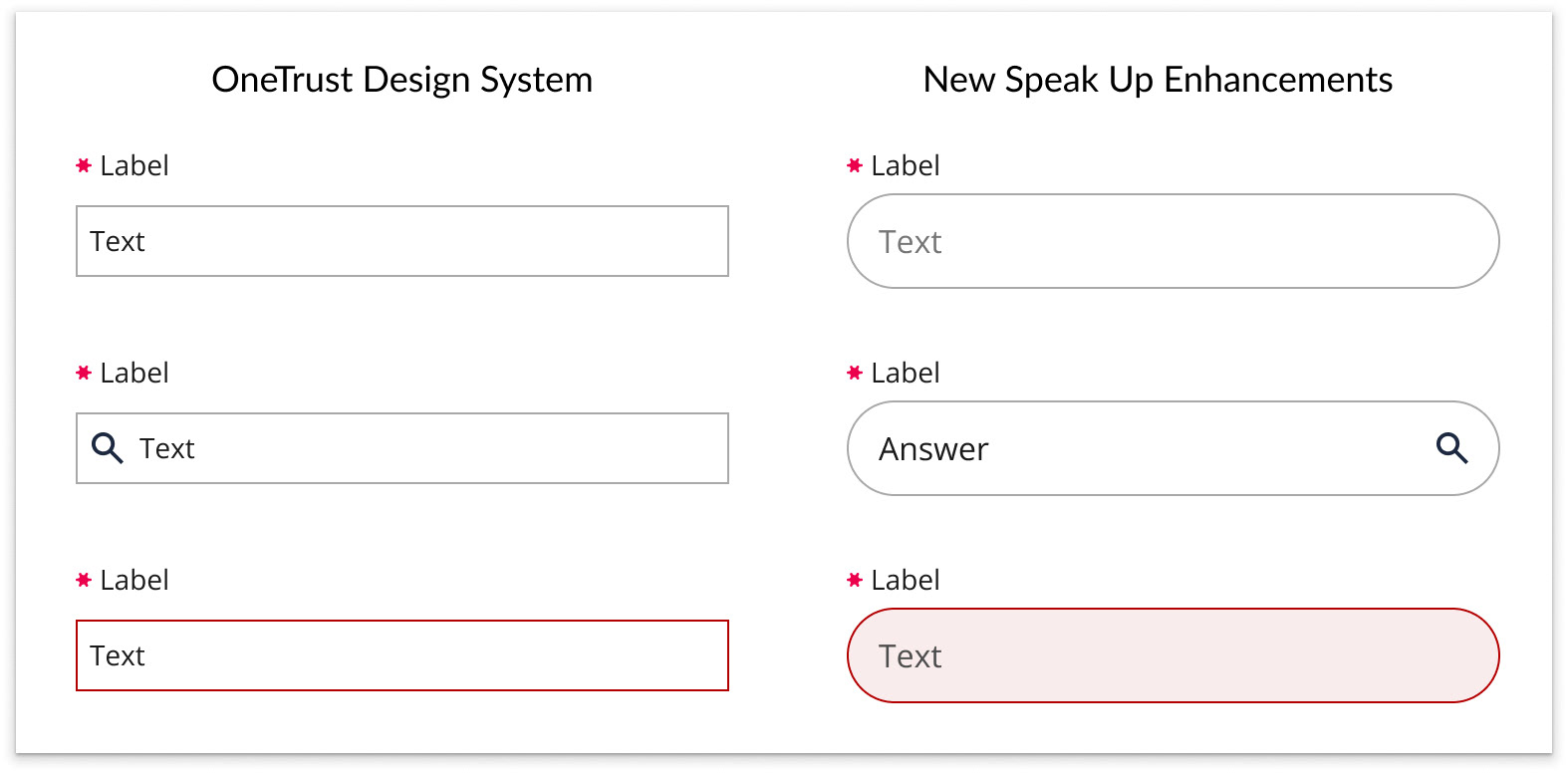
Form field enhancements include larger text size, more padding, and customizable corner radii to ensure a B2C feel.

The sizing and breakpoints for the updated modal component, which was originally not responsive.

I created a new card button to add an indistinguishably clear affordance when users choose answers throughout the flow. I also included an option for customers to add help text within the button to provide guidance to users.
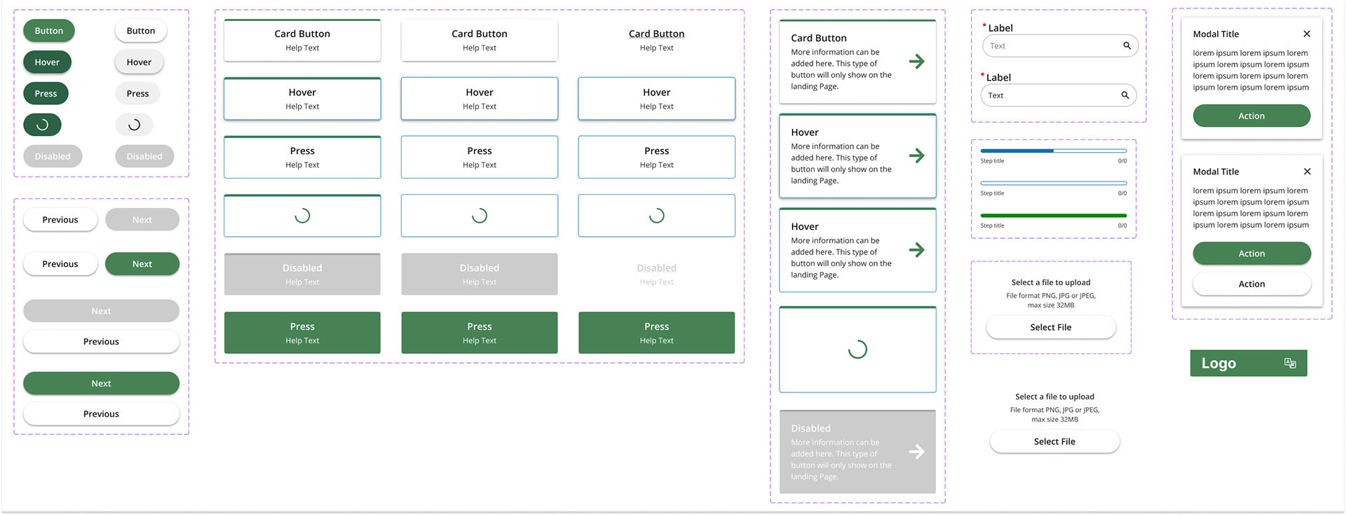
Documented components created for the new design library (including variables).
Outcomes
I presented the design direction to the OneTrust Ethics Customer Advisory Board to validate the new approach. Key outcomes included:
• Ethics and Compliance leaders validated that the flexibility to customize the intake flow is critical for building reporter trust across different corporate cultures and unique scenarios
• I identified a high interest in AI-driven intake and triage which led to impacting roadmap iterations (I advocated to launch the foundational responsive UI first to gather data while continuing to explore AI considerations)
I led cross-functional alignment and ensured multi-track delivery.
I led cross-functional alignment and ensured multi-track delivery.
• I led bi-weekly workshops and meetings with Product Managers and Engineering to align requirements, ensuring the Speak Up flow remained cohesive despite having multiple internal stakeholders
• I successfully balanced the lead design role for Speak Up while simultaneously driving the Disclosure Approval Experience for a separate B2B product, demonstrating an ability to scale design thinking across the OneTrust ecosystem without losing quality